Elevating Mobile Engagement for Financial Tools
This case study dives into the challenges, solutions, and outcomes of redesigning a feature-rich fintech mobile experience.
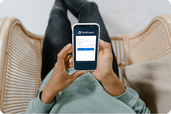
Total Expert is a powerful customer engagement platform tailored for financial institutions, helping banks, credit unions, and lenders manage marketing, sales, compliance, and customer relationships. I was brought in to improve the mobile experience—specifically Android—by aligning it with iOS, expanding functionality, and resolving UX inconsistencies.
Role:
Sole UX/UI designer
Industry:
Fintech, CRM, Marketing Automation
Tools:
Figma, FigJam, Zoom, Jira
Duration:
Nov 2024 – Feb 2025
Value Added +
- Improved clarity and usability across key civic entry points, including login, landing, and dashboard views
- Reduced friction when accessing complex economic development data through structured layouts and filtering
- Enabled faster comprehension of redevelopment activity, project scope, and citywide impact
- Increased transparency and trust by presenting public data in a clear, accessible, and consistent format
- Delivered a scalable web and brand system aligned with civic, government, and public-sector standards
Goals Achieved 𖣠
- Reduced cognitive load when navigating data-heavy dashboards and project listings
- Improved discoverability and understanding of economic development metrics
- Increased efficiency for residents, developers, and stakeholders reviewing active projects
- Strengthened onboarding clarity for first-time users accessing civic resources
- Established predictable interaction patterns for maps, tables, and filters
- Balanced detailed public data with a clean, approachable, and professional interface
As the sole designer on this sprint, I was responsible for end-to-end UX/UI work on the Total Expert mobile platform, covering task management, contact record enhancements, navigation improvements, and cross-platform consistency between iOS and Android.
Pain Points Identified:
- Inconsistent experience between iOS and Android platforms
- Panel-based Android screens created disjointed navigation
- Contact records lacked visibility into memos, tasks, notes, and outcomes
- No ability to create or manage tasks directly within the app
- Leads had no associated outcome visibility
Goals:
- Unify the mobile experience across iOS and Android
- Convert panel-based Android displays to standalone screens aligned with iOS patterns
- Enhance contact records with memos, tasks, notes, and outcomes
- Streamline contact detail navigation and reduce steps for common actions
- Improve task management with intuitive layouts, filters, and clear visual hierarchy
NOTES
To make the Total Expert mobile app both effective and user-friendly, I focused on these key features:
- Cross-Platform Consistency: A cohesive experience across iOS and Android with seamless transitions from panel-based to standalone screens.
- Task Management: An intuitive task viewing interface with visually distinguishable, actionable tasks and filtering capabilities.
- Memo Integration: Quick, clear access to memos within contact records, using visual hierarchy to distinguish them from other data types.
- Enhanced Contact Details: A consolidated contact page surfacing memos, tasks, notes, and outcomes in a logical, accessible layout.
- Outcome Visibility: Outcomes linked directly to their respective leads, with icons or color codes for quick recognition.
- Streamlined Navigation: Improved contact detail flows that reduce steps and highlight editable fields to minimize user confusion.
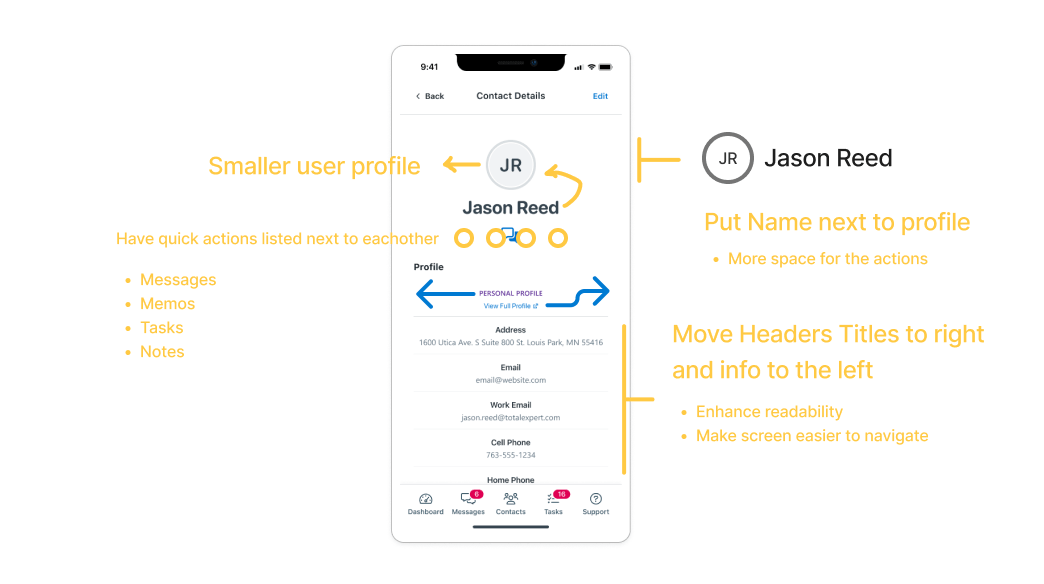
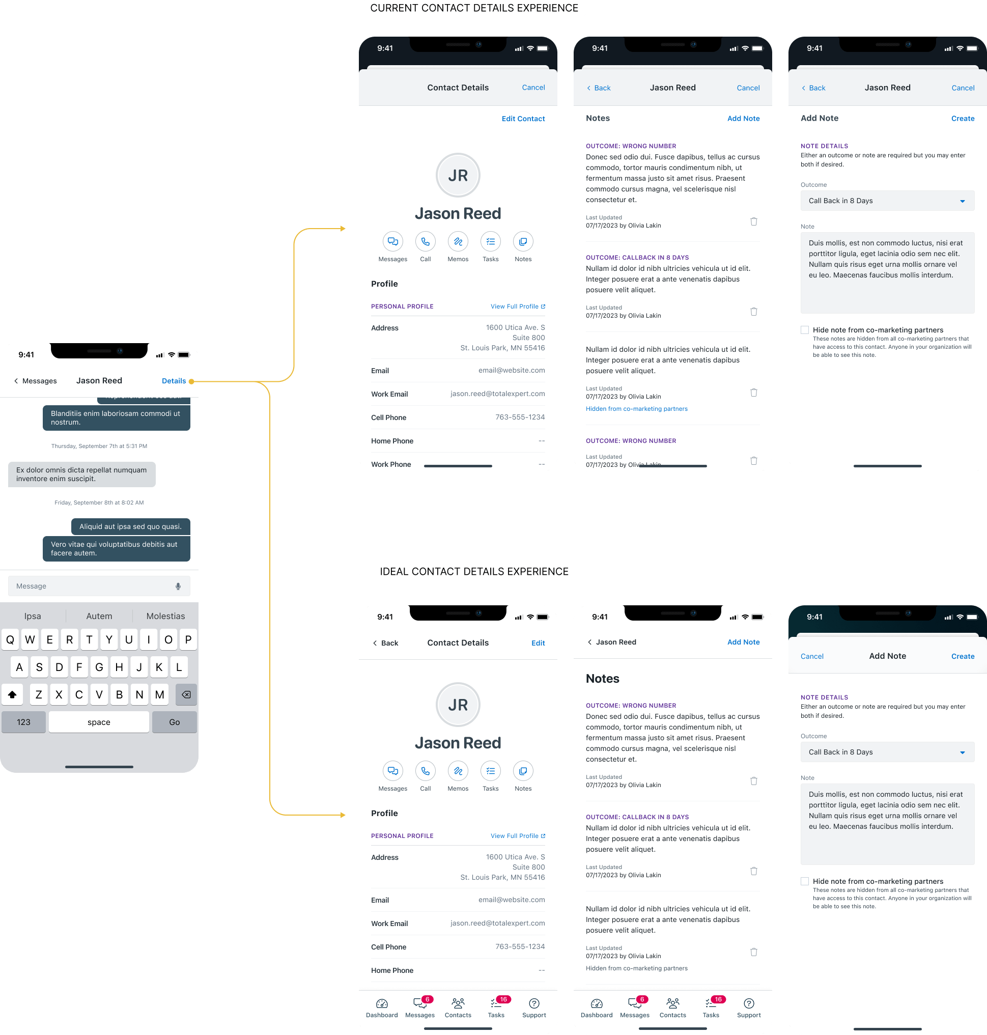
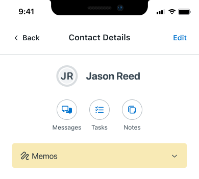
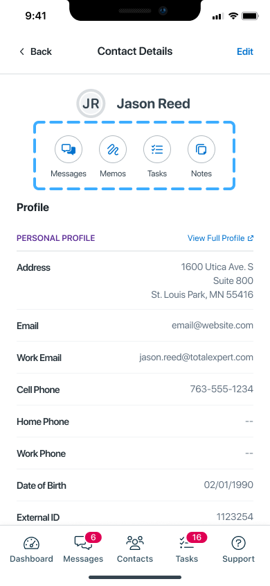
STREAMLINING THE CONTACT DETAILS EXPERIENCE
The contact details screen is one of the most frequently visited views in the Total Expert mobile app, yet it was one of the most cluttered and difficult to navigate. Information was buried, actions were hard to find, and the overall layout created unnecessary friction for users who needed quick access to critical contact data. To address this, I led a complete overhaul of the contact details experience, focusing on reducing cognitive load, improving information hierarchy, and surfacing the most frequently used actions without requiring users to dig through nested menus.
Key improvements included:
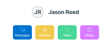
- Introduced quick-action buttons for Memos, Tasks, and Notes, placing the most frequent actions front and center for immediate access
- Reorganized the layout to establish a clear information hierarchy, grouping related content logically and reducing visual clutter
- Introduced collapsible sections to minimize excessive scrolling and allow users to focus on what matters most in the moment
- Streamlined the overall structure so users could orient themselves quickly, regardless of how they arrived at the screen
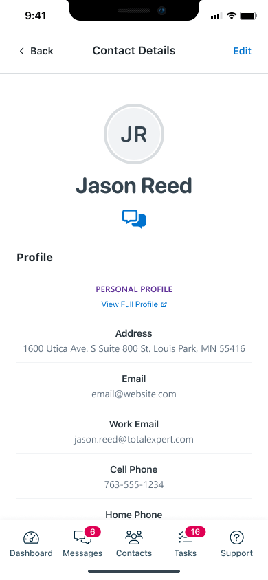
The before state reflected a common pattern in legacy enterprise mobile apps: everything was visible at once, which paradoxically made nothing easy to find.
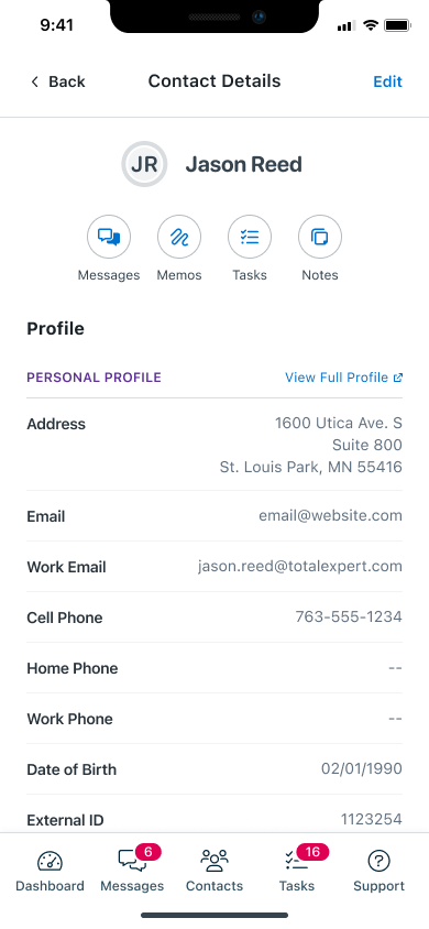
The redesigned screen introduced breathing room, clear section labels, and a prioritized layout that puts the most actionable information at the top.


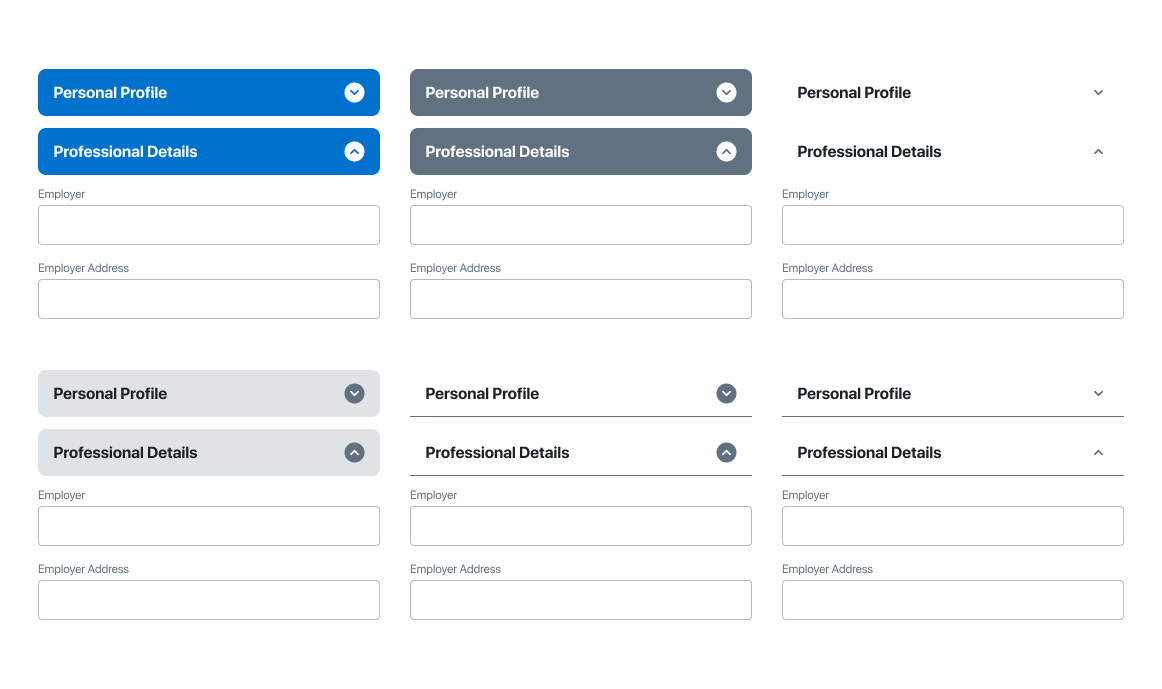
To accommodate different user contexts and workflows, I explored alternate configurations for the heading action area.
These variants allowed for flexibility depending on the contact’s status, role, or active workflow, ensuring the interface remained relevant and useful across a range of scenarios.
BREAKING OUT OF THE PANEL
One of the most impactful structural changes in this project was the conversion of layered, cramped panel-based layouts into dedicated, full screens. The original Android design relied heavily on stacked panels that compressed information into tight spaces, making it difficult to read, interact with, and navigate.
To bring the Android experience in line with iOS usability standards, I transitioned these panels into standalone screens with clear entry and exit points, giving each section of the app the space and focus it deserved.
At the same time, I was careful not to over-correct. Total Expert’s goal was consistency across platforms, not uniformity at the expense of usability. To strike the right balance, I retained certain panel elements as slide-up menus and pop-ups for actions that benefit from contextual overlay, such as quick edits or confirmations. This preserved the efficiency of the panel pattern where it made sense, while eliminating it where it created confusion.
Results of the transition:
- Reduced tap depth across key user flows, getting users to the information they need in fewer steps
- Decreased mental load by giving each screen a single, clear purpose
- Improved cross-platform consistency, making the Android and iOS experiences feel like true counterparts rather than separate products
A CLEARER PICTURE OF EVERY CONTACT
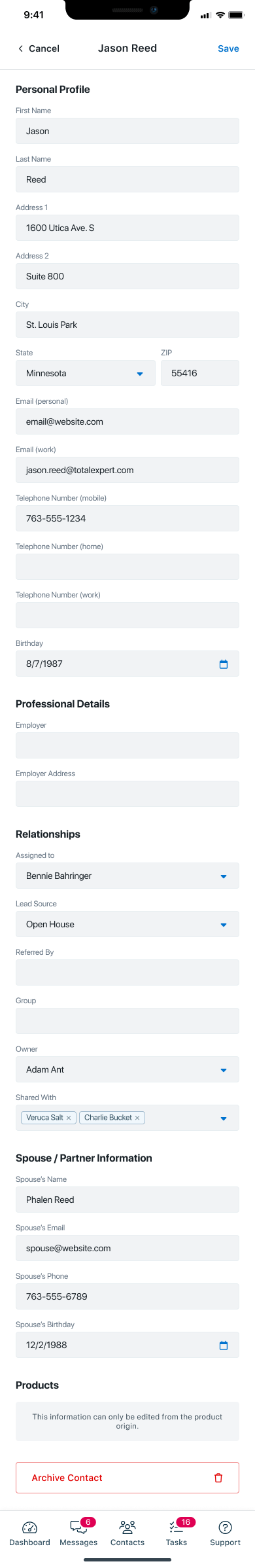
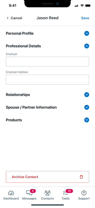
Beyond the structural changes, I revamped the editing workflow for contact details from the ground up. The previous flow required users to navigate through multiple layers to update even basic information, creating unnecessary friction in what should be a routine task.
The redesigned workflow introduced:
- Clearer field organization with logical groupings that reflect how users actually think about contact information
- Collapsible sections that reduce visual noise and allow users to expand only what they need
- Highlighted editable fields that make it immediately clear what can be changed and how, reducing confusion and accidental edits
- Streamlined navigation with fewer steps between viewing and editing a contact record
The result is a contact detail experience that feels fast, focused, and frustration-free, whether a user is making a quick update between calls or doing a thorough review of a contact’s history.
BOOSTED PRODUCTIVITY WITH SMARTER TASKS
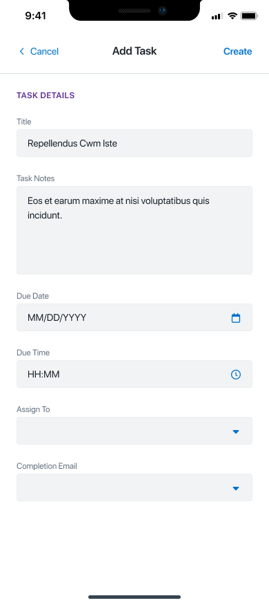
Prior to this redesign, task creation and management were locked to the web platform entirely. Mobile users had no way to create, update, or interact with tasks on the go, forcing them to switch contexts and devices to complete basic workflow actions. This was a significant gap for a user base that is frequently mobile and time-sensitive.
To close this gap, I introduced full task functionality directly within the mobile app, designed from the ground up for touch-first interaction.
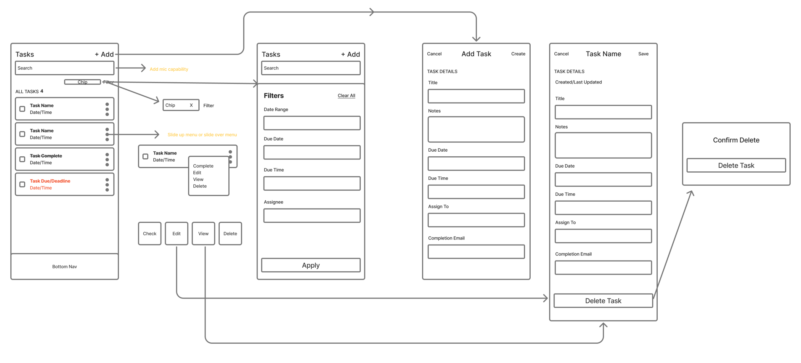
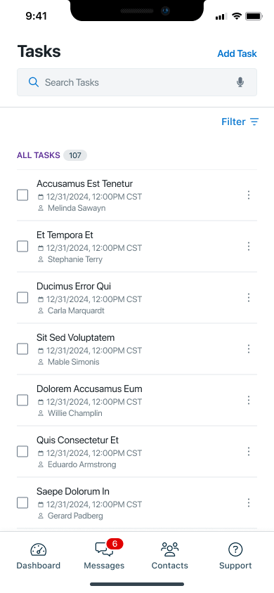
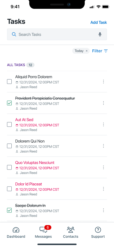
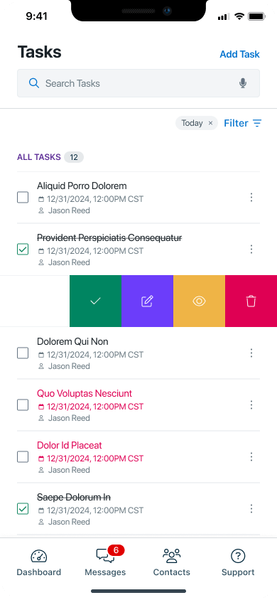
Task List and States
The task list was designed to give users an immediate, scannable overview of everything on their plate. I introduced color-coded status states to visually differentiate task progress at a glance, eliminating the need to open each task to understand its current state. Users can instantly distinguish between pending, in-progress, and completed tasks without any additional interaction.
Slide-Action Controls
Rather than relying on traditional tap-and-hold or button-heavy interfaces, I implemented slide-action controls that allow users to complete, edit, view, or delete a task with a single swipe gesture. This interaction pattern keeps the interface clean while making the most common actions instantly accessible, dramatically reducing the number of taps required to manage tasks throughout the day.
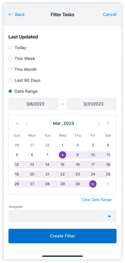
Filtering and Search
For users managing large volumes of tasks, I introduced a filtering and search system that allows tasks to be sorted and located by status, due date, contact, or keyword. This transforms the task list from a passive log into an active productivity tool, giving users control over how they prioritize and navigate their workload.
The task creation flow was redesigned to be fast and intuitive, with clearly defined input fields, contextual guidance, and a minimal number of steps. Users can create a task on the go without confusion, and the interface adapts to common task types to reduce the amount of manual input required.
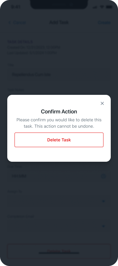
Editing tasks now feels seamless, with real-time field updates and clearly accessible edit states. I also introduced a streamlined delete function with a confirmation modal to prevent accidental data loss, balancing efficiency with the safeguards users need when managing important workflow items.

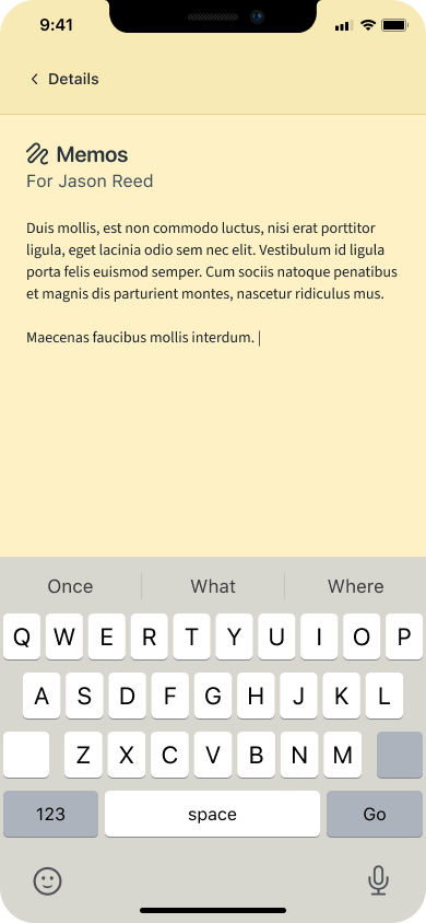
MEMOS, RIGHT WHERE YOU NEED THEM
Memos are a critical part of how sales and relationship management teams document context around their contacts. Yet in the original design, there was no dedicated memo experience within the mobile app at all. Users had no way to view or reference memos tied to a contact record without switching to the web platform.
I introduced a fully integrated memo viewing experience within the contact record, giving users quick, contextual access to memo history exactly when and where they need it.

The initial implementation placed the memos section directly on the main contact screen. While this improved visibility, it quickly became clear that the section was consuming too much screen real estate and competing with other critical information for the user’s attention.
In response, I transitioned memos to a dedicated screen accessible via the contact’s quick-action bar. This approach preserved immediate discoverability while giving memos the space to be displayed clearly and completely, without cluttering the main contact view.
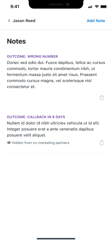
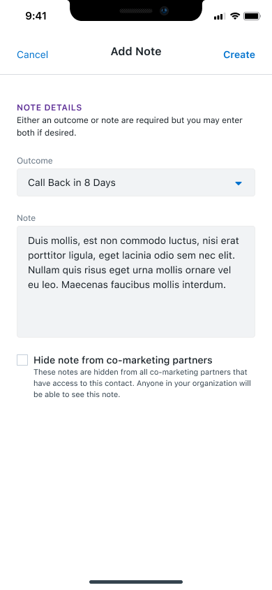
CLEARER LEAD PATHS, SMARTER FOLLOW-UPS
Understanding the outcome of a lead interaction is essential for sales teams making decisions about next steps, prioritizing follow-ups, and reporting on pipeline health. Previously, this information was not surfaced within the mobile app, leaving users without critical context when they needed it most.
I designed a dedicated lead outcomes view that presents outcome data in a structured, easy-to-scan format directly within the app. Key design decisions included:
- Icons and color coding to represent different outcome types at a glance, reducing the time needed to interpret status information
- Slide-action controls consistent with the task management interface, maintaining interaction patterns users already know
- Filtering and search to help users locate specific outcomes within larger lead records quickly and efficiently
- Updating outcomes directly within the app, closing the loop on a workflow that previously required switching to the web platform
REFLECTIONS & KEY LEARNINGS
The Value of Cross-Platform Consistency: Working across Android and iOS simultaneously reinforced how important it is to design with both platforms in mind from the start. The most effective solutions were not those that mimicked one platform’s conventions blindly, but those that identified the underlying user need and addressed it in a way that felt native to each environment. Maintaining a unified visual language while respecting platform-specific patterns was one of the most nuanced challenges of this project.
Usability Over Aesthetics: This project was a constant reminder that the most elegant interface is not always the most visually complex one. The biggest usability wins came from simplifying, not adding: removing layers, reducing steps, and giving users clearer paths to the actions they actually needed. Good design here meant getting out of the way.
Navigation as a Design Problem: Features like collapsible sections, slide-action menus, and the panel-to-screen transition all addressed the same underlying problem: users were spending too much time navigating and not enough time working. Treating navigation itself as a design problem, rather than an afterthought, led to some of the most meaningful improvements in the project.
Designing Within Constraints: Managing screen real estate on mobile is an exercise in constant trade-offs. The decision to move memos to a dedicated screen is a good example: the initial solution solved one problem but created another. Recognizing that and iterating quickly was a key part of delivering a result that actually worked for users.
Designing for the User, Not the Feature List: The most important shift in this project was moving from a feature-driven mindset to a user-driven one. Rather than asking “how do we add tasks to mobile?” the better question was “what does a user actually need when managing tasks on their phone?” That reframe shaped better decisions at every stage, from layout to interaction to labeling.
CHALLENGES I OVERCAME
Platform Alignment: Adapting Android screens to mirror iOS designs required finding a balance between cross-platform consistency and platform-specific user expectations. Each platform carries its own set of conventions, and users notice when those conventions are violated. The solution was not to force uniformity, but to identify the underlying interaction goal and solve for it in a way that felt native to each environment.
Managing Screen Real Estate: Overcrowded screens created a pressure that ultimately led to better design decisions. Introducing collapsible sections, transitioning memos to a dedicated screen, and restructuring the contact details layout were all direct responses to the constraints of the mobile canvas. Working within tight spatial limits pushed a more disciplined approach to hierarchy, forcing every element to earn its place on the screen.
Minimizing User Effort: Designing features like slide-action menus and quick-action buttons meant finding ways to surface functionality without adding visual complexity. The goal was to reduce the number of taps, scrolls, and mental decisions required to complete routine tasks, making the app feel effortless for users who are often working quickly and under pressure.
Feature Integration: Adding new capabilities including memos, tasks, and lead outcomes to an existing mobile platform without disrupting the overall experience required careful planning at every stage. Each feature had to be scoped, designed, and tested not just in isolation, but in the context of how users move through the app as a whole. Keeping the interface clean while meaningfully expanding its functionality was one of the most demanding and rewarding aspects of this project.
Iterative Refinement: No design survived first contact with reality unchanged. Overcoming early design hurdles demanded continuous iteration and revision based on feedback, edge cases, and real-world usage patterns. The willingness to revisit decisions, including moving memos off the main screen and rethinking the panel-to-screen transition, was what ultimately produced a result that worked. Flexibility and adaptability were not just useful skills here, they were essential ones.