Elevating the Vocal Learning Experience Anytime, Anywhere
This project explores how a redesigned mobile platform improves access and usability for vocal learners.
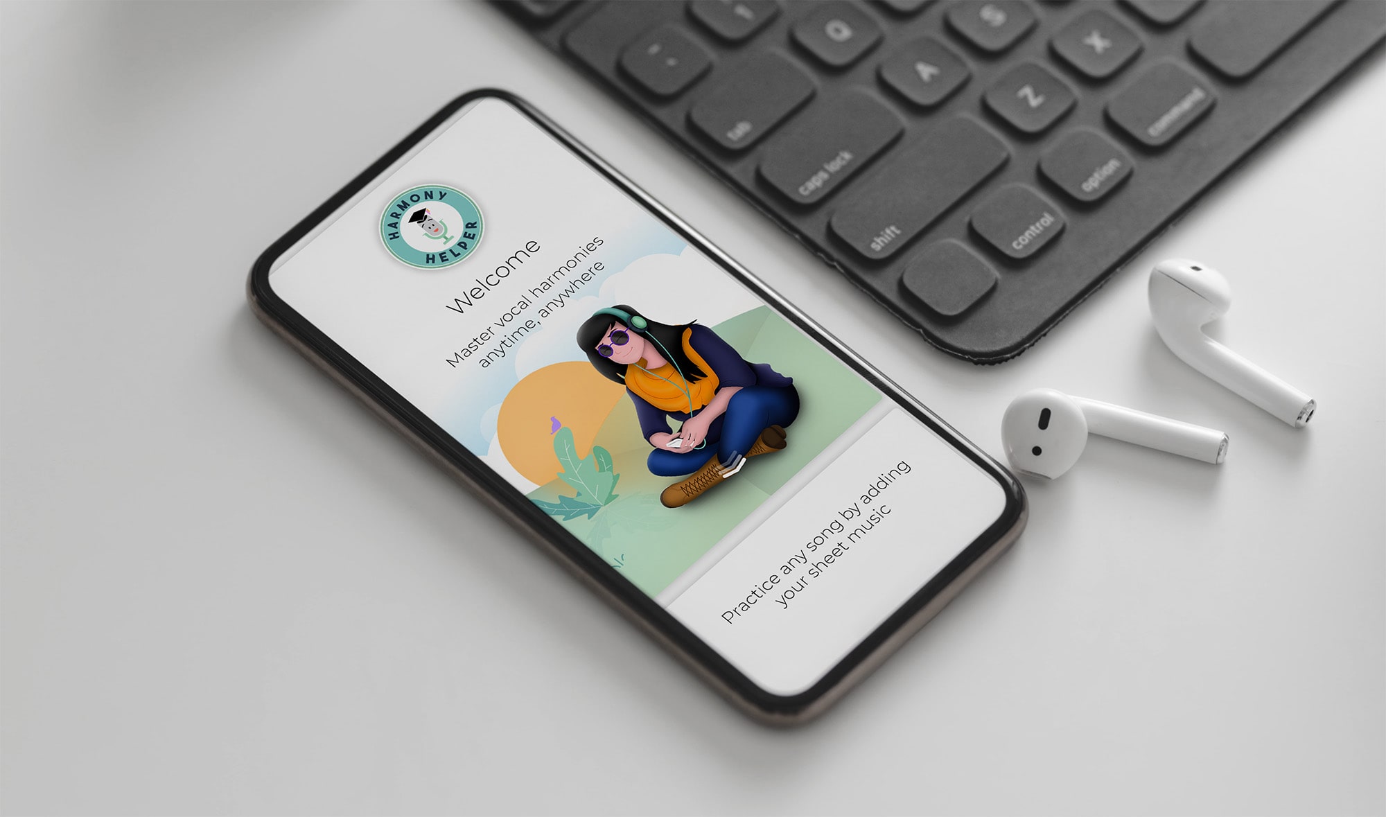
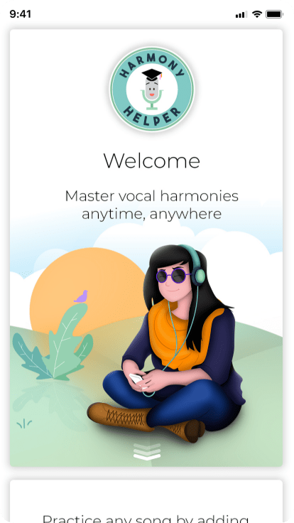
Harmony Helper is a vocal rehearsal app designed to help singers practice and perfect their performances anytime, anywhere. It acts as a 24/7 digital rehearsal room, giving singers the tools they need to build confidence, refine technique, and master their parts without needing a director, pianist, or rehearsal space.
The app provides real-time feedback on pitch and rhythm, volume controls to isolate individual vocal parts, and a guided five-step approach to learning harmonies, making it equally useful for seasoned performers and first-time singers alike.
Role:
Sole UX/UI Designer, responsible for end-to-end mobile app design, website design, and brand identity
Industry:
Tools:
Adobe XD, Photoshop, Illustrator, Figma, Teams, Zoom
Duration:
2018 – 2020

Giving Voice to the Brand Behind the Harmony Helper App
The app alone was not enough. Alongside the product, I developed a complete brand identity to position Harmony Helper consistently across every touchpoint, from the app interface to the marketing website and beyond.
Every brand decision was made with the same user in mind: a singer who needed to feel that this tool was built specifically for them, credible, accessible, and deeply attuned to the world of vocal performance. The result was a cohesive identity that makes Harmony Helper feel less like a utility and more like a creative partner.
Value Added +
- Improved accessibility to vocal rehearsal anytime, anywhere through a mobile-first experience
- Reduced setup time between discovery and meaningful practice
- Enabled personalized learning paths for individual singers and ensemble members
- Supported both solo practice and collaborative rehearsal workflows
- Established a cohesive brand and visual system across app, web, and marketing touchpoints
Goals Achieved 𖣠
- Reduced cognitive load during onboarding, uploads, and practice setup
- Increased clarity and confidence through real-time visual and auditory feedback
- Delivered predictable, repeatable interaction patterns for daily rehearsal use
- Balanced advanced musical functionality with an approachable, beginner-friendly interface
- Created a scalable design system adaptable to future features and platforms
As the sole designer on this project, I was responsible for elevating the Harmony Helper platform across multiple touchpoints, including the mobile app, logo, branding, and website. The scope of my work encompassed:
Mobile App Design across core user flows and screens
Song Library and Upload Features for seamless content management
Questionnaire Walkthrough Wizard to guide users through on-boarding
Practice Screen with real-time tools for vocal rehearsal
Tooltips for Guidance to support new and returning users
Website Redesign to align with the updated brand identity
Pain Points Identified:
- Inconsistent visual language across screens and features
- Overly complex upload and practice flows with too many steps
- Lack of in-app guidance for new or unfamiliar features
- Poor accessibility in font sizing, contrast, and touch target sizing
- No real-time feedback during vocal recording or practice sessions
Goals:
- Deliver a consistent visual and functional experience across all screens
- Simplify complex features like song uploads and practice tools to reduce cognitive load
- Embed contextual tooltips to guide users without disrupting their flow
- Ensure accessibility standards across typography, color contrast, and touch targets
- Provide real-time feedback mechanisms to keep users engaged and informed
NOTES
To make Akoya both effective and user-friendly for endodontists, I focused on these key features:
- Consistency Across Features: Maintained uniform colors, typography, and iconography throughout the app to create a cohesive, intuitive experience across every screen.
- Usability and User Experience: Simplified layouts to reduce cognitive load, minimized interaction steps for key features, and implemented collapsible sections to keep screens clean and focused.
- Accessibility: Applied readable fonts, sufficient color contrast, and large touch targets to ensure the app is usable by all, with alternate navigation paths to accommodate diverse user needs.
- Visual Engagement: Balanced vibrant visuals with clean layouts to create an inviting experience, using thoughtful animations for tooltips and transitions to guide users smoothly.
- Task-Specific Design: Designed a clear, step-by-step upload flow with progress indicators, and built practice screen tools including note bars, metronomes, and octave adjustments for easy, intuitive use.
- Contextual Tooltips: Strategically placed concise, informative tooltips near new or complex features to support users without interrupting their workflow.
- Feedback Mechanisms: Integrated real-time visual feedback including pitch trackers and success messages to confirm user actions and maintain engagement throughout practice sessions.
- Testing and Iteration: Conducted usability testing with diverse users to identify pain points, iterating on layouts and interactions to continuously refine the experience.
ESTABLISHING THE APP’S VISUAL IDENTITY
The foundation of Harmony Helper was built on a clear design philosophy: make something visually compelling without sacrificing usability. I established the overall look and feel of the app from the ground up, developing a simplified, user-friendly interface that paired custom branding with a vibrant color system to create an experience that felt as energetic and expressive as the music it was built for.
Every screen was considered not just as a functional surface, but as an opportunity to reinforce the brand personality: warm, approachable, and deeply attuned to the needs of singers. I designed the welcome and walkthrough pages with custom illustrations that introduced new users to the app in a visually engaging, narrative-driven way, setting the tone for everything that followed.
Key decisions in this phase included:
- Establishing a cohesive color palette that balanced vibrancy with readability across light and dark contexts
- Designing custom iconography and typography that felt native to the music space without alienating non-technical users
- Creating onboarding illustrations that communicated the app’s value proposition visually, reducing the need for heavy instructional copy
- Defining reusable design components that could scale consistently across the full feature set
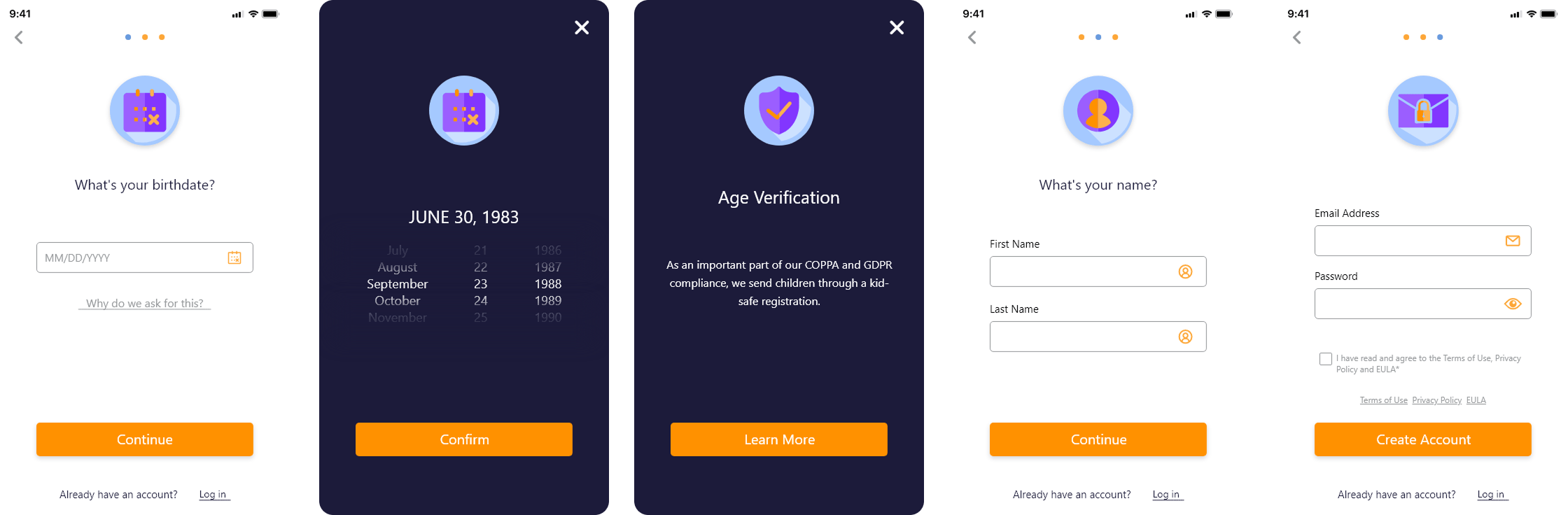
SIMPLIFYING SUBSCRIPTION AND REGISTRATION FLOWS
First impressions matter, especially when asking users to commit their time, personal information, or money. The original subscription and registration flows suffered from early drop-off caused by unclear pricing, dense information architecture, and a multi-step onboarding process that felt more like a barrier than a welcome.
I redesigned both flows from the ground up with a single guiding principle: remove friction without removing trust. Every decision was made in service of helping users understand the value of Harmony Helper quickly, commit with confidence, and get into the experience as fast as possible.
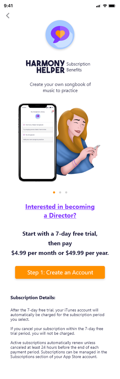
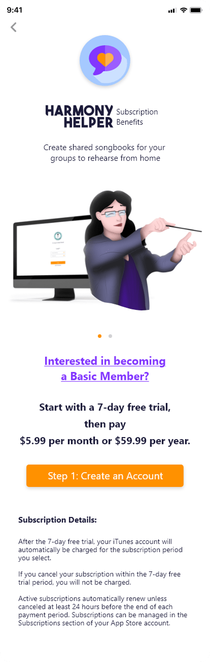
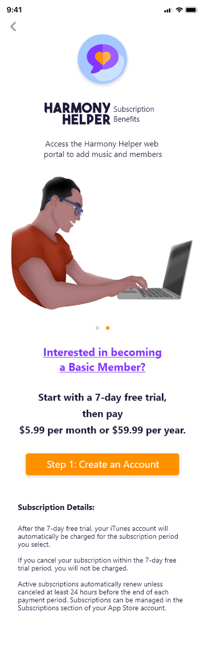
The subscription flow was restructured to lead with clarity. Pricing tiers were presented in a clean, scannable format that made the differences between plans immediately obvious. Visual hierarchy was strengthened to guide the eye naturally toward the most relevant information, and calls to action were made bold, direct, and contextually appropriate at each decision point.
By simplifying the layout and guiding users through a predictable step-by-step progression, the experience supports faster comprehension and reduces hesitation, allowing users to focus on getting started rather than deciphering their options.
The registration flow was rebuilt around the concept of progressive disclosure: breaking the process into clearly defined, manageable steps that reveal only what is needed at each stage. This keeps users focused on one task at a time while maintaining forward momentum through the flow.
Compliance requirements such as age verification were integrated seamlessly into the experience, providing the necessary clarity without disrupting the overall rhythm of onboarding. Clear field labels, real-time validation cues, and consistent primary actions ensured users always understood what was required and could complete registration with confidence.
DESIGNING THE SONG LIBRARY AND UPLOAD EXPERIENCE
Creating a structured, collaborative system that allows users to manage content, upload music, and prepare personalized practice experiences.
The song library is the organizational heart of Harmony Helper, and it needed to be both powerful and effortless to use. I designed a system that gives users a clear, intuitive, and highly flexible way to manage their music directly within the app.
Users can upload individual songs as sheet music files or photos and organize them into custom songbooks that reflect their personal workflow or ensemble needs. This structure allows musicians to categorize their repertoire by genre, skill level, or performance context, making it easy to locate the right material quickly, even as their library grows.
Collaboration was built into the core of the design. Users can invite others to contribute to their songbooks, enabling real-time sharing and group rehearsal coordination. This functionality supports both individual practice and collaborative learning, creating a dynamic space where musicians can work together efficiently regardless of location.
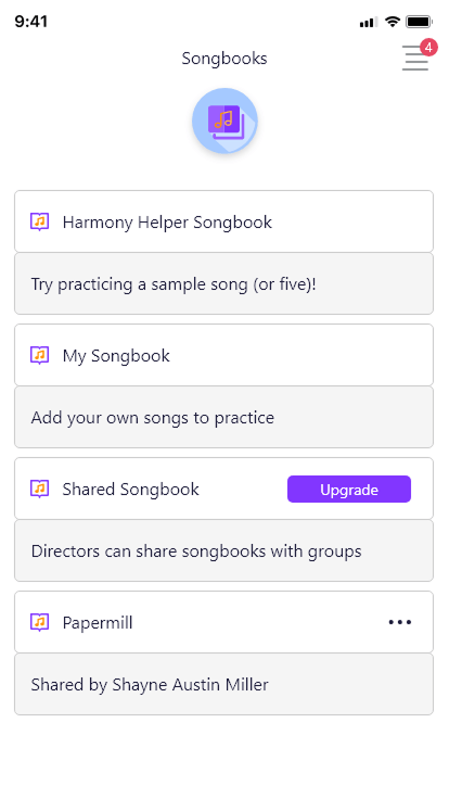
Key design priorities for the song library included:
- A clean, navigable interface that scales gracefully as content volume increases
- Flexible organization tools that accommodate a wide range of musical contexts and ensemble sizes
- Collaborative features that support shared ownership of songbooks without creating confusion
- Effortless editing and management so users spend more time practicing and less time organizing
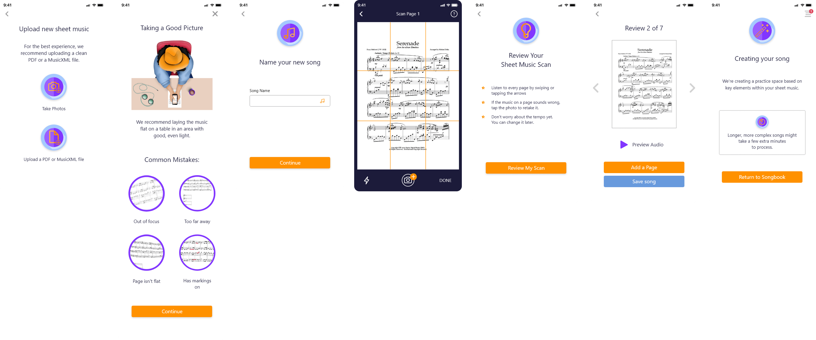
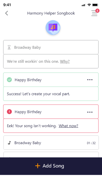
Getting music into the app needed to be fast, flexible, and foolproof. I designed an upload experience that allows users to add sheet music either by uploading files directly or by taking a photo within the app. The system automatically processes the music and converts it into playable MIDI tracks, dramatically reducing setup time and letting users move straight into practice.
This approach removes one of the most common friction points in music learning apps: the gap between having the material and being ready to practice with it. The result is a workflow that is fast, flexible, and genuinely friction-free, supporting both individual learners and collaborative rehearsal groups.
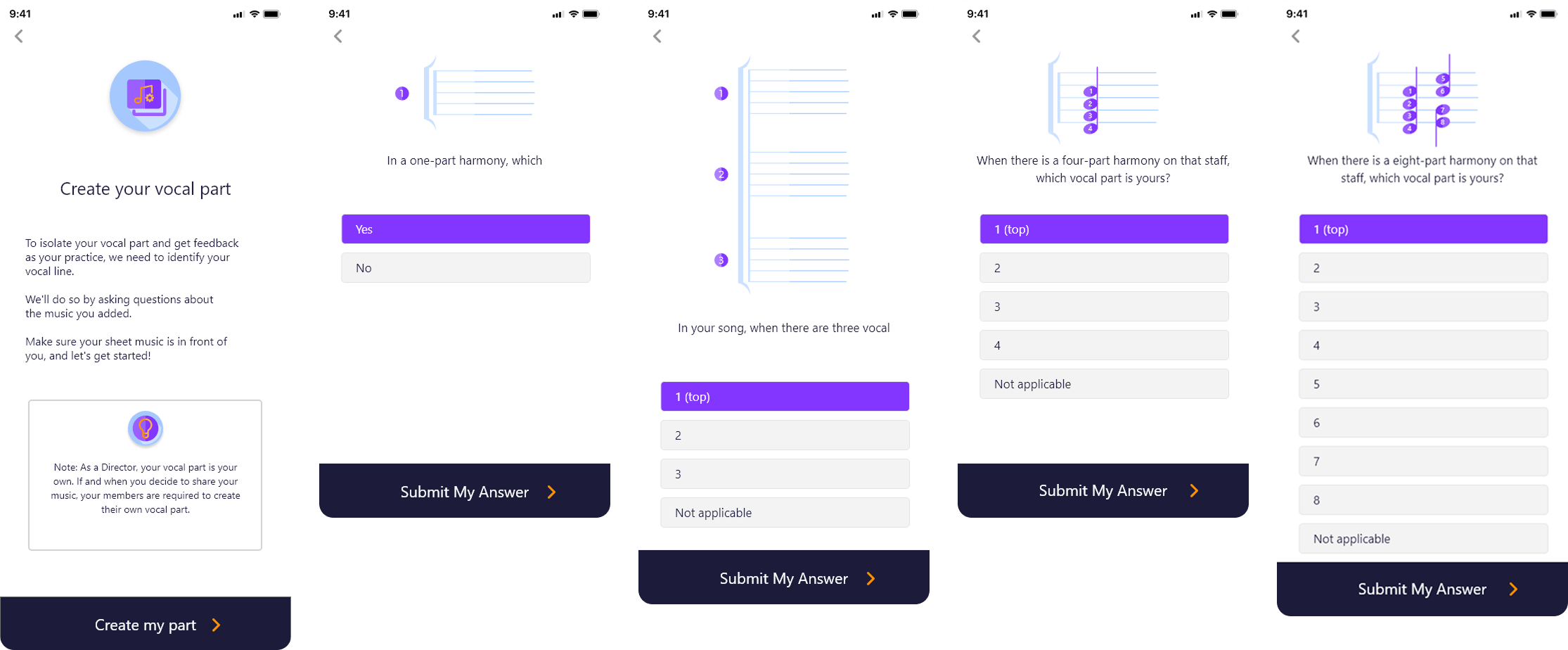
To take personalization further, I integrated a guided questionnaire walkthrough directly into the upload flow. This interactive wizard adapts dynamically based on the uploaded sheet music, providing users with a tailored experience from the very start of their rehearsal preparation.
The wizard helps users identify and isolate their specific vocal part and define the number of vocal lines present in the piece. By capturing this information early, the system ensures the practice environment is immediately aligned with each user’s unique role within the song.
The selections made in the wizard are seamlessly reflected in the practice screen, automatically highlighting relevant parts and muting others as needed. This approach:
- Reduces confusion during rehearsal by eliminating manual setup
- Creates a more efficient and focused practice environment
- Supports both individual singers and ensemble groups in preparing their specific parts
- Makes the transition from upload to active practice feel immediate and intuitive
Together, these features create a fully personalized rehearsal environment that adapts to the needs of every singer, from beginners learning a new part to seasoned performers refining their technique.
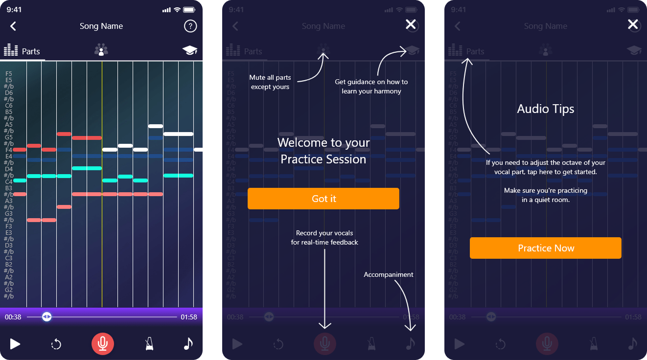
DYNAMIC PRACTICE SCREEN FOR EVERY SINGER
Real-Time Visual Feedback and Interactive Pitch Guidance for Accurate and Confident Singing
The interactive practice screen is the core of the Harmony Helper experience, and it was designed to give singers a clear, engaging, and deeply informative rehearsal environment that works as hard as they do.
Visual Part Representation
Each vocal part is displayed as a music note bar, giving users a visual map of how their part fits within the overall arrangement. This makes it easier to follow along, anticipate entries, and stay aligned with other vocal lines during practice, whether rehearsing solo or alongside other ensemble members.
Real-Time Pitch Feedback
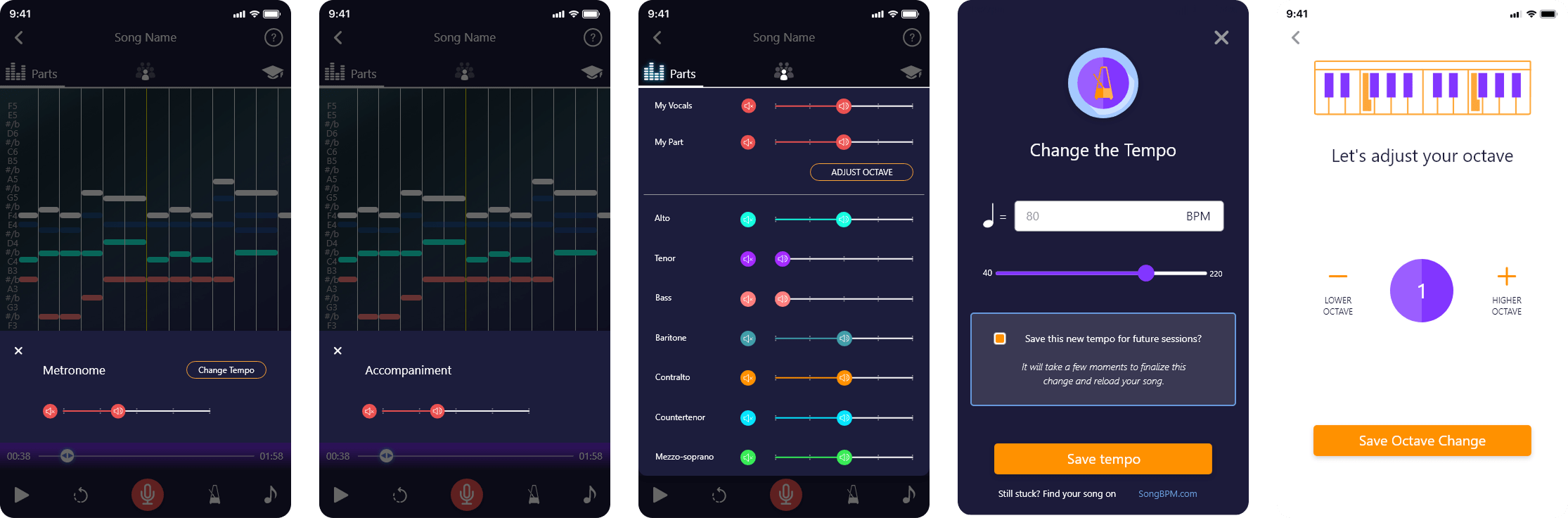
A real-time pitch tracking system helps users identify whether they are singing too sharp or flat, with an accompanying note key bar that provides continuous visual guidance and helps users adjust instantly. This feedback loop builds muscle memory and pitch accuracy over time, giving singers the precision tools they need to improve with every session.
Rhythm and Timing Awareness
Beyond pitch, the screen encourages consistent timing and rhythm awareness, giving singers a holistic view of their performance that goes beyond simply hitting the right notes. This full-picture approach supports more complete vocal development.
To give users full control over their rehearsal environment, I designed a suite of additional tools including:
- Vocal recording and playback to review and critique performances
- Metronome integration for timing accuracy
- Individual vocal part volume controls for customized listening balance
- Octave adjustment to accommodate different voice ranges
- Accompaniment settings to tailor background music levels
- Tempo controls for slowing down or speeding up practice at any stage
See the App in Action
Watch the PraiseCharts interview to explore key features like the song library, upload workflow, and interactive practice screen, and see how users engage with the app in real rehearsal scenarios.
REFLECTIONS & KEY LEARNINGS
Balancing Aesthetics and Functionality: Designing Harmony Helper reinforced that visual appeal and usability are not competing priorities. They are most powerful when pursued together. Every aesthetic decision, from the color system to the custom illustrations, was made in direct service of the user experience, ensuring the app felt as good to use as it looked.
Brand Identity Consistency: Redesigning the logo and branding materials emphasized how critical cohesion is across every touchpoint. When visual language, tone, and interaction patterns all align, the brand becomes memorable and trustworthy in a way that no single screen can achieve alone.
User-Centric Design Principles: Building features like the song library, upload flow, and practice screen deepened my understanding of what it means to design with the user’s actual workflow as the starting point, not the feature list. The best decisions in this project came from asking what users needed to accomplish, not what the app needed to include.
Space Optimization: Designing for mobile meant making constant trade-offs with screen real estate. Features like collapsible sections, dedicated screens, and progressive disclosure were not just design choices but necessary solutions to the challenge of surfacing complex functionality without overwhelming the user.
Innovative Problem-Solving: Integrating advanced capabilities like the sheet music processor, questionnaire wizard, and real-time pitch tracking into a simple, approachable interface required creative thinking at every stage. The challenge was not building the features but making them feel effortless.
Accessibility and Inclusivity: Designing tooltips, readable layouts, and clear navigation patterns reinforced how important it is to build for a diverse user base from the start. Harmony Helper needed to serve first-time singers and experienced performers alike, and that range of needs shaped every design decision made throughout the project.
CHALLENGES I OVERCAME
Maintaining Consistency Across Platforms: Aligning the branding and interface across the app, website, and booth materials required meticulous attention to detail at every stage. When users encounter a product across multiple surfaces, inconsistency, even subtle inconsistency, erodes trust. Every color, typographic choice, and interaction pattern had to feel like it belonged to the same family, whether a user was exploring the app on their phone, browsing the website on a desktop, or encountering the brand for the first time at a live event. Maintaining that unified visual language across such different contexts was one of the most discipline-intensive challenges of the project.
Navigating Complex Features: Designing tools like the MIDI music processor and real-time vocal feedback system presented significant technical and design challenges. The underlying functionality was sophisticated, but sophistication in the backend cannot translate to complexity on the screen. Simplifying these features for users while fully preserving their power demanded creative problem-solving, close collaboration with technical stakeholders, and careful, iterative testing. The goal was always to make advanced capabilities feel like natural, intuitive parts of the experience rather than features that required a learning curve to unlock.
Space and Layout Management: The limited canvas of a mobile screen is one of the most unforgiving constraints in product design, and it was felt acutely across features like the song library and practice screen, where the volume and complexity of information threatened to overwhelm the interface. The solution was not to reduce functionality but to rethink how it was presented. Implementing collapsible sections, dedicated screens for specific tasks, and progressive disclosure patterns allowed the full depth of the product to remain accessible without surfacing everything at once. Each iteration brought the layouts closer to a balance between completeness and clarity.
Engaging New Users: The welcome pages and walkthrough experience had to accomplish something genuinely difficult: introduce a feature-rich app to a brand new user in a way that felt exciting rather than overwhelming. Every screen in the onboarding flow had to strike a precise balance between visual engagement and clear, actionable guidance. Too much information and users disengage. Too little and they feel lost. The use of custom illustrations, concise copy, and a step-by-step progression helped ease users into the app’s core concepts naturally, building confidence before they ever reached the main experience.
Iterative Design Process: No design in this project was finished after the first pass. Addressing feedback from user testing, stakeholders, and real-world usage was a continuous and essential part of the process. Each round of iteration surfaced new pain points, edge cases, and opportunities for refinement that were not visible at the concept stage. This iterative approach was not a sign that the initial designs fell short; it was the mechanism by which good designs became great ones. The willingness to revisit, revise, and occasionally rebuild from scratch was what ultimately produced an experience that genuinely met user expectations.