User-Centric Design for Healthcare Onboarding and Course Discovery
Improving Accessibility, Engagement, and Learning Experiences Across Northwell Health’s Platforms
Northwell Health is New York’s largest healthcare provider, serving millions of patients across New York City, Long Island, and Westchester. It operates 21 hospitals and over 900 outpatient facilities, offering a wide range of medical services, including cancer treatment, neurology, cardiology, and pediatrics.
Northwell is known for its commitment to medical research, education, and innovation, with initiatives aimed at advancing healthcare solutions.
Role: Sole UX/UI designer + Brand Designer
Industry: Medical Research & Education
Tools: Figma, Adobe XD, Zoom
Duration: March 2023 – April 2023
I was tasked with designing key screens for Northwell Health, focusing on creating a seamless and intuitive experience that aligned with the organization’s branding and accessibility standards. The screens I designed included:
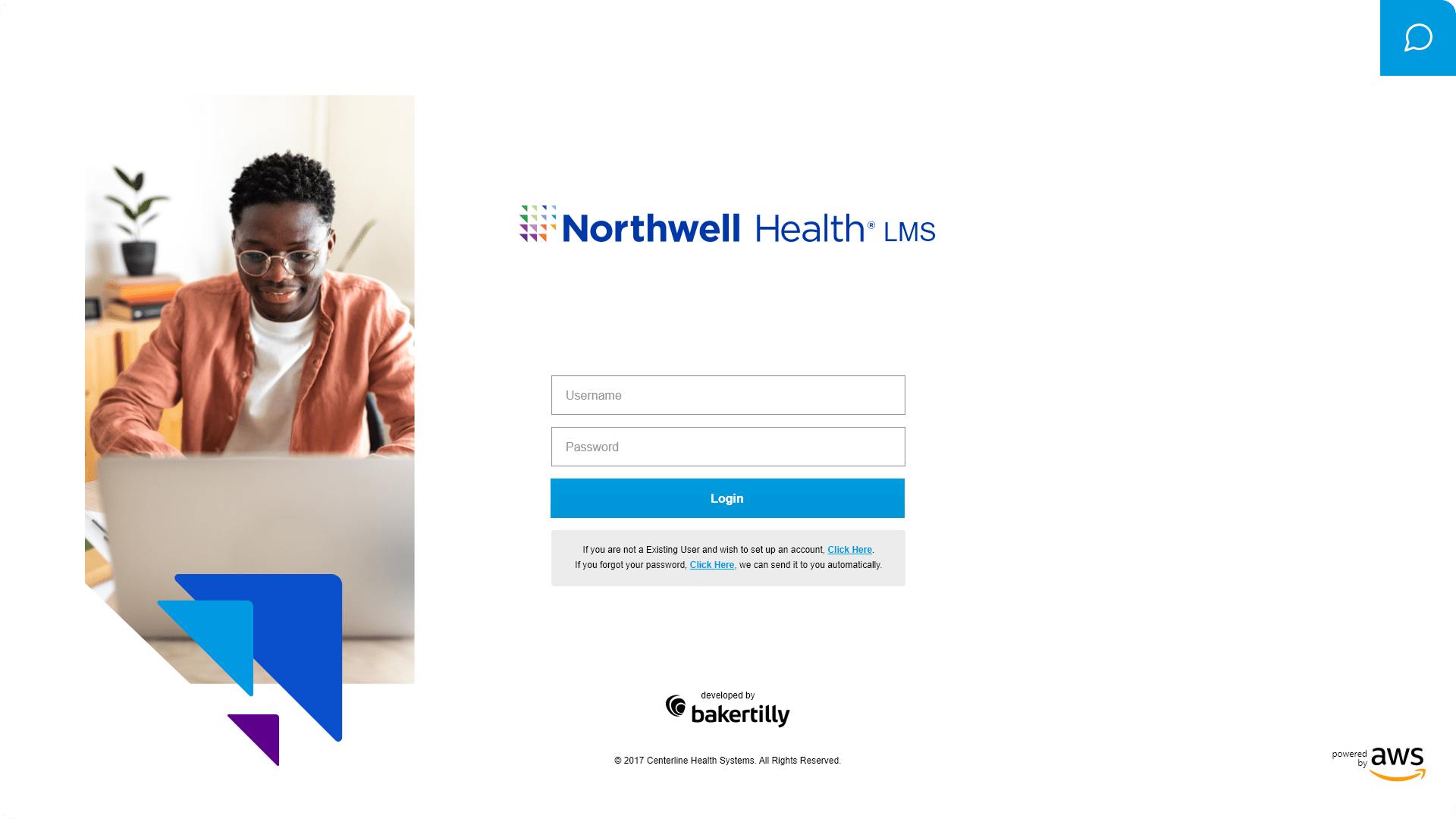
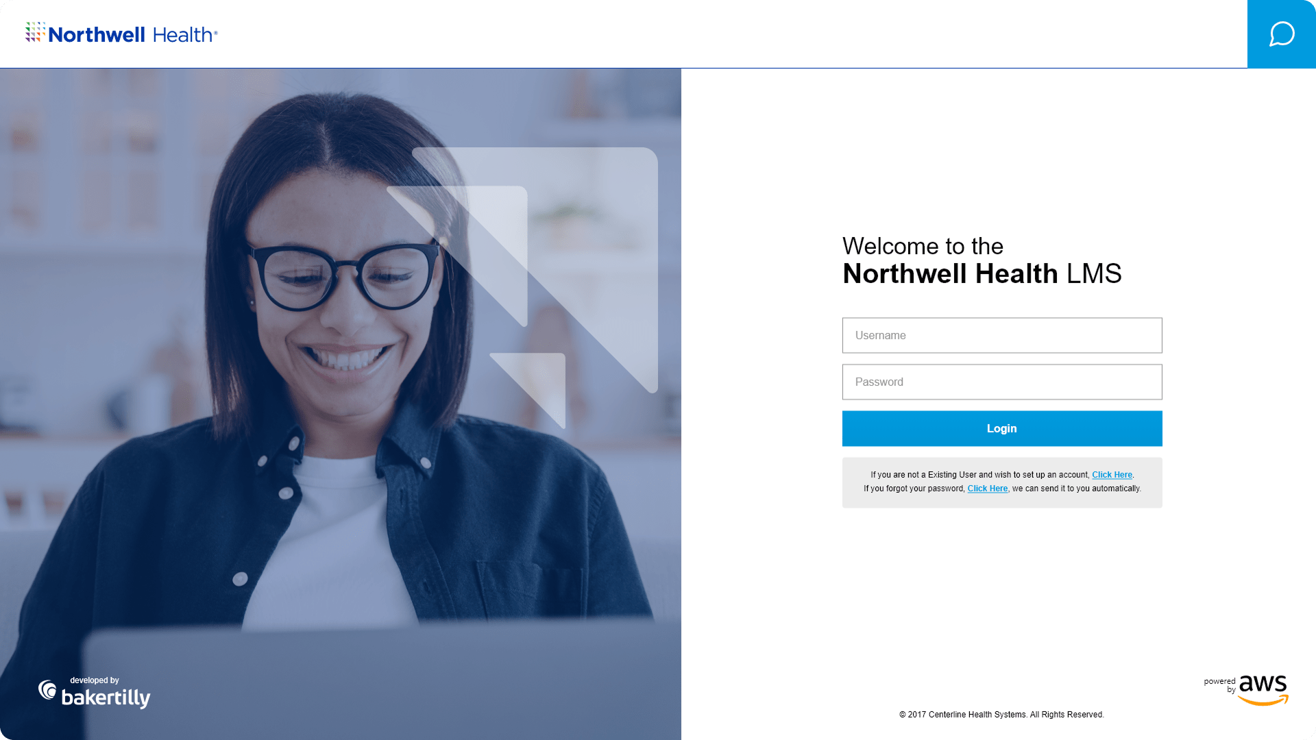
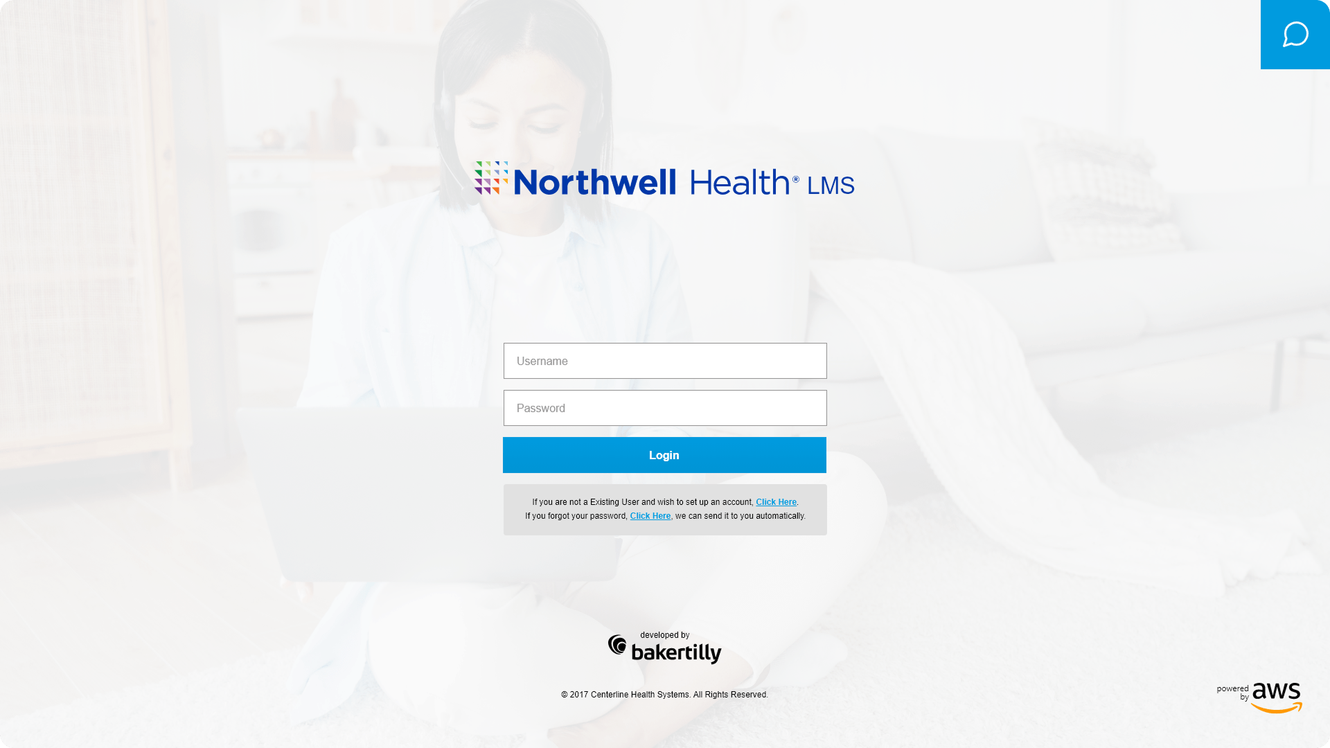
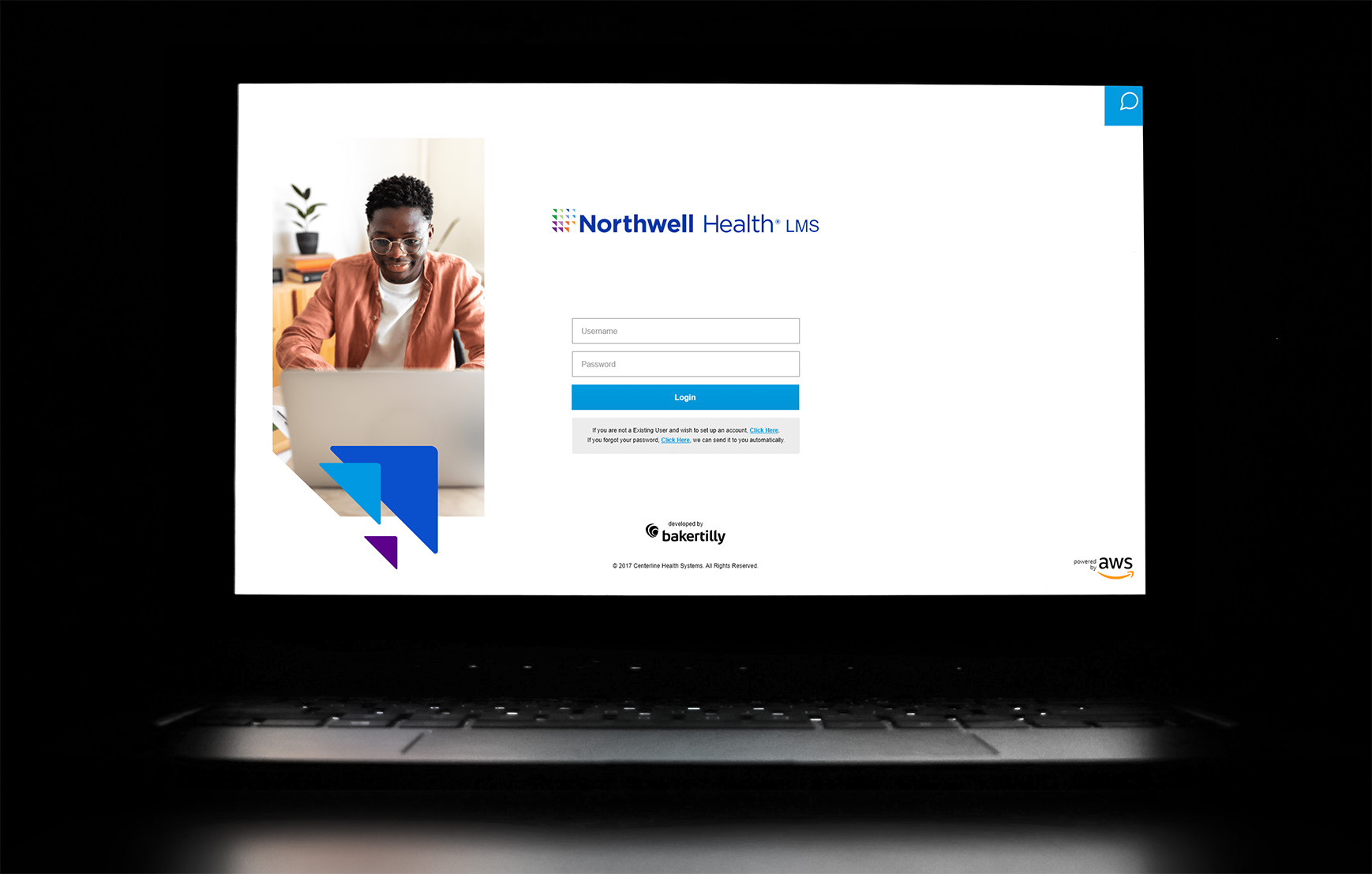
- Login Page – Streamlined for clarity and ease of access, with clear input fields, error states, and visual cues to guide users.
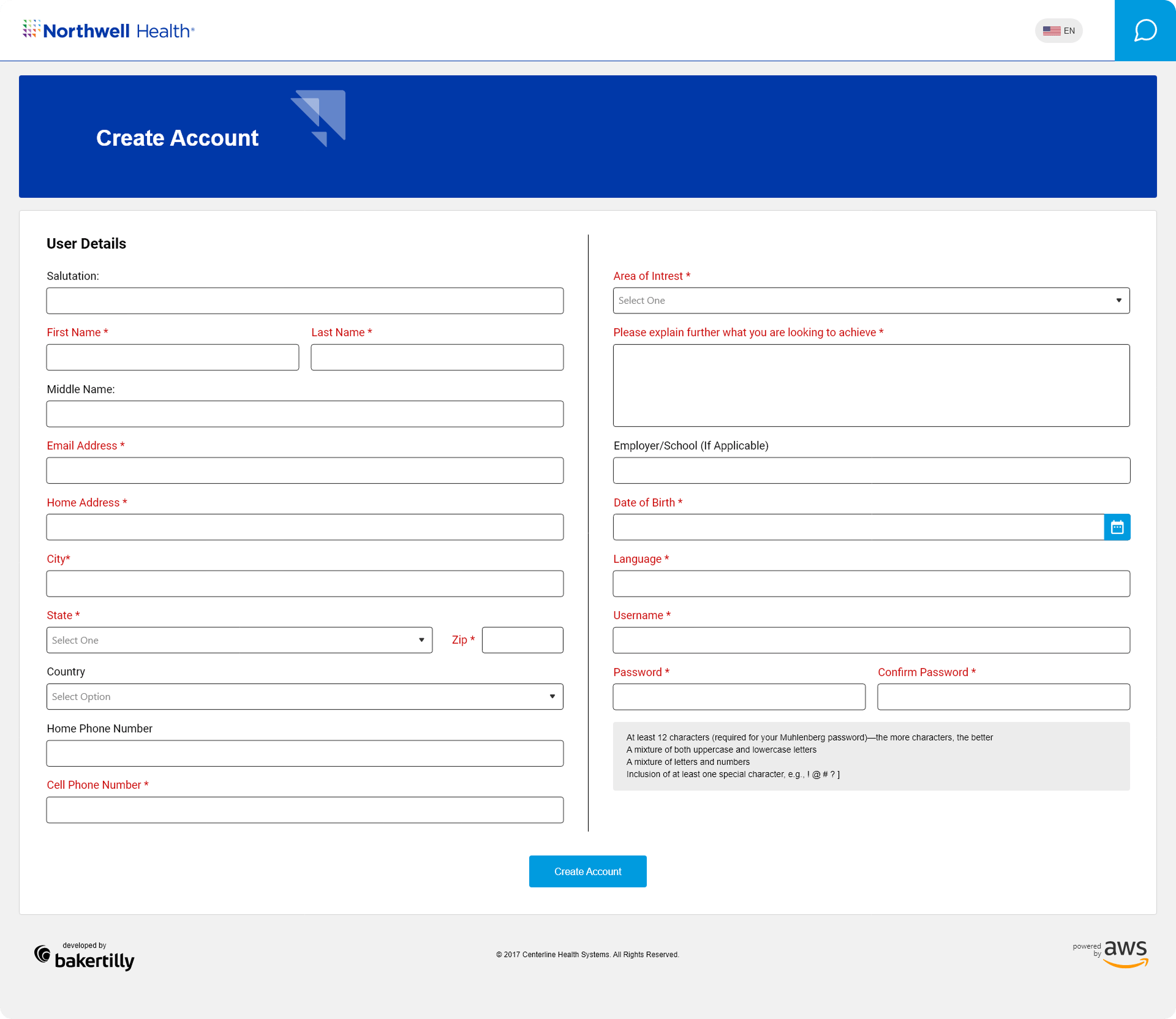
- Create Account Page – Simplified account setup with progressive disclosure, reducing cognitive load while ensuring compliance with accessibility guidelines.
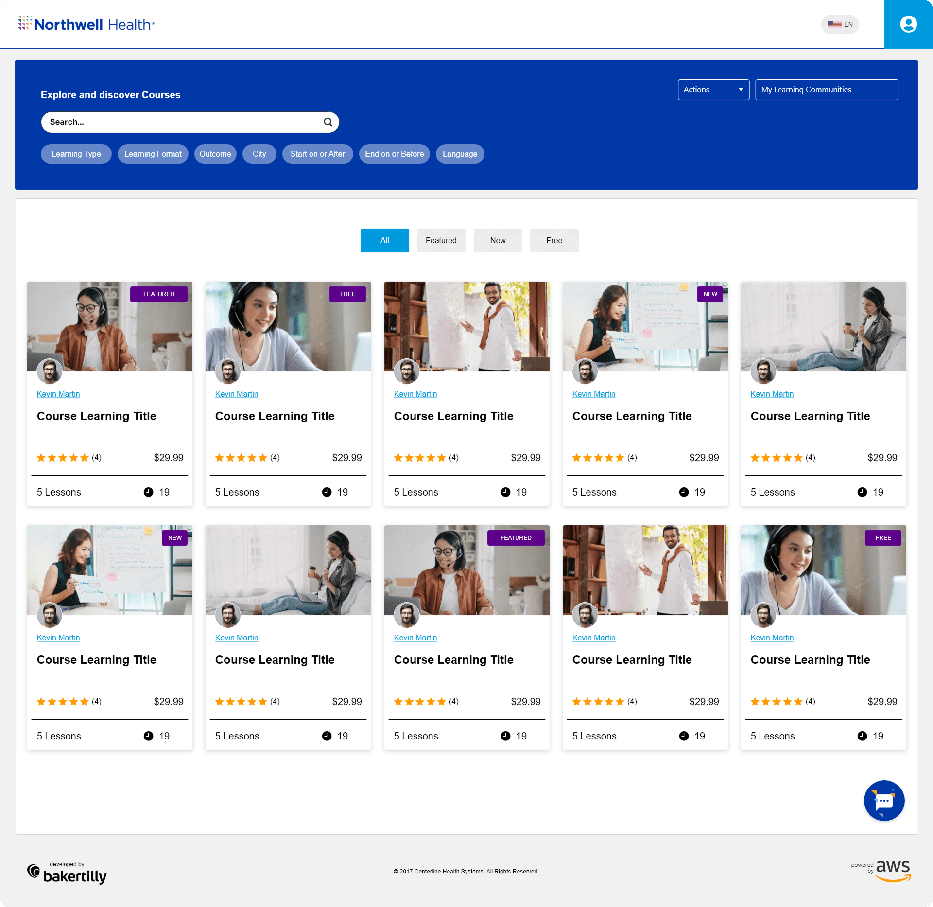
- Courses Page – Organized for discoverability and engagement, featuring intuitive navigation, clear hierarchy, and interactive elements that encourage exploration.
Designing these screens required a careful balance of usability, visual consistency, and accessibility. Each component was created with the user’s goals in mind, ensuring a cohesive experience across the platform while remaining faithful to Northwell Health’s brand identity.
NOTES
- User-Centered Design: Prioritized the needs and behaviors of both patients and staff, ensuring workflows were intuitive and task-oriented.
- Accessibility-First Thinking: Incorporated WCAG-compliant color contrast, typography, and focus states to support diverse users, including those with visual or motor impairments.
- Consistency & Branding: Maintained Northwell Health’s visual identity through color schemes, typography, and iconography, while standardizing UI components across screens.
- Interactive Feedback: Designed micro-interactions, hover states, and progress indicators to make navigation predictable and informative.
- Iterative Prototyping: Created wireframes and high-fidelity prototypes to validate design decisions through stakeholder and user feedback before final implementation.
SEAMLESS, SECURE ACCESS ACROSS DEVICES
Creating Intuitive Login Experiences for Desktop, Tablet, and Mobile
I designed a clean and professional login interface that prioritized ease of use, trust, and accessibility. The screens featured clearly labeled input fields, intuitive button placement, and responsive layouts for desktop, tablet, and mobile devices. Multiple alternative designs were explored to optimize usability, with a focus on outcome-driven goals such as reducing login errors, improving task completion speed, and increasing user confidence in the platform.
GUIDED, ACCESSIBLE SIGN-UP ACROSS DEVICES
Designing a Simple and Intuitive Account Creation Experience
I designed the account creation screen to provide a straightforward, guided sign-up process for desktop, tablet, and mobile users. Clear instructions, logical field grouping, and real-time input validation enhanced usability, while touch-friendly interactions and scalable layouts ensured accessibility across devices. Outcome-focused goals included reducing sign-up errors, increasing completion rates, and providing a smooth onboarding experience.
INTUITIVE LEARNING DASHBOARD ACROSS DEVICES
Organizing Courses for Clear Navigation and Engagement
I designed the courses page to provide a clear, organized, and engaging learning experience on desktop, tablet, and mobile devices. Users could easily browse, filter, and enroll in courses, while interactive elements and progress tracking enhanced usability and motivation. Outcome-focused goals included improving course discoverability, streamlining enrollment, and supporting efficient learning journeys.
↑ 35%
task clarity
↑ 25%
feature engagement
↑ 20%
user confidence
↓ 30%
cognitive load
20%
increase in user confidence
Streamlined onboarding and account creation for clearer, more usable experiences across devices.
Reduced friction in multi-step forms and frequent tasks like enrollment and login.
Enabled faster scanning and task execution through structured layouts and visual hierarchy.
Boosted confidence and accuracy with real-time validation and touch-friendly design.
Delivered a cohesive, scalable design system aligned with enterprise healthcare SaaS standards.
- Reduced cognitive load across complex workflows like account creation and course enrollment.
- Improved form completion, data accuracy, and task success rates.
- Increased efficiency in high-volume user interactions and learning tasks.
- Strengthened onboarding clarity and user orientation across all devices.
- Created predictable, repeatable interaction patterns for daily platform use.
- Balanced functional depth with a clean, professional interface for accessibility and engagement.
REFLECTIONS & KEY LEARNINGS
User-Centered Design:
Designing these screens reinforced the importance of creating intuitive, accessible experiences. Clear navigation for login, account creation, and course browsing improved overall user flow and engagement.
Balancing Simplicity and Functionality:
Streamlining complex processes—like registration and course selection—while keeping a visually appealing layout highlighted the value of efficiency paired with aesthetics.
Consistency Across Devices:
Adapting layouts for desktop, tablet, and mobile strengthened my ability to create responsive, scalable interfaces without compromising usability.
Accessibility Best Practices:
Touch-friendly interactions, readable typography, and high-contrast elements enhanced inclusivity for a diverse range of users.
Guiding Users Effectively:
Strategic placement of buttons, progress indicators, and feedback elements ensured a smooth, frustration-free experience.
CHALLENGES I OVERCAME
Ensuring Seamless Navigation:
Refined login and course browsing workflows to minimize friction and reduce cognitive load.
Creating Engaging Yet Functional Layouts:
Balanced visual appeal with usability, keeping designs clean without sacrificing key functionality.
Optimizing Mobile and Tablet Experiences:
Adapted content for smaller screens while maintaining consistency, readability, and smooth interactions.
Handling User Input Validation:
Implemented efficient error handling and real-time validation for smooth account creation and form submission.
Maintaining Brand Cohesion:
Aligned screens with Northwell Health’s professional identity through consistent branding, typography, and color schemes.

