Giving Voice to the Brand Behind the Harmony Helper App
Crafting a Distinct Identity to Reflect the App’s Purpose and Personality
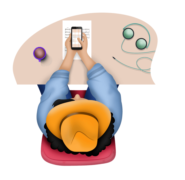
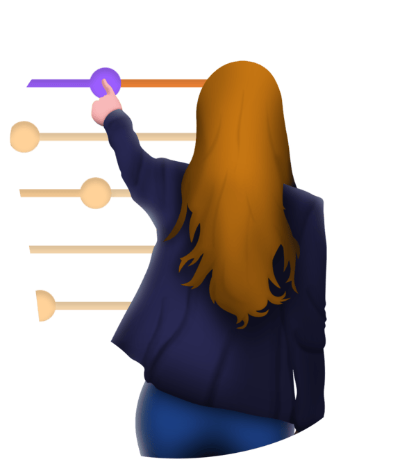
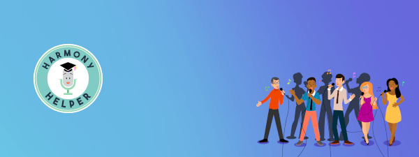
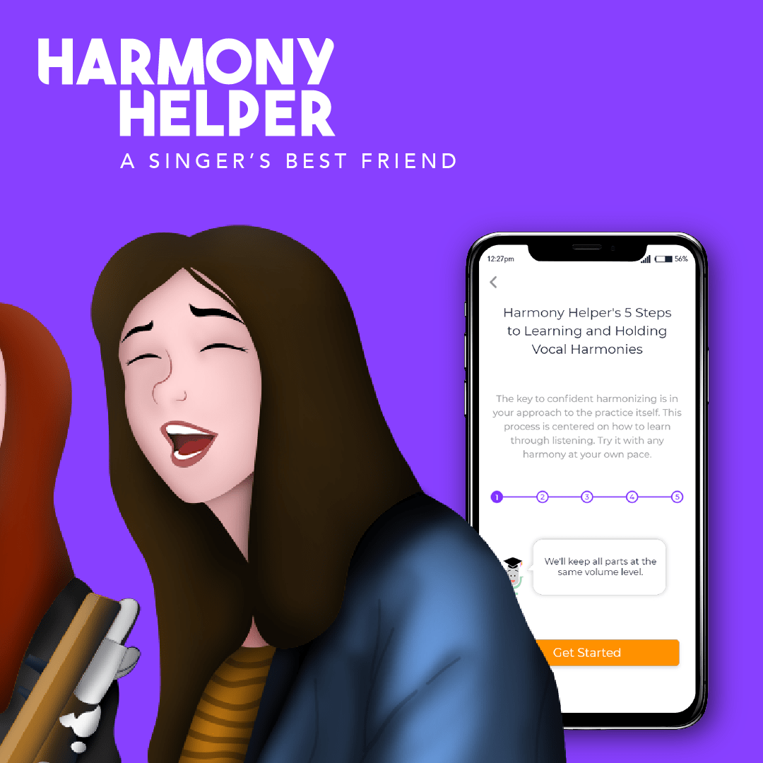
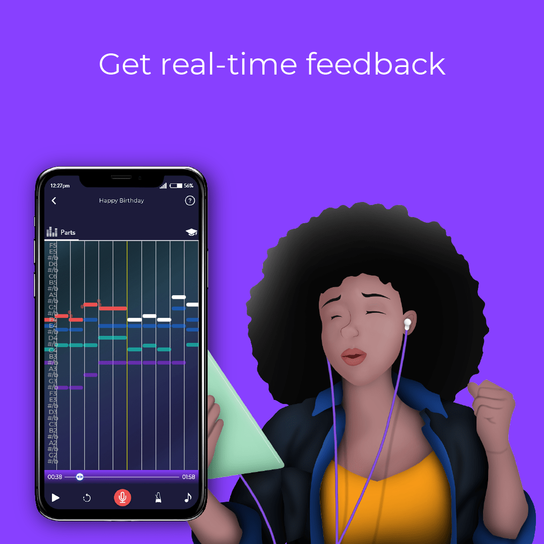
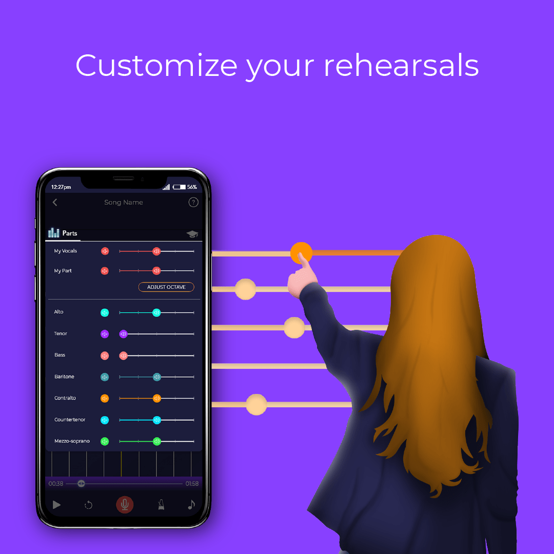
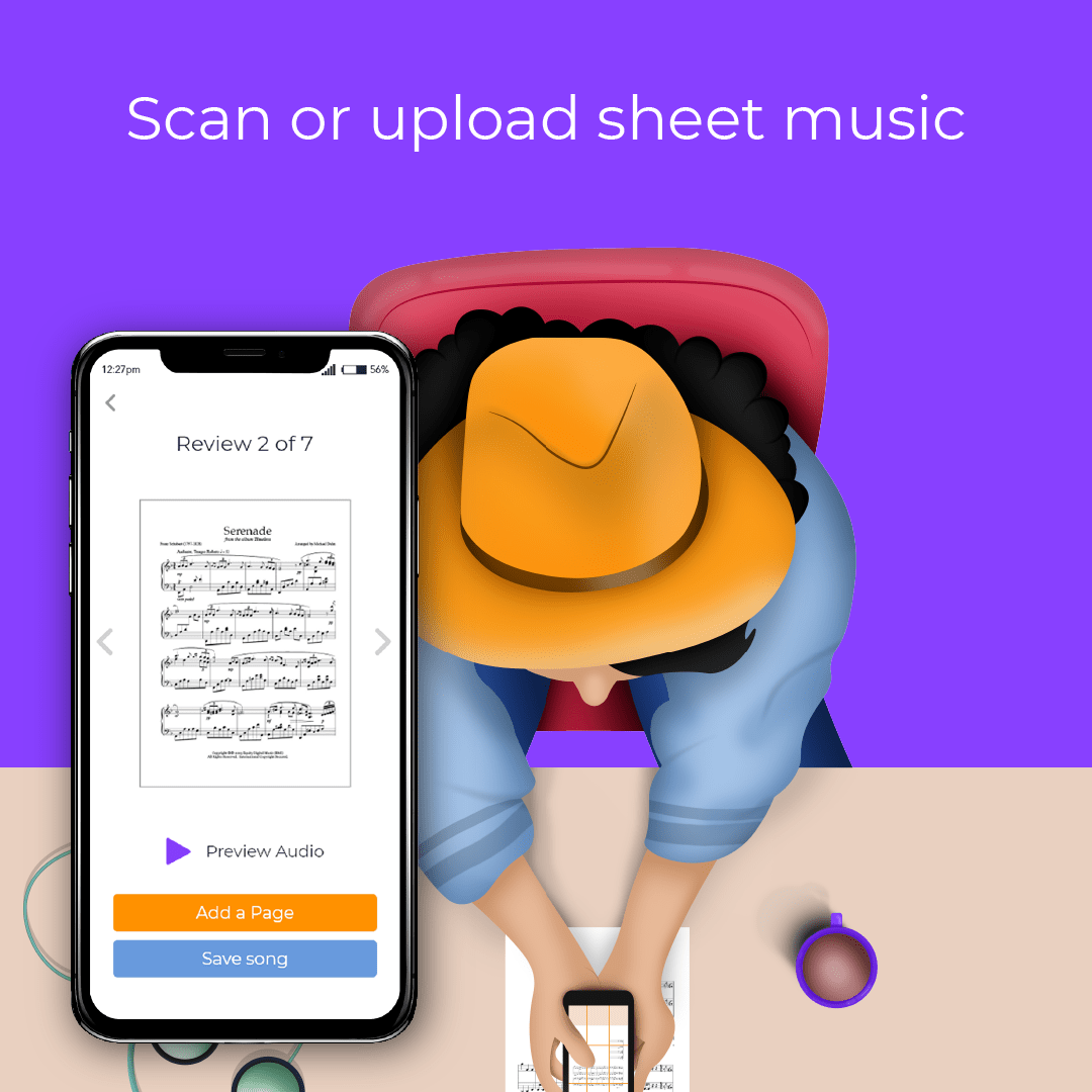
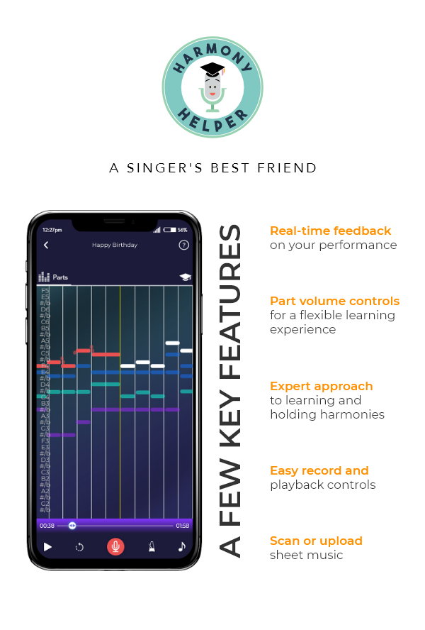
Harmony Helper is a vocal rehearsal app designed to help singers practice and perfect their performances anytime, anywhere. It acts as a 24/7 digital rehearsal room, providing tools like real-time feedback on pitch and rhythm, volume controls to isolate vocal parts, and a guided five-step approach to learning harmonies.
Role:
Sole Graphic Designer
Industry:
Music, entertainment, and performing arts industry
Tools:
Photoshop, Illustrator, Teams, Zoom
Duration:
2018 – 2020
Giving the App Its Own Voice
As part of a broader initiative to elevate Harmony Helper’s brand presence and market perception, I led the visual direction and end-to-end design execution across a wide range of marketing materials and user-facing touchpoints. This meant redefining the brand’s entire identity system, starting with a comprehensive logo redesign and extending it into print, digital, and experiential formats.
The objective was to craft a cohesive, contemporary visual language that felt both professional and playful, directly aligned with the app’s mission to support singers at every level. The work spanned illustration, brand collateral, event signage, paid advertising, web graphics, and more, ensuring that every interaction with the brand, from a social media post to a trade show booth, felt unified, high-quality, and unmistakably Harmony Helper.
My contributions included:
Logo Redesign to modernize and strengthen the brand mark
App Illustrations and Design to enhance onboarding and engagement
Promo Assets for social media and web campaigns
Email and Newsletter Layouts for ongoing audience communication
App Store Graphics to drive discoverability and downloads
Flyers and Rack Cards for physical distribution and events
Print and Digital Advertisements across multiple formats and placements
Brand Touchpoints and Merchandise to extend the identity into the real world
Pain Points Identified:
- Outdated logo and visual identity that no longer reflected the product’s polish or direction
- Inconsistent brand language across digital, print, and physical touchpoints
- Onboarding experience that relied too heavily on text-heavy instructions over visual guidance
- Lack of scalable design assets for use across app, web, and event contexts
- Weak brand presence at live events and in digital marketing campaigns
Goals:
- Redesign the logo and brand mark to better reflect the app’s modern, approachable identity
- Establish a cohesive visual system across typography, color, and iconography
- Develop custom illustrations to improve onboarding clarity and reduce friction
- Create marketing and event materials that unify the brand across every touchpoint
- Deliver a scalable asset library adaptable across app, web, print, and merchandise
NOTES
To make Harmony Helper’s brand both compelling and consistent, I focused on these key areas:
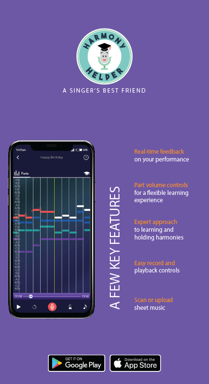
- Logo Redesign: Modernized the microphone mascot and wordmark with cleaner geometry, a bolder color palette, and improved scalability across digital and physical applications.
- App Illustrations and Design: Created Broadway-inspired characters and custom illustrations to guide users through onboarding in a visually engaging, friction-reducing way.
- Promo Assets for Social and Web: Designed cohesive promotional graphics that maintained brand consistency across social media platforms and web campaigns.
- Email and Newsletter Layouts: Developed eye-catching email templates and promotional banners, including campaigns for BroadwayCon, blending creativity with clarity.
- App Store Graphics: Designed store visuals and promotional screenshots to drive discoverability and communicate the app’s value at a glance.
- Flyers and Rack Cards: Produced print collateral for physical distribution and live events, carrying the brand’s energy into real-world interactions.
- Print and Digital Advertisements: Created multi-format ad assets optimized for both print placements and digital campaigns across multiple channels.
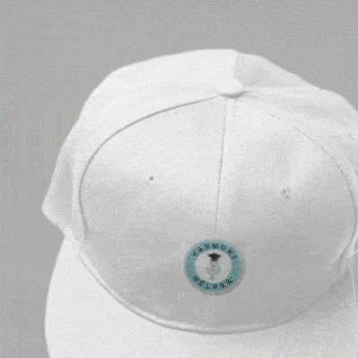
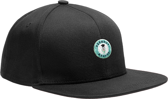
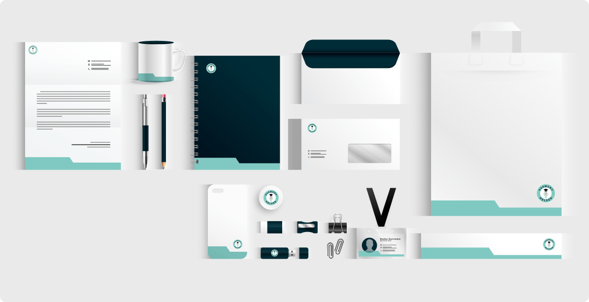
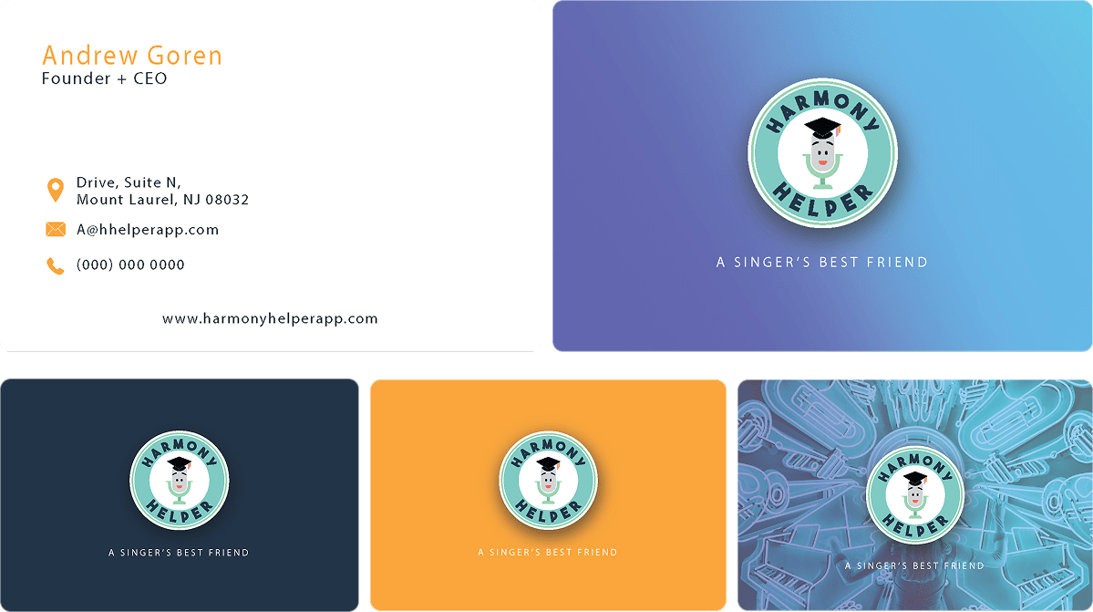
- Brand Touchpoints and Merchandise: Extended the identity into apparel, business cards, stationery, and booth displays, ensuring a unified presence wherever users encounter the brand.
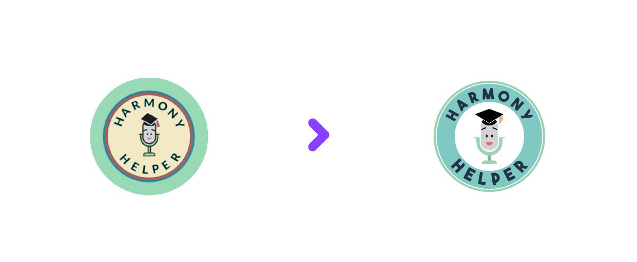
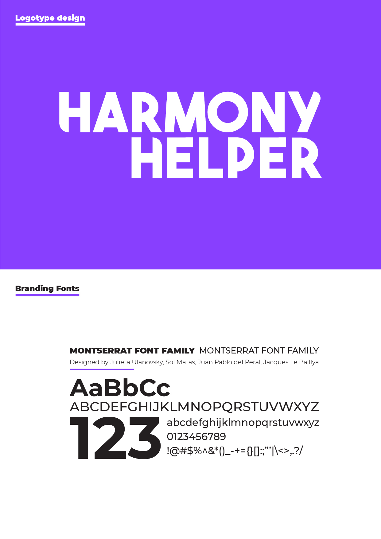
MODERNIZING THE HARMONY HELPER MARK
The logo is the most concentrated expression of a brand’s identity. For Harmony Helper, the original mark had served its purpose in the early stages, but as the platform matured into a modern, app-first product, the logo struggled to keep pace. A full redesign was needed, one that honored the brand’s approachable, educational character while giving it the visual strength and scalability a growing product demands.
The original logo presented several limitations that became increasingly apparent as the platform evolved:
- Limited visual presence: Thin line-work and muted color choices caused the logo to lose impact across digital and print applications, particularly at smaller sizes and on mobile screens
- Misalignment with the product: As Harmony Helper grew into a polished, modern app, the original logo no longer reflected the product’s quality, usability, or forward-thinking direction
- Scalability issues: The mark did not perform consistently across the range of contexts a growing brand requires, from app icons to event banners
The redesigned Harmony Helper logo was built to better reflect the app’s modern, approachable, and educational character across every surface it touches. The redesign strengthens visual clarity and scalability while preserving the friendly personality users already associate with the brand.
Key updates included:
- Refined Character Emblem: The friendly microphone mascot was retained but simplified, with cleaner shapes and an updated expression to improve clarity, recognition, and personality at small sizes
- Bolder Color Palette: A brighter, more saturated green paired with a richer navy introduces stronger contrast and energy, helping the brand stand out across both digital and physical touchpoints
- Geometric Typography: A clean, bold sans-serif typeface was introduced for both the circular emblem and the standalone wordmark, improving legibility and reinforcing a modern, cohesive visual system
- Versatile Wordmark: Designed as a flexible branding element, the new text logo performs consistently across app UI, headers, and print applications, using strong geometry and balanced rhythm for a confident presence
The brand refresh extended well beyond the logo itself. To ensure cohesion throughout the full Harmony Helper experience, the refresh included:
- Typography for Readability: A modern type system selected to enhance legibility at small sizes, support accessibility standards, and maintain a friendly, instructional tone across the interface
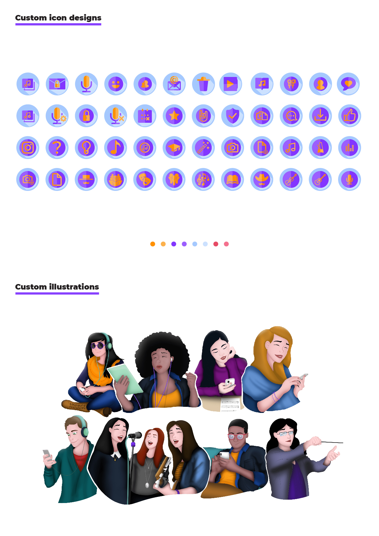
- Purpose-Driven Iconography: Icons redesigned with clear shapes and consistent styling to reduce cognitive load and ensure intuitive navigation within the app
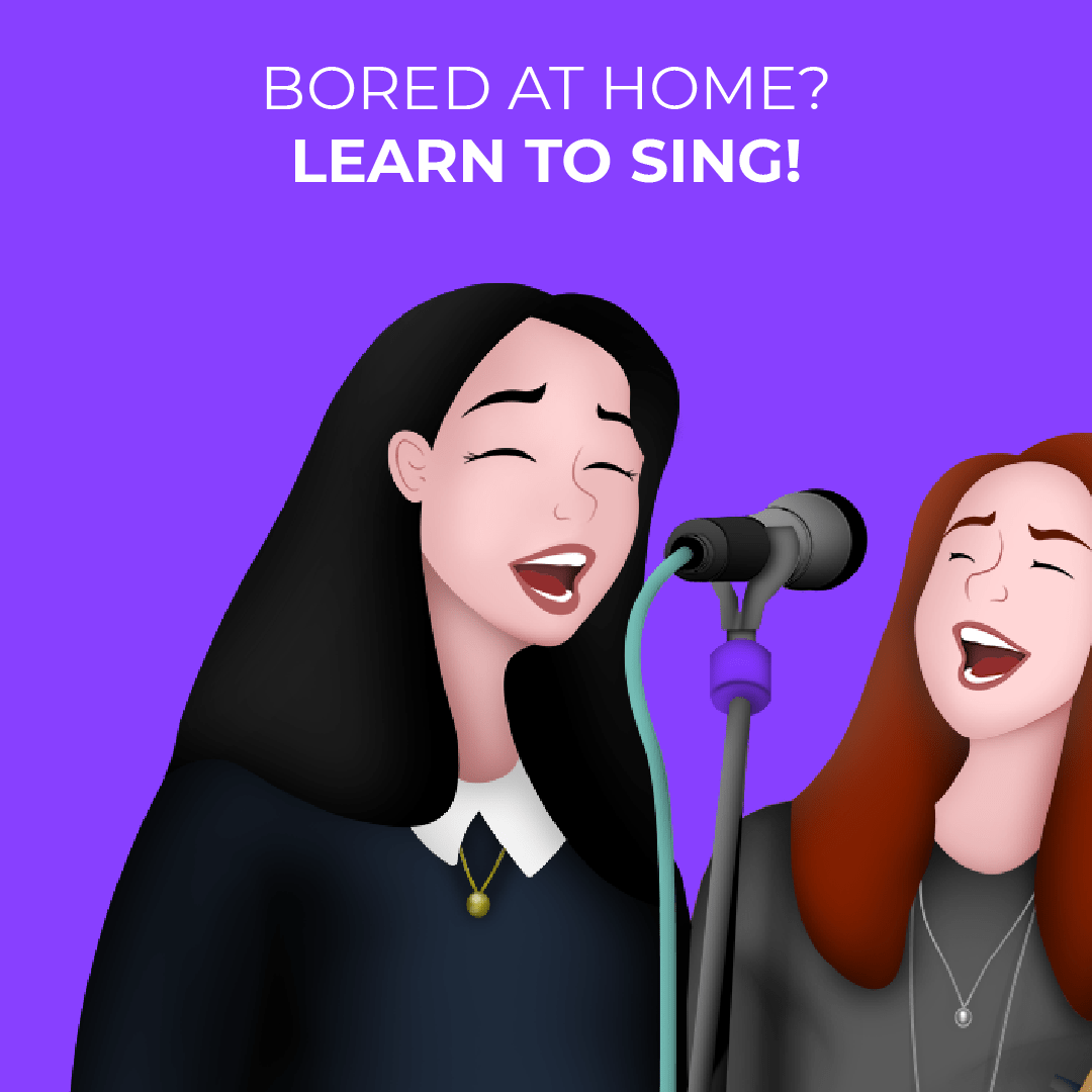
DRIVING ENGAGEMENT THROUGH VISUAL STORYTELLING
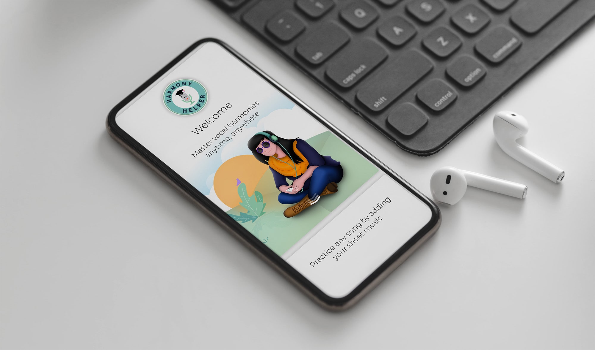
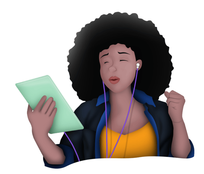
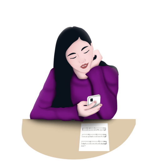
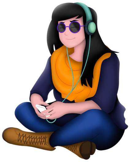
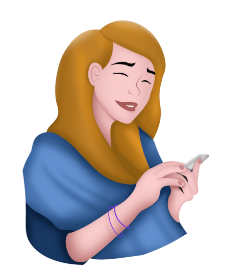
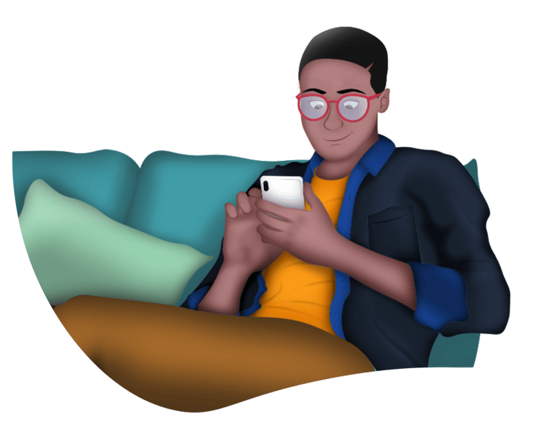
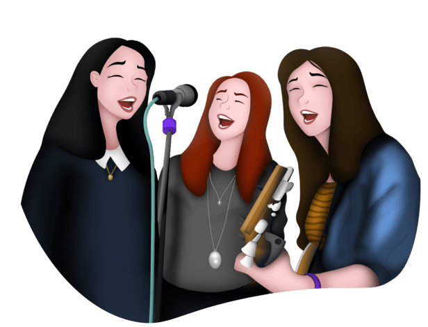
One of the most distinctive creative decisions in this project was the introduction of custom illustrations and character designs to improve onboarding clarity and reduce friction for first-time users. Rather than relying on text-heavy instructions, the app used Broadway-inspired visuals paired with instructional steps to help users understand key features in a way that felt engaging, warm, and immediately accessible.
These illustrations did more than decorate the screen. They served a clear functional purpose: guiding users through unfamiliar workflows with visual cues that felt intuitive rather than prescriptive, making the first experience with Harmony Helper feel like an invitation rather than a tutorial.
MEASURED OUTCOMES & IMPACT
The introduction of illustration-driven onboarding produced meaningful results across several dimensions:
- Reduced onboarding confusion: Visual walkthroughs decreased reliance on support prompts and repeat instructions during initial setup
- Improved task comprehension: Character-led guidance helped users complete core actions more confidently during their first sessions
- Faster time-to-value: Clear visual cues supported quicker onboarding completion and earlier engagement with primary app features
- Increased engagement: Playful, brand-aligned sticker sets encouraged interaction and added moments of delight without interrupting user flow
- Stronger brand recall: The Broadway-inspired characters reinforced the app’s purpose, improving memorability and emotional connection with the product


These illustration-driven enhancements balanced usability with personality, supporting both functional understanding and long-term user engagement.
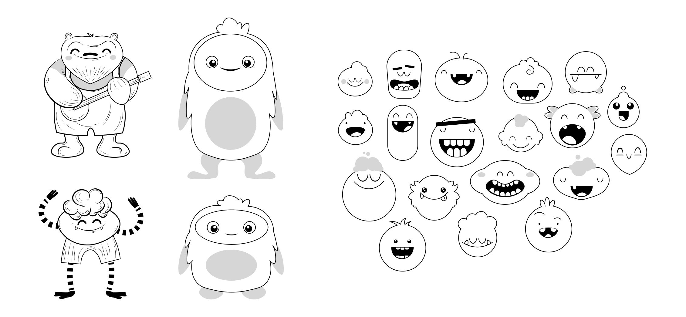
As part of the illustration exploration, I designed a series of playful, monster-inspired characters that pushed the visual personality of Harmony Helper in a more whimsical direction. While these characters did not make the final product, they played a critical role in shaping the overall creative direction.
Each concept drew inspiration from Broadway plays and iconic musicals, with characters reflecting theatrical traits like expressive movement, costume-like details, and stage-ready personalities. This exploration helped define how far the brand could lean into character-driven storytelling while still supporting an educational experience. Although the final direction favored a more streamlined character system, these concepts directly informed later illustration decisions and demonstrate the depth of visual exploration that shaped the final design solution.

Characters based around Broadway plays and musicals
BRINGING THE BRAND TO LIFE ACROSS EVERY TOUCHPOINT
A brand is only as strong as its least considered touchpoint. With Harmony Helper, the goal was to ensure that every surface, whether digital or physical, felt like it belonged to the same cohesive world. I translated the refreshed brand identity into a full range of materials that connect with audiences wherever they engage.
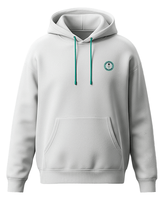
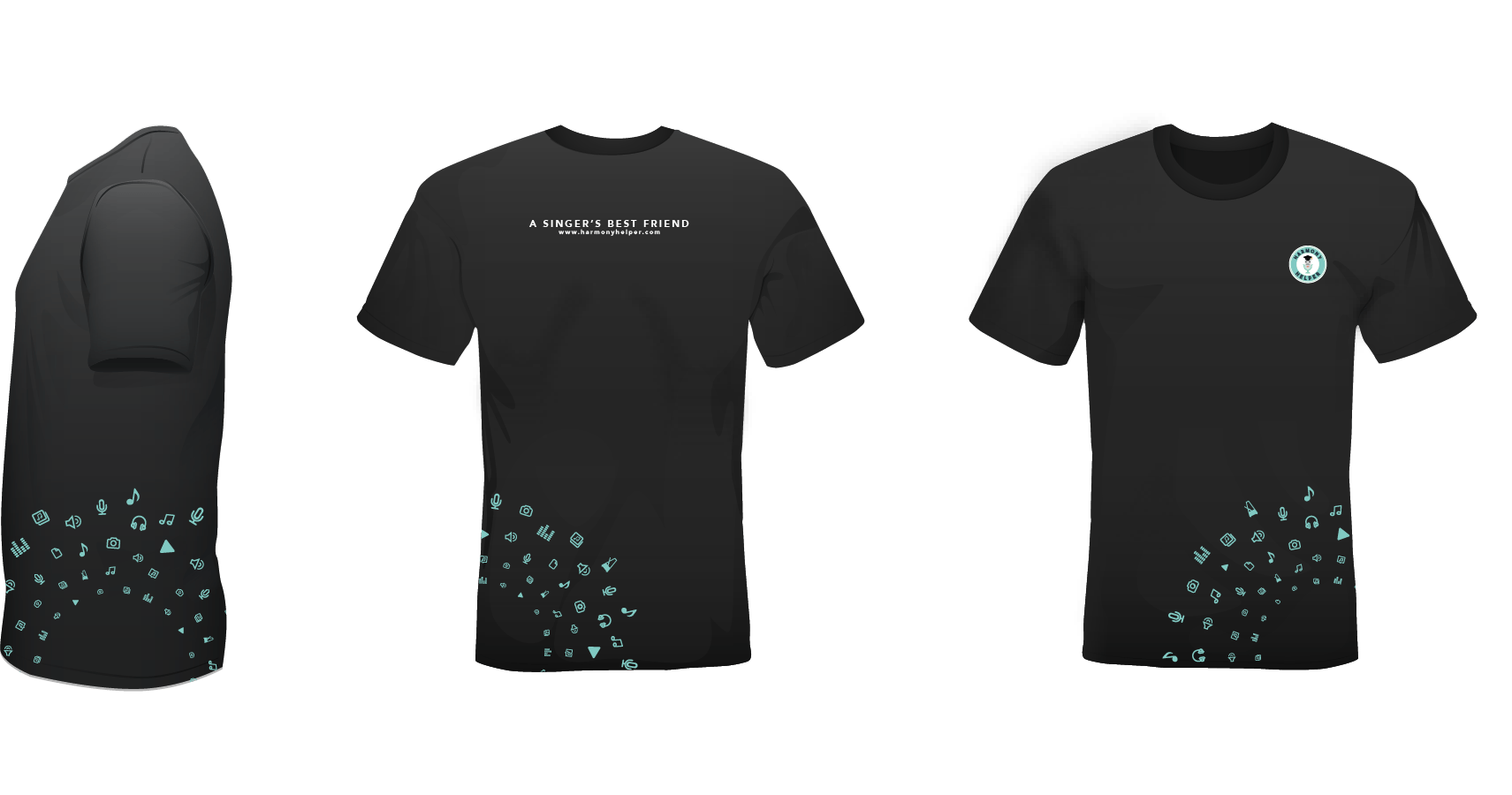
The brand’s energy was carried into real-world interactions through apparel, business cards, stationery, and email headers, each designed to feel polished and on-brand without losing the warmth and approachability at the heart of the Harmony Helper identity.


App Store visuals, promotional screenshots, and landing page assets were designed to deliver a seamless, on-brand experience online, supporting discoverability and driving downloads by communicating the product’s value clearly and compellingly at every digital entry point.

Newsletter layouts and promotional banners, including campaigns for BroadwayCon, were designed to blend creativity with clarity, capturing attention while communicating key messages in a format that felt consistent with the broader brand.
Every asset, from merchandise to digital campaigns, works together to tell a cohesive brand story and leave a lasting impression.
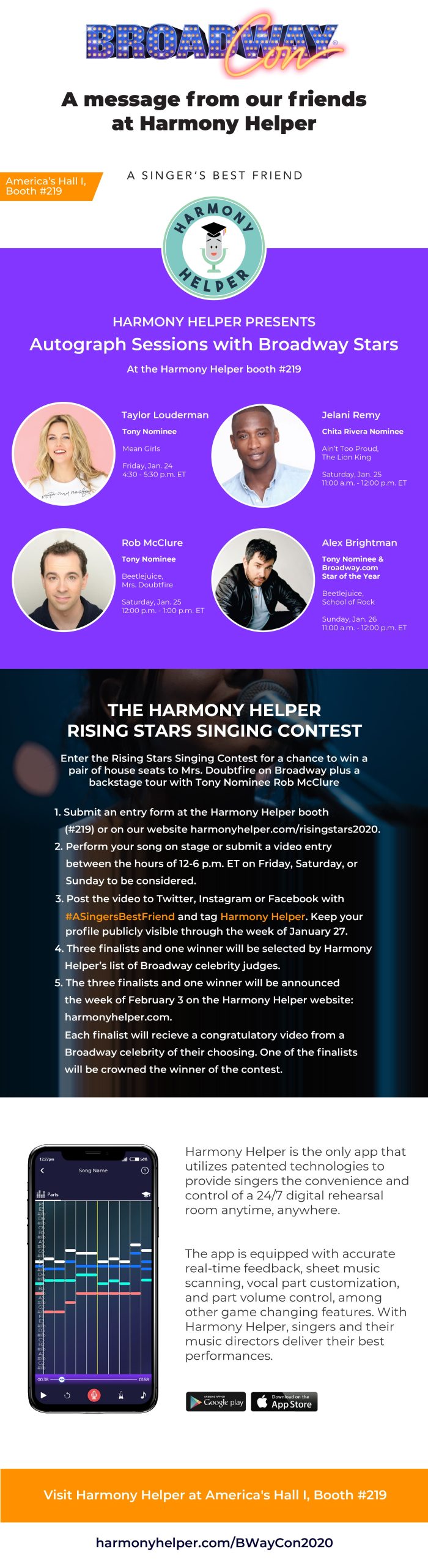

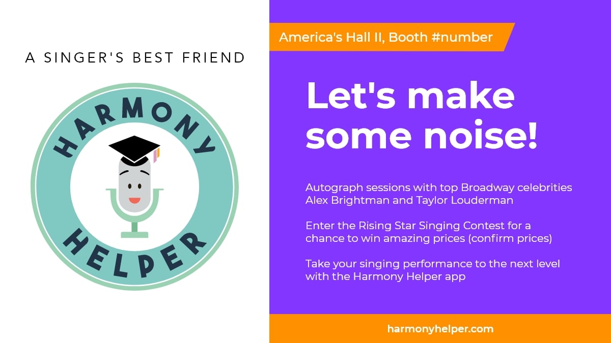
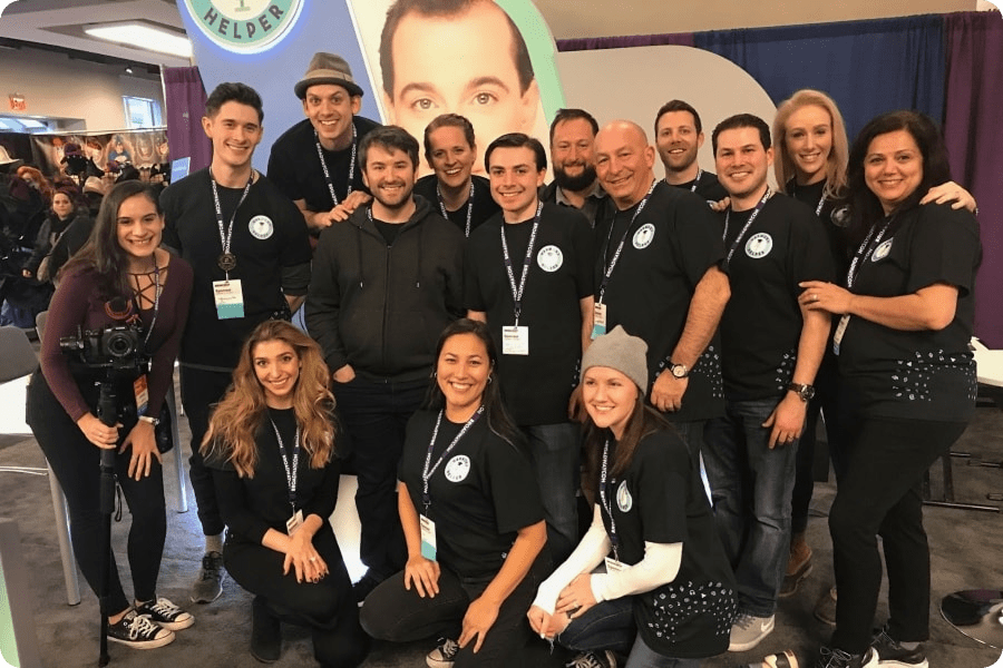
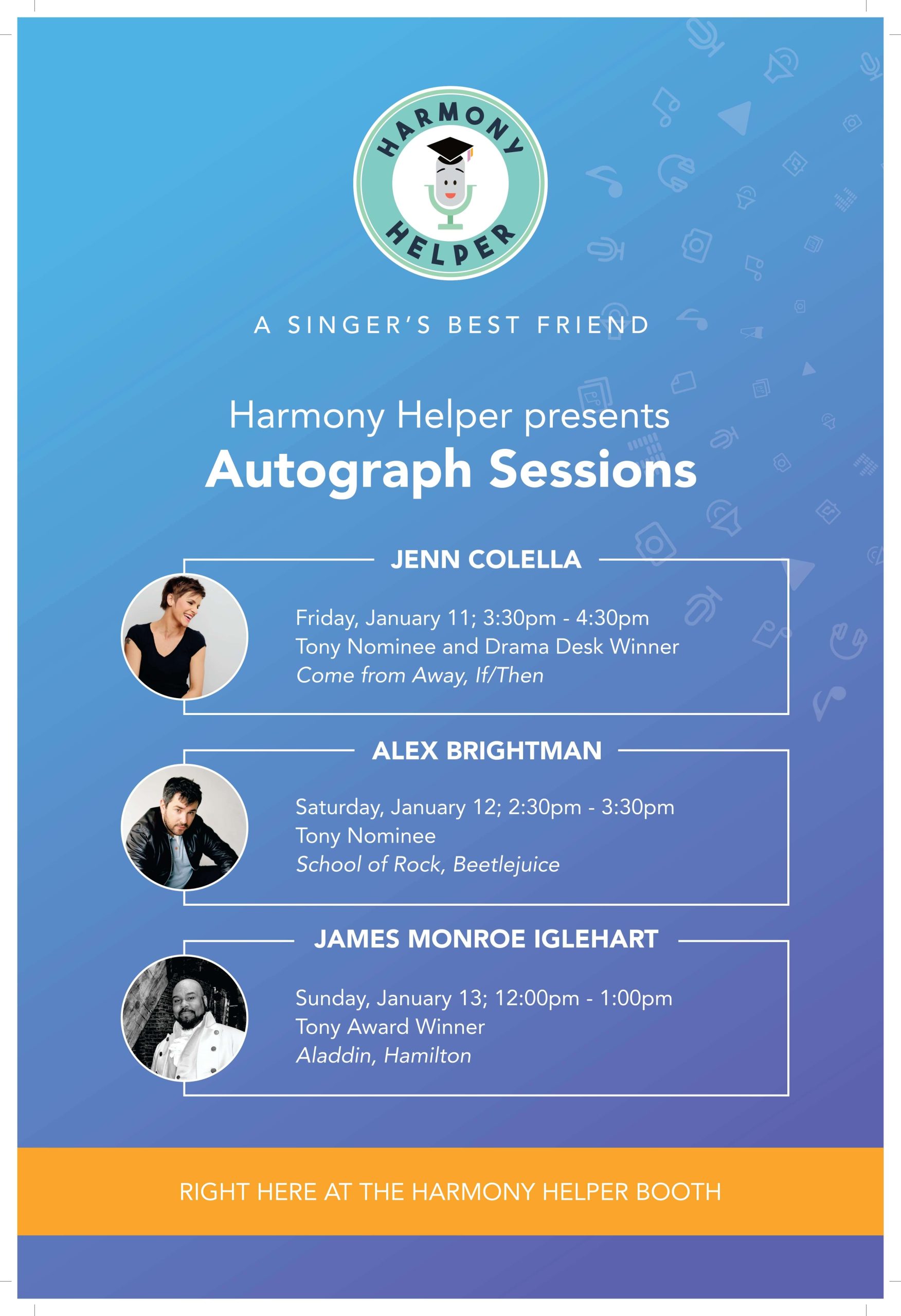
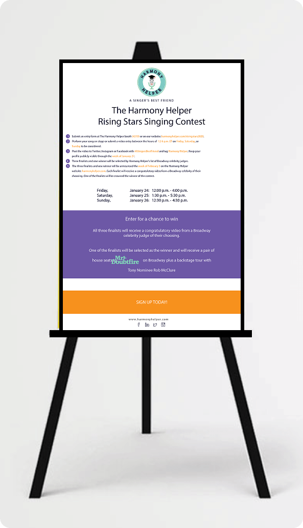
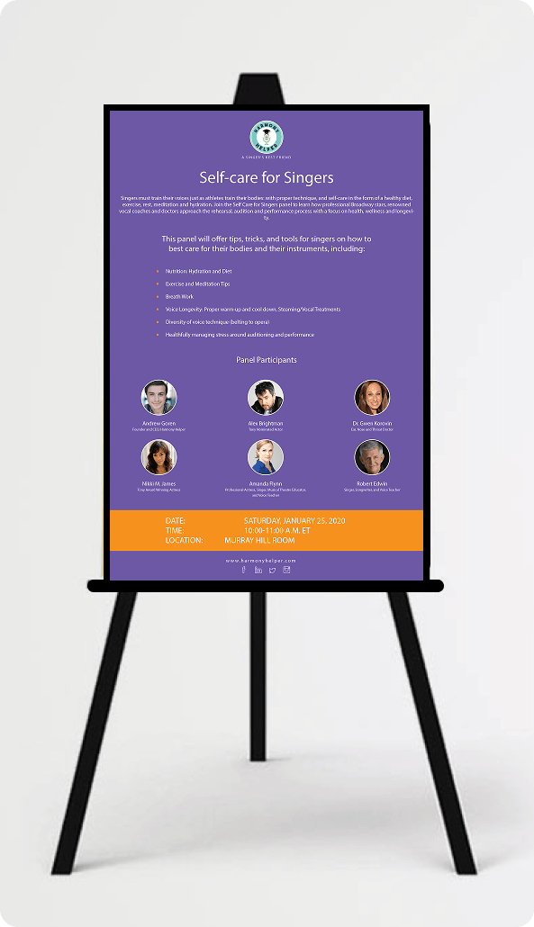
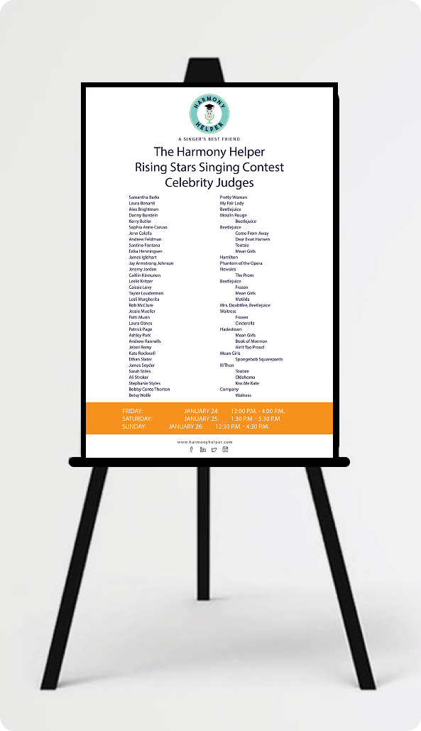
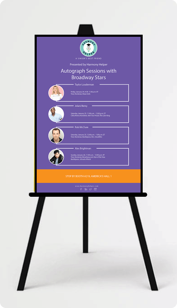
For Harmony Helper’s BroadwayCon booth at the New York Hilton Midtown and Javits Convention Center, I expanded the branding effort into a fully immersive physical experience.
This included attention-grabbing banners, printed collateral, and booth displays that brought the refreshed identity to life in three dimensions, creating a brand presence that was cohesive, energetic, and impossible to walk past without noticing.
Every asset, from merchandise to digital campaigns to event materials, was designed to work together as part of a single, unified brand story, one that left a lasting impression and made Harmony Helper feel like the professional, purposeful product it had become.


REFLECTIONS & KEY LEARNINGS
Balancing Aesthetics and Functionality: Designing Harmony Helper reinforced that visual appeal and usability are not competing priorities. Every aesthetic decision, from the color system to the custom illustrations, was made in direct service of the user experience, ensuring the brand felt as purposeful and engaging as the product it represented.
Brand Identity Consistency: Redesigning the logo and extending it across print, digital, and experiential touchpoints emphasized how critical visual cohesion is at every level. When typography, color, and interaction patterns all align, the brand becomes memorable and trustworthy in a way that no single asset can achieve alone.
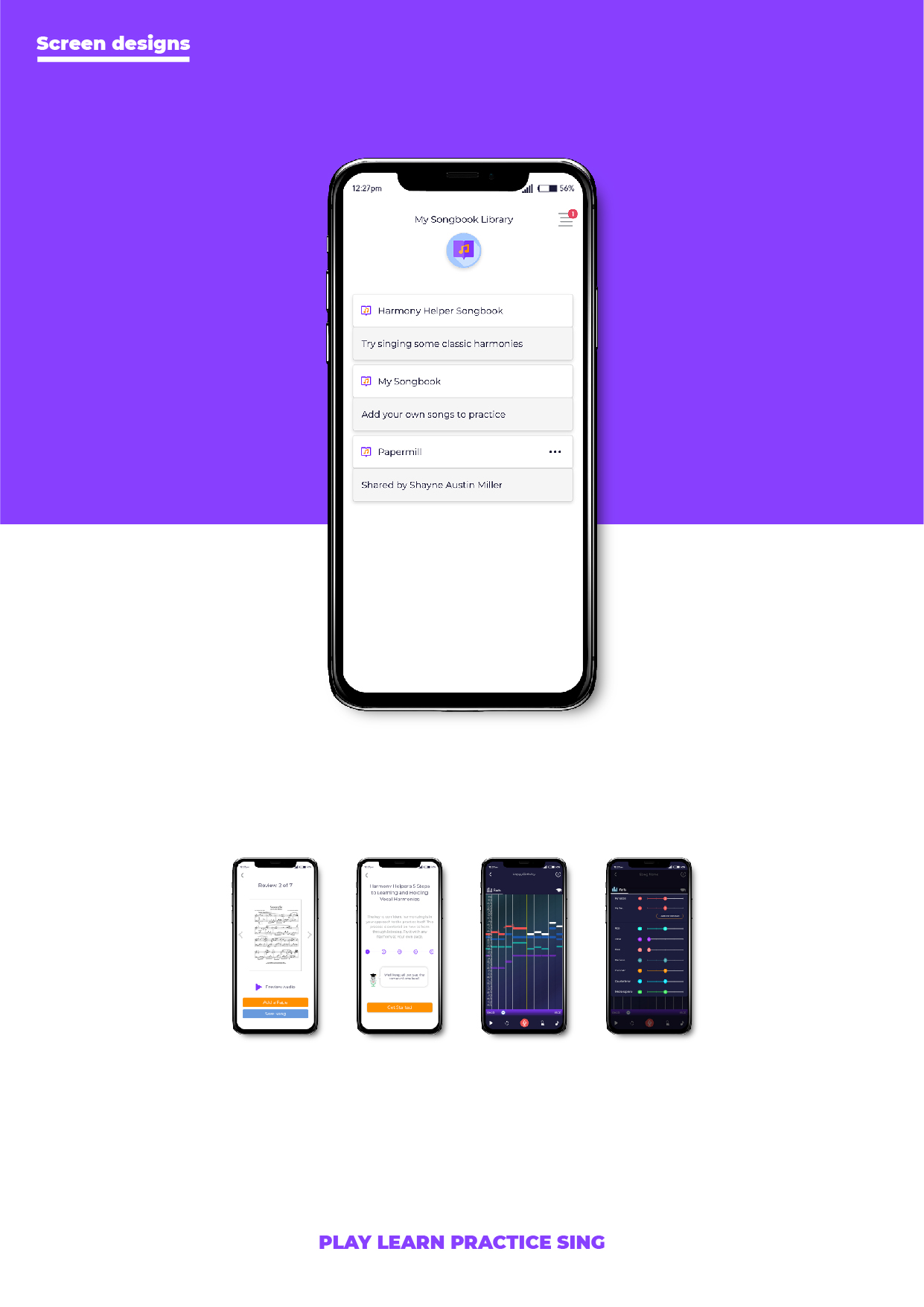
User-Centric Design Principles: Developing features like the illustration-driven onboarding, song library, and practice screen deepened my understanding of what it means to design around the user’s actual workflow. The best decisions in this project came from asking what singers needed to accomplish, not what the app needed to include.
Visual Storytelling Over Instruction: Introducing Broadway-inspired character illustrations as a replacement for text-heavy onboarding reinforced the power of visual communication. When users are guided by imagery rather than instructions, comprehension improves, and the experience feels like an invitation rather than a tutorial.
Scalability Across Touchpoints: Designing for a brand that lived across a mobile app, website, social media, email campaigns, and a live event booth required every asset to perform consistently across radically different contexts. Building a flexible, scalable design system from the start was what made that consistency possible.
Accessibility and Inclusivity: Designing readable layouts, clear navigation patterns, and contextual tooltips reinforced how important it is to build for a diverse user base from the start. Harmony Helper needed to serve first-time singers and experienced performers alike, and that range of needs shaped every design decision throughout the project.
CHALLENGES I OVERCAME
Modernizing the Brand Without Losing Its Personality: Redesigning the Harmony Helper logo required preserving the warmth and approachability users already associated with the brand while giving it the visual strength and scalability a growing product demands. Striking that balance, between familiar and refreshed, between playful and professional, was one of the most nuanced creative challenges of the project.
Maintaining Consistency Across Platforms: Aligning the brand identity across the app, website, email campaigns, and BroadwayCon booth materials required meticulous attention to detail at every stage. Inconsistency, even subtle inconsistency, erodes trust. Every color choice, typographic decision, and component pattern had to feel like it belonged to the same family, whether a user encountered the brand on their phone, on a desktop, or at a live event.
Simplifying Complex Features: Designing tools like the MIDI music processor and real-time vocal feedback system presented significant interaction design challenges. The underlying functionality was sophisticated, but sophistication in the backend cannot translate to complexity on the screen. Making advanced capabilities feel like natural, intuitive parts of the experience demanded creative problem-solving, close collaboration with technical stakeholders, and careful iterative testing.
Engaging New Users Through Onboarding: The welcome flow and walkthrough experience had to introduce a feature-rich app to brand new users in a way that felt exciting rather than overwhelming. Every screen had to strike a precise balance between visual engagement and clear, actionable guidance. The use of custom illustrations, concise copy, and a step-by-step progression helped ease users into the app’s core concepts naturally, building confidence before they ever reached the main experience.
Space and Layout Management: The limited canvas of a mobile screen was felt acutely across features like the song library and practice screen, where the volume and complexity of information threatened to overwhelm the interface. Implementing collapsible sections, dedicated screens, and progressive disclosure patterns allowed the full depth of the product to remain accessible without surfacing everything at once.
Iterative Design Process: No design in this project was finished after the first pass. Addressing feedback from usability testing, stakeholders, and real-world usage was a continuous and essential part of the process. Each round of iteration surfaced new pain points, edge cases, and opportunities for refinement that were not visible at the concept stage. That willingness to revisit, revise, and rebuild was what ultimately produced an experience that genuinely met user expectations.