
Re-imagining Endodontic Software for Seamless Practice Management
This case study explores the challenges, solutions, and outcomes of designing a feature-rich endodontic software experience.
Akoya is a dynamic startup advancing the field of endodontics through innovative technology. The company offers comprehensive practice management solutions spanning CRM systems, patient scheduling, medical history, financial management, reporting, and medical imaging, all designed to streamline workflows for endodontic professionals. With a focus on efficiency and patient care, Akoya is establishing itself as a trailblazer in dental healthcare tech.
Role:
Sole UX/UI designer + Brand Designer
Industry:
Endodontists, Medical
Tools:
Figma, FigJam, Zoom, Jira, ClickUp, Claude (Anthropic)
Duration:
2024 – 2025
Value Added +
- Modernized a legacy endodontic workflow without disrupting clinical precision
- Reduced training time for new and tech-averse users through intuitive interaction patterns
- Enabled faster clinical decision-making with centralized patient data and imaging
- Improved operational efficiency across administrative, clinical, and financial workflows
- Established a scalable foundation for future features and practice growth
Goals Achieved 𖣠
- Reduced cognitive overload across complex, data-heavy workflows
- Streamlined high-frequency tasks such as scheduling, charting, and imaging review
- Delivered role-based experiences tailored to doctors, assistants, and administrators
- Balanced clinical depth with a clean, modern, enterprise-grade interface
- Ensured accessibility, responsiveness, and HIPAA-conscious design standards
Endodontic practices face a double burden: managing highly specialized patient care while navigating outdated, overly complex systems like TDO. Akoya set out to revolutionize practice management by building a clean, modern, all-in-one software solution, from CRM to imaging to billing, purpose-built for today’s dental specialists.
Pain Points Identified:
- Cluttered interfaces with unnecessary features
- Poor imaging tool integration
- Inefficient scheduling and charting
- Lack of mobile responsiveness
- Steep learning curves for new users
Goals:
- Streamline the endodontic workflow across charting, imaging, billing, and scheduling
- Design a responsive interface for desktop and mobile platforms
- Ensure the platform is intuitive and accessible, even for tech-averse users
- Embed HIPAA-compliant standards throughout
- Deliver a brand identity that feels modern, trustworthy, and clinical
NOTES
To make Akoya both effective and user-friendly for endodontists, I focused on these key features:
- Streamlined Patient Charting: Simplified workflows for quick, accurate updates to patient records.
- Customizable Dashboards: Tailored interfaces surfacing the tools and information most relevant to each user.
- Intuitive Navigation: A clean, modern design with easy-to-use menus and robust search capabilities.
- Imaging Tool Integration: Seamless compatibility with dental imaging systems for effortless access, annotation, and storage of visual diagnostics.
- Procedure Tracking: Organized tools to document treatments, track progress, and represent outcomes visually.
- Appointment Management: A user-friendly scheduling system to efficiently handle appointments and follow-ups.
- Secure Data Management: HIPAA-compliant features to protect patient records and sensitive information.
- Advanced Analytics: Built-in tools to analyze practice performance and generate actionable reports.
- Cross-Device Accessibility: A responsive design ensuring consistent functionality across computers, tablets, and smartphones.
- Comprehensive Training and Support: Interactive tutorials and round-the-clock support to simplify onboarding and ongoing assistance.
PURPOSE
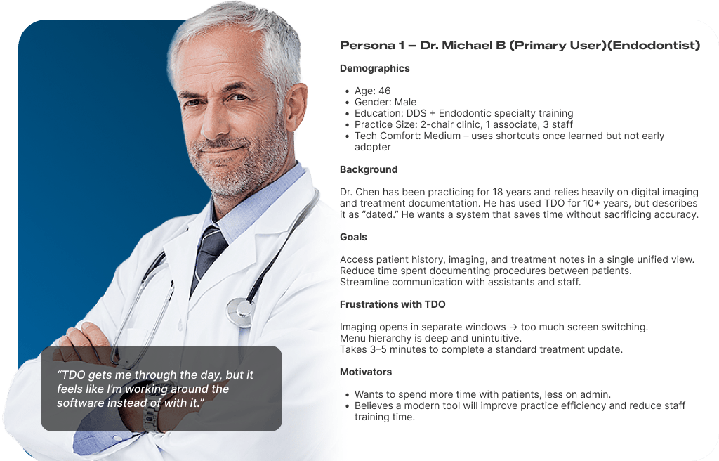
Akoya was envisioned to replace TDO, a legacy endodontic practice management system that many clinicians described as functional but cumbersome. My research goal was to deeply understand how endodontists, assistants, and practice managers interacted with TDO, its strengths, its friction points, and how a modern platform could streamline workflows without disrupting critical clinical tasks.
USER SURVEYS
Participants: 42 clinicians from 9 endodontic practices, all current TDO users.
Key Questions:
- Which TDO features are indispensable?
- Which tasks take the most time to complete?
- What would make you switch to a new platform?
Top Pain Points:
- 68% cited slow navigation as their biggest issue
- 53% found the interface outdated and cluttered
- 41% reported being unable to complete certain tasks without asking a colleague for help
Insights:
Top Must-Have Features: Imaging integration, treatment notes, and scheduling.
USER RESEARCH METHODS
Stakeholder & SME Interviews
Participants:
- 5 endodontists who had used TDO for over 5 years
- 3 dental assistants
- 2 practice managers
- 1 IT support lead from a multi-location clinic
Objectives:
- Identify the core workflows that are critical to both clinical and administrative success.
- Surface frustrations with TDO’s interface and speed.
- Understand compliance and data security needs (HIPAA, cloud backups).
Key Quotes:


CONTEXTUAL INQUIRY (Live Observation)
Observed 4 endodontists and 2 assistants in real clinic settings using TDO during patient appointments.
Findings:
- Imaging, notes, and scheduling often required multiple window swaps.
- Keyboard shortcuts were used heavily — but only by veteran users.
- Assistants often printed forms to fill manually because digital entry was “too slow at the moment.”
BASELINE USABLILITY TESTING (Legacy System)
Method:
Remote moderated sessions, using TDO for common tasks.
Tasks Tested:
- Locate a patient’s most recent CBCT scan
- Update treatment plan
- Schedule follow-up
Results:
- Avg. time to update treatment plan: 3:47 min (target for Akoya: under 2:00)
- 57% of participants misclicked at least twice trying to open imaging.
- Several users abandoned a task due to unclear navigation labels.

KEY INSIGNTS
Navigation Bottlenecks
- TDO’s multi-window workflow created unnecessary screen switching.
- Critical tasks buried in deep menu hierarchies slowed clinicians.
- Visual Clutter
- The Legacy UI lacked a clear visual hierarchy — every screen felt “full.”
- Icons and labels were inconsistent across modules.
- High Learning Curve
- New staff needed weeks to become proficient in TDO.
- Shortcuts existed but were undocumented and non-intuitive.
I reviewed modern dental and medical practice management platforms to see how they addressed TDO’s weaknesses.
INDIRECT COMPETITORS (Medical EMR Leaders)
Indirect Competitors (Medical EMR Leaders)
To benchmark Akoya against the broader healthcare software landscape, I examined four leading medical and dental practice management platforms that address similar workflow challenges — even if not endodontic-specific.
Dentrix is the dominant general dental practice management system. It offers scheduling, billing, and charting but was designed for general dentistry, not specialists. Its interface is dated and desktop-bound, and imaging requires third-party add-ons. It served as a useful benchmark for feature breadth, but not for UX quality.
Eaglesoft (Patterson Dental) competes closely with Dentrix. It provides strong insurance and billing workflows, but is similarly hampered by a legacy UI, limited mobile support, and fragmented imaging integration. Clinicians using Eaglesoft reported similar frustrations to TDO users — steep learning curves and cluttered screens.
Epic (MyChart ecosystem) represents the gold standard in medical EMR. It excels at patient data centralization, role-based access, and cross-device responsiveness. However, it is built for hospitals and large health systems — its complexity and cost make it inaccessible for small specialty practices. It set the bar for what enterprise-grade clinical UX can look like.
Curve Dental is the most modern of the indirect competitors — a cloud-native dental platform with a clean UI and strong scheduling tools. It lacks endodontic-specific clinical features (e.g., periapical charting, CBCT integration) but demonstrated that modern design principles can work in a dental context.
COMPETITIVE FEATURE BENCHMARKING
| Feature | Akoya | TDO | Dentrix | Eaglesoft | Epic | Curve Dental |
|---|---|---|---|---|---|---|
| Clinical | ||||||
| Endodontic-specific charting | Full | Full | None | None | None | None |
| Imaging integration (CBCT / X-ray) | Full | Partial | Partial | Partial | Partial | None |
| Treatment notes & procedure tracking | Full | Full | Full | Full | Full | Full |
| Medical history management | Full | Partial | Full | Full | Full | Partial |
| Scheduling & Administration | ||||||
| Appointment scheduling | Full | Full | Full | Full | Full | Full |
| Patient CRM & communication | Full | Partial | Partial | Partial | Full | Full |
| Role-based dashboards | Full | None | None | None | Full | Partial |
| Financial | ||||||
| Billing & insurance management | Full | Full | Full | Full | Full | Full |
| Reporting & analytics | Full | Partial | Partial | Partial | Full | Partial |
| UX & Platform | ||||||
| Mobile / tablet responsiveness | Full | None | None | None | Partial | Full |
| Modern, intuitive UI | Full | None | None | None | Partial | Full |
| HIPAA-compliant data handling | Full | Full | Full | Full | Full | Full |
| Customizable workflows | Full | None | Partial | Partial | Full | Partial |
| WCAG accessibility compliance | Full | None | None | None | Partial | Partial |
SUMMARY OF OPPORTUNITIES FOR AKOYA
Based on this analysis, Akoya’s competitive advantage should be:
- Seamless Imaging Integration: Unify CBCT scans, X-rays, and treatment notes in one view.
- Role-Specific Dashboards: Reduce clutter and speed up task completion.
- Mobile and Tablet Optimization: Accommodate clinicians moving between treatment rooms.
- Customizable Workflows: Allow each practice to tailor forms and layouts.
- Touch-Friendly, Accessible Design: Meet WCAG 2.1 standards and improve on TDO’s small click targets.
- Modern, Consistent UI: Deliver a polished, brand-aligned interface that builds trust from the first login.
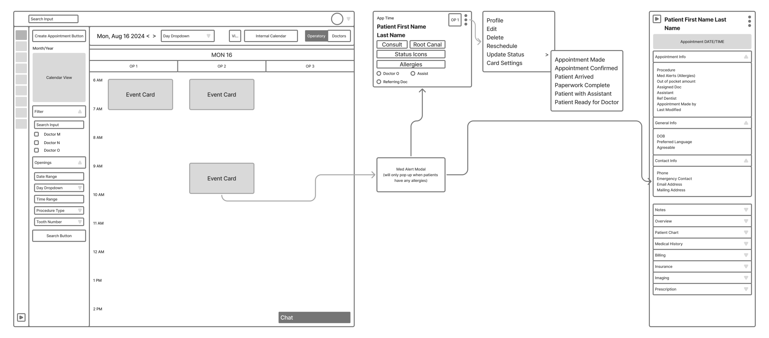
USER JOURNEY MAPPING
To ensure a clear understanding of how different users interacted with the Akoya platform, I created a detailed swimlane diagram mapping each step across the system. This visualization captured the end-to-end journey for administrators, endodontists, patients, and support staff.

To build this accurately, I consulted closely with the product owner to align on business goals and conducted interviews with practicing endodontists to understand their clinical workflows, pain points, and real-world needs. These insights helped me:
- Surface inefficiencies in existing workflows
- Identify key moments where automation or redesign could reduce friction
- Highlight communication gaps across roles
- Ensure alignment between front-end features and back-end functionality
The swim-lane diagram became a foundational tool for streamlining design decisions, prioritizing features, and building a platform that balances administrative efficiency with a strong clinical focus.
KEY INSIGHTS GATHERED
- Doctors emphasized the need for quicker access to imaging and treatment history during consultations. This insight led to the integration of a persistent sidebar and streamlined image viewer.
- Many endodontists found existing systems too cluttered and rigid, particularly around charting and treatment plans. This inspired more modular screen layouts and collapsible sections to reduce visual overload.
- Scheduling and patient management were often delegated to staff, but errors in shared workflows led to confusion. I addressed this by clearly delineating role-based views and permissions within the platform.
- The product owner stressed the importance of scalability and onboarding for new practices. In response, I designed a dashboard experience that could be customized based on the size and maturity of the clinic.
OUTCOMES
The swimlane diagram also served as a collaborative blueprint across teams, enabling:
- Cross-functional alignment during development sprints
- Early validation of design assumptions
- Identification of logic gaps, especially in patient and financial flows
- Clear articulation of backend dependencies required to support the front-end UX
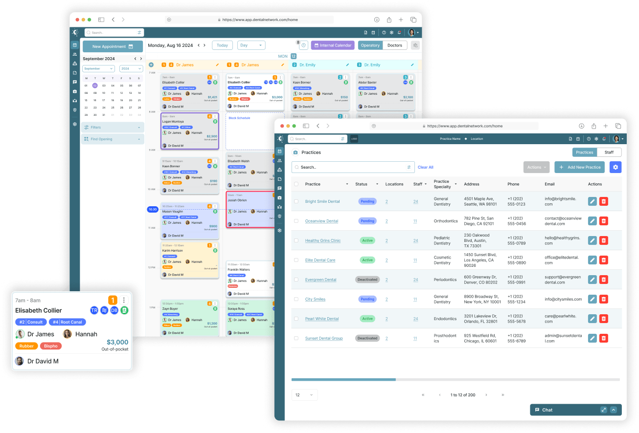
REDESIGNING THE CALENDAR SYSTEM FOR CLARITY AND CONTROL
The calendar system was rethought to streamline workflows, minimize ambiguity, and support more efficient day-to-day scheduling.
CALENDAR REDESIGN FOR DENTAL PRACTICE SCHEDULING
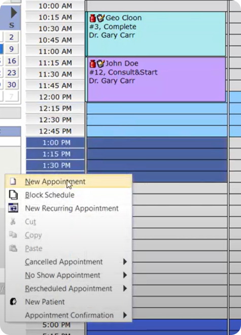
The scheduling calendar is the most heavily used interface for front-desk and administrative staff in a dental practice. It must support high-speed scheduling, easy updates, and clear visual communication.
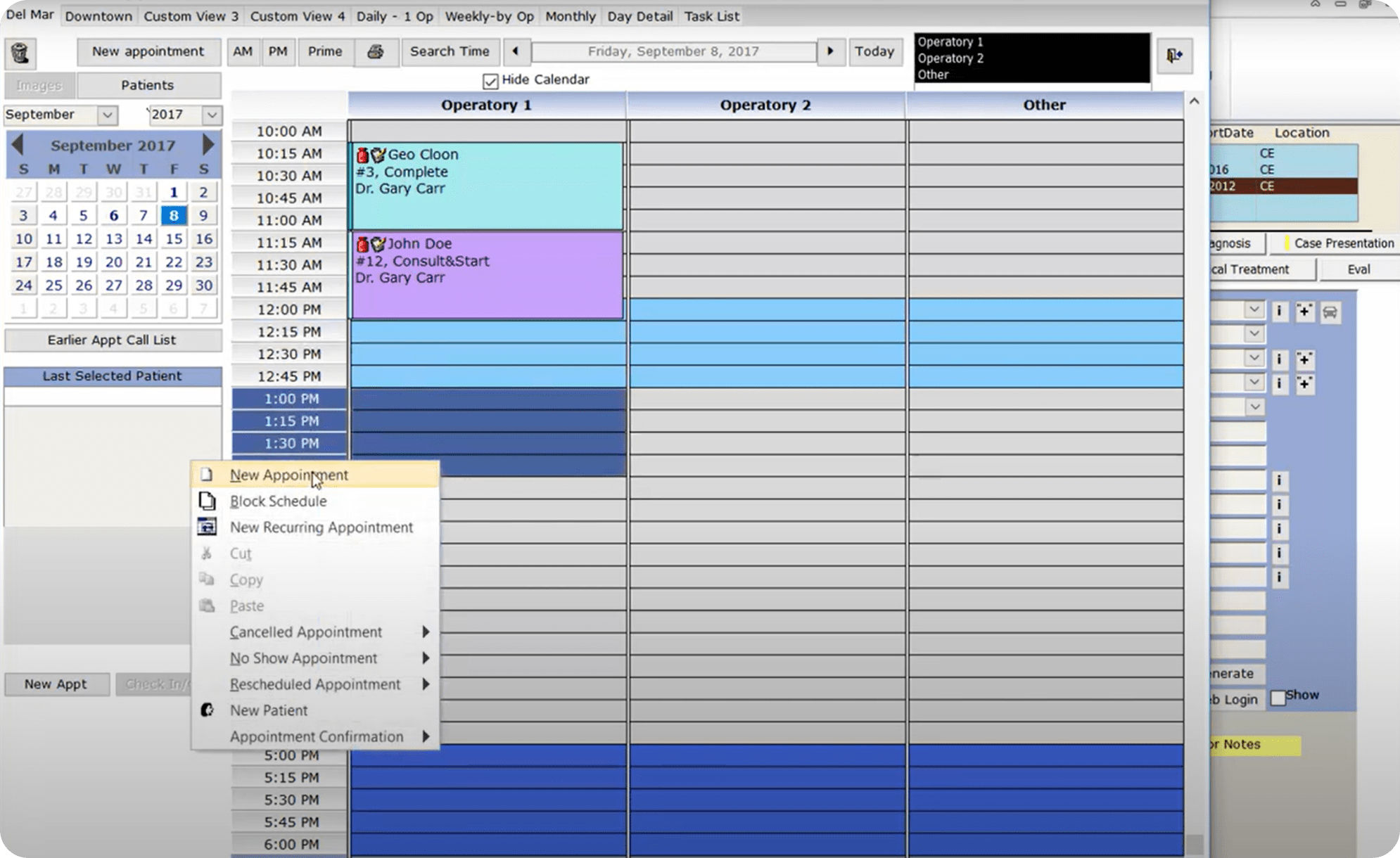
The legacy system featured an outdated interface with minimal visual hierarchy, limited interactivity, and cumbersome workflows. Simple tasks like rescheduling or confirming appointments required excessive clicking through nested menus, slowing down front-desk operations.
CALENDAR REDESIGN
To modernize this experience, I designed a fully responsive calendar interface featuring a flexible grid system that supports daily, weekly, and monthly views. Key improvements include:
- Color-coded columns for each provider improve visual scannability and reduce cognitive load
- Drag-and-drop rescheduling for faster interaction
- Pop-up modals for inline editing, allowing staff to update appointment details without navigating away
- Dynamic status indicators (confirmed, arrived, ready for doctor) that help staff track patient flow throughout the day
- Search and filtering to quickly locate patient data or available time slots
- Mobile-friendly layout ensuring usability across devices for teams working on the go
This redesign improved the usability and accessibility of the calendar while aligning the interface with a modern, approachable visual language, supporting both clarity and performance in high-volume dental practices.
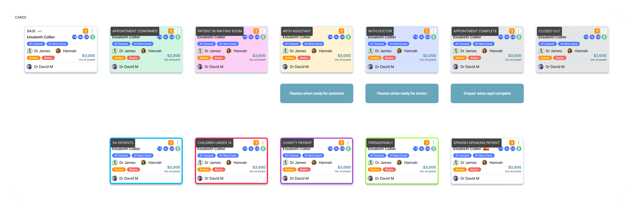
A SIMPLER, SMARTER EVENT CARD UI
Appointment event cards are the most frequently viewed UI component in the dental scheduling system. They must communicate key patient, provider, and treatment information at a glance, especially under time pressure.
The legacy event card presented information in a visually dense, text-heavy layout. Icons lacked tooltips and there was minimal visual hierarchy, making it difficult to quickly parse details like procedure type, provider, or patient name.
- Structured Info Hierarchy: Patient name, time, and provider are visually distinct and grouped by relevance
- Icon System with Meaningful Grouping: Icons for treatment status, alerts, assistants, and location are separated by function and supported by hover tooltips
- Visual Tags and Status Markers: Statuses like “Double Booking,” “Confirmed,” and “Forms Completed” are clearly labeled using color-coded badges
- Compact but Expandable Layout: Each card defaults to the most relevant information, but can expand or open inline menus for editing, updating, or chat
- Color Coding and Highlighting: Cards can be distinguished by treatment type, urgency, or provider (see Card Status Types below)
- Scalable Across Views: Cards display consistently across day, week, and month views, important for scheduling at scale
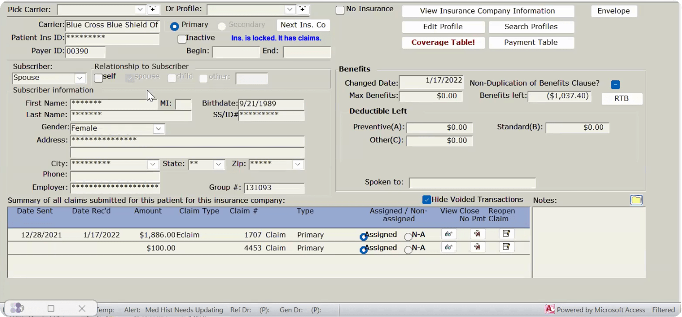
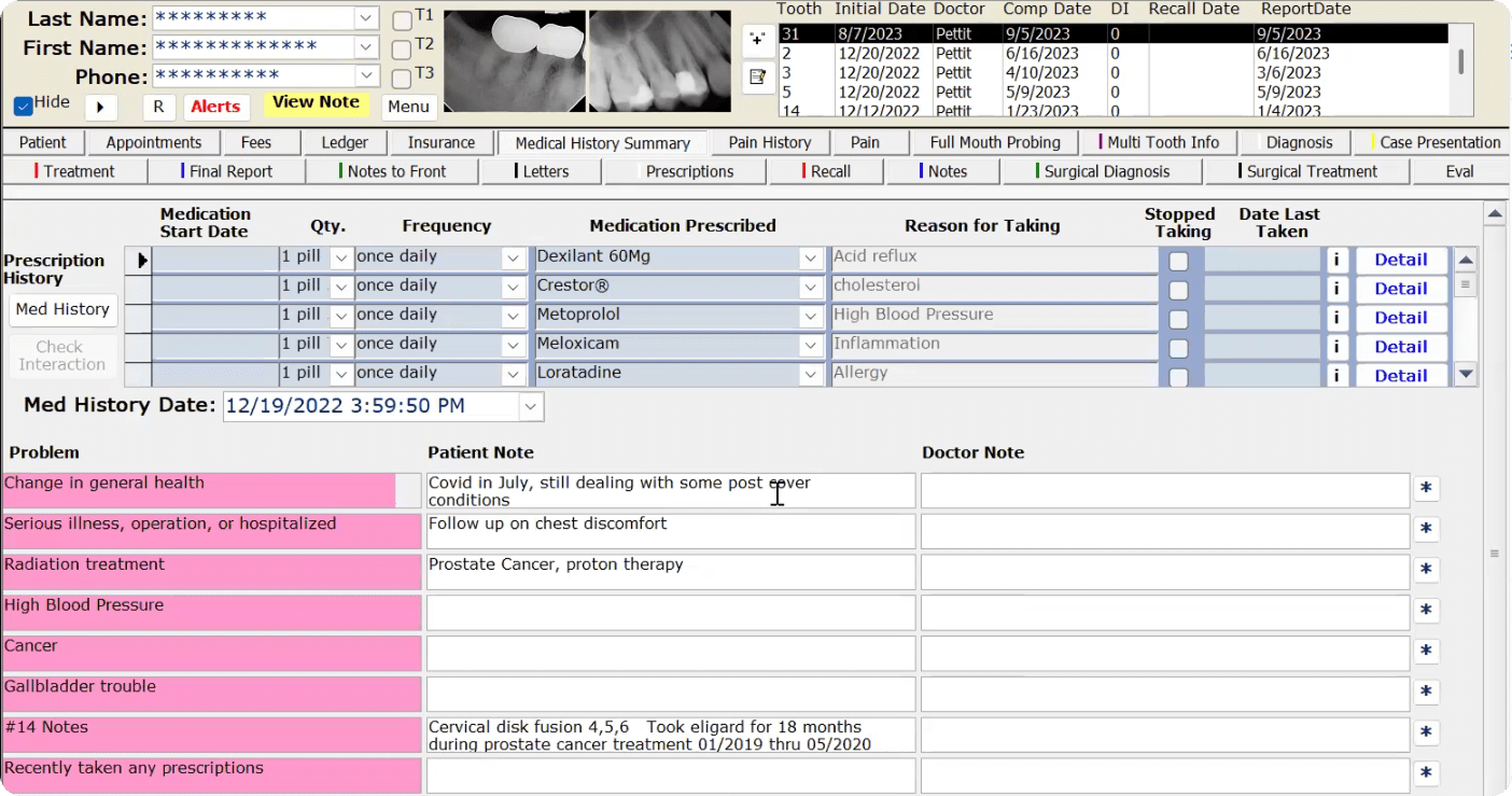
OUTDATED AND OVER-COMPLICATED: THE EXISTING PATIENT CHART
PATIENT CHART EXISTING UI
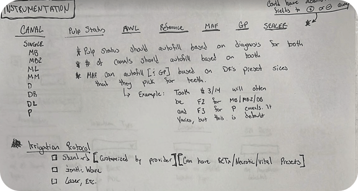
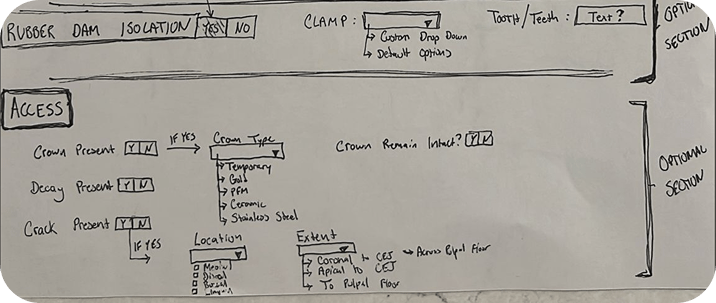
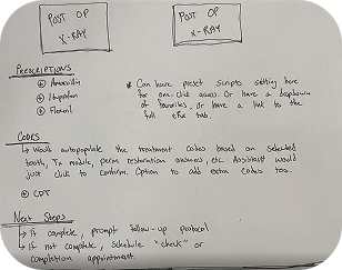
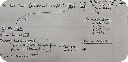
TDO, the current software used by many endodontists, suffers from a cluttered, complicated interface that makes it difficult to use and navigate. Many features go unused, compounding inefficiency. Akoya addresses this by consulting directly with doctors, incorporating their feedback, and delivering a streamlined, user-friendly interface focused on essential functions and workflows.
PATIENT ENCOUNTERS AND DETAILS
This patient encounter screen is designed as part of an electronic health record (EHR) system to help doctors efficiently manage patient information and streamline their clinical workflow.
Main Features and Functions:
- Patient Overview: Key details such as name, age, and demographic information are displayed prominently, allowing doctors to quickly confirm they are viewing the correct patient record.
- Appointments and Scheduling: Tools to view, schedule, or modify appointments, making it easy to plan and coordinate care.
- Medical History and Diagnostics: A summary of the patient’s medical history with options to review past diagnoses, treatments, and supporting documents like X-rays and reports.
- Treatment Plans: A dedicated area for documenting and managing ongoing or proposed treatments, tracking progress, and adjusting care as needed.
- Clinical Notes: A dedicated space for documenting clinical encounters, including symptoms, diagnoses, and observations from consultations.
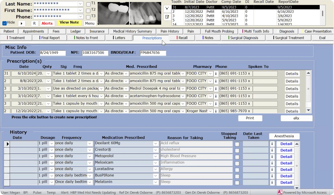
- Prescriptions: Enables prescription management, including viewing current medications or adding new ones for accurate medication tracking.
- Billing and Administrative Tools: Financial details such as billing history and insurance information, accessible to support administrative workflows.
- Communication Features: Options for messaging or follow-up scheduling to support better doctor-patient communication.
NOTES
The screen centralizes patient data, keeping it organized and accessible so doctors can focus on providing quality care while reducing administrative burden.
CENTRALIZED USER PROFILE MANAGEMENT
- The profile screen provides a comprehensive view of a professional’s personal and contact information, serving as a centralized hub for managing essential details and supporting efficient communication and record-keeping.
- The Certifications and Training screen helps doctors manage, upload, and update their professional qualifications, centralizing all records to ensure compliance and up-to-date credentials.
- The Professional Insurance screen gives doctors an organized platform to manage insurance information across categories like liability, disability, life insurance, and malpractice, keeping all details accessible and current for administrative and compliance workflows.
- The Finance screen provides doctors with an intuitive platform for managing and analyzing financial performance, tracking revenue, production, payouts, and overall financial health to support data-driven decision-making.
- The Professional Images screen gives doctors an efficient platform to manage, upload, and utilize scanned images for purposes like promotional materials or case studies, ensuring visual assets are easily accessible within their practice workflow.
CBCT, X-RAY, AND SCAN INTEGRATION AT YOUR FINGERTIPS
The Endodontist Imaging Module simplifies the organization and management of patient imaging, supporting various upload and capture types including CBCT scans, X-rays, and microscope images.
Doctors can add new images, categorize them by type (Pre-Op, Post-Op), and save them to their professional library for future reference. The module ensures easy access to saved images, helping endodontists enhance case documentation and streamline their workflow.
Key features include broad imaging support for CBCT, X-ray, and microscope files, efficient organization through tagging (by tooth number or consultation type), and a professional image library for saving and retrieving images for educational or reference purposes.
AI-ASSISTED DESIGN WORKFLOW HOW GENERATIVE AI ACCELERATED AND ELEVATED THIS PROJECT
Integrating Claude and Figma AI to Reduce Cycle Time, Improve Output Quality, and Sharpen Design Decisions
The Akoya project was designed and documented with generative AI tools integrated directly into the workflow. Rather than treating AI as a separate step, Claude (Anthropic) and Figma AI were embedded into the core design and communication process from early mobile app ideation through to final case study delivery. The result was a measurably faster, more refined output that would have taken significantly longer to produce through a fully manual process.
Claude (Anthropic), UX Copy & Content Strategy Designing and documenting a mobile-first dental platform for endodontists required not just strong visuals but precise, professional language that could communicate complex UX decisions to a clinical and technical audience. Claude was used as a collaborative writing partner throughout, generating structured drafts for every content section that were then directed, refined, and shaped to match the project’s tone, audience, and design intent.
Tasks where Claude provided direct value:
- Project overview and role descriptions written and refined through iterative prompting
- UX approach narratives structured around specific interaction design and accessibility decisions
- Pain points, goals, and notes sections developed with consistent voice and bolding structure
- Feature descriptions for tools like the song library, upload flow, and practice screen articulated with clinical precision and UX clarity
- Reflections and key learnings written to communicate design thinking at a professional portfolio level
- Challenges framed and articulated to demonstrate problem-solving depth and strategic awareness across a complex, multi-screen mobile product
Figma AI, Design Acceleration & Prototyping Designing a multi-screen mobile app for a specialized clinical audience meant managing significant complexity across user flows, component systems, and responsive layouts. Figma AI was used throughout the design phase to accelerate component generation, layout exploration, and iteration cycles, keeping the focus on higher-order UX decisions rather than repetitive production tasks.
Tasks where Figma AI provided direct value:
- Rapid layout exploration across core app screens including the practice screen, song library, and onboarding flow
- Component generation to accelerate design system development and maintain consistency across screens
- Responsive layout adjustments to ensure the experience held up across different mobile device sizes
- Prototype iteration at a pace that allowed for more frequent review cycles and earlier validation of interaction patterns
- Collapsible section and navigation pattern exploration to address the mobile screen real estate constraints identified during the design process
IMPACT & TIME SAVINGS
The integration of Claude and Figma AI into the Akoya project produced measurable improvements across both output quality and production speed:
- Case study copy that previously would have taken 3-4 weeks to write, review, and refine manually was completed in under one week through AI-assisted iteration
- Design cycle time was reduced by an estimated 30-40%, allowing more time to be spent on UX strategy, user flow refinement, and accessibility decisions
- Consistency of voice and structure across all copy sections was maintained at a level that would have required significantly more manual revision without AI assistance
- Component generation and layout exploration through Figma AI accelerated the build of a cohesive mobile design system purpose-built for a clinical endodontic audience
- Prototype iteration moved faster, enabling earlier validation of complex interaction patterns across the onboarding, practice, and song library flows
REFLECTIONS & KEY LEARNINGS
Prioritizing User-Centric Design: Each screen required a deep understanding of the needs of endodontists and their administrative teams. I learned to balance functionality with simplicity, ensuring interfaces were intuitive yet comprehensive.
The Importance of Organization: Structuring certifications, financial data, and patient information reinforced how critical it is to present complex data in a clear, accessible way, and strengthened my ability to prioritize and categorize information effectively.
Consistency Across Screens: Each screen served a unique purpose, but needed to feel cohesive within the broader software. This taught me the value of maintaining consistent navigation, design elements, and language to enhance the overall user experience.
Iterative Refinement: Refining each screen through feedback and revisions reinforced the importance of iteration and collaboration in producing a polished final product.
Anticipating Diverse Scenarios: I learned to account for varied use cases, from emergencies and routine checks to financial reporting, ensuring screens were versatile and adaptable across different situations.
CHALLENGES I OVERCAME
Balancing Complexity and Clarity: Designing screens that offered robust functionality without overwhelming users was a central challenge. Adding filters and search functions helped make complex datasets manageable while keeping the interface intuitive.
Technical and Functional Integration: Ensuring that uploads, edits, and real-time updates worked seamlessly across screens required careful alignment between technical capabilities and user expectations.
Data Accuracy and Accessibility: Managing large volumes of data, including professional images, certifications, and financial records, required keeping information accessible without creating clutter. Smart organization tools and metadata tagging addressed this effectively.
Designing for Compliance and Professional Standards: Screens like Professional Insurance and Certifications required strict adherence to regulatory and professional standards. Balancing legal compliance with usability was a challenge I navigated carefully.
Dynamic User Needs: Endodontists and their practices have evolving needs, making flexibility and scalability essential design considerations. Anticipating those needs while maintaining simplicity was one of the more rewarding aspects of this project.