
Streamlining Insurance Claims Through Intelligent Automation
This case study dives into the challenges, solutions, and outcomes of redesigning a feature-rich fintech experience.
Baker Tilly Quantum is an innovative platform designed to streamline the process of calculating business interruption claims. It combines automation with professional expertise to deliver efficient, data-driven solutions for the insurance industry.
Role:
Sole UX/UI Designer + Brand Designer
Industry:
Fintech, CRM, Insurance, and Risk Management
Tools:
Figma, Adobe XD, Zoom, Jira
Duration:
2021 – 2022
Value Added +
- Improved clarity and usability across critical platform entry points
- Reduced friction in complex, high-frequency workflows
- Faster scanning, decision-making, and task execution
- Increased confidence and accuracy during data-heavy input processes
- Delivered a cohesive, scalable design system aligned with enterprise SaaS standards
Goals Achieved 𖣠
- Reduced cognitive load across complex workflows
- Improved form completion and data accuracy
- Increased efficiency in high-volume case management
- Strengthened on-boarding clarity and user orientation
- Created predictable, repeatable interaction patterns for daily use
- Balanced functional depth with a clean, professional interface
I was entrusted with designing and rebranding key screens for Baker Tilly Quantum, a platform dedicated to streamlining business interruption claim calculations within the insurance industry. Working as the sole UX/UI and Brand Designer, I owned the end-to-end design process across research, interaction design, visual design, and brand alignment. Every decision was made with the goal of delivering a platform that feels as professional and trustworthy as the firm behind it.
My work spanned the full product experience, from the first point of entry to the most complex data-collection workflows. This required balancing enterprise-grade functionality with a clean, approachable interface, ensuring that users, whether first-time or returning, could navigate the platform with clarity and confidence.
My responsibilities included designing:
Login Screen: Streamlined for fast, frictionless user access
Landing Screen: Structured to improve user orientation and support onboarding
Case Listing Screen: Built for high-volume workflow management and scannability
Questionnaire Wizard: Designed as a guided, adaptive flow for complex data collection
Pain Points Identified:
- Inconsistent visual language across key platform screens
- No clear brand identity to reinforce trust and professionalism
- Complex claim calculation workflows with too many steps and unclear structure
- Poor information hierarchy on data-heavy screens like the Case Listing Screen
- Lack of guided navigation for new users completing the Questionnaire Wizard
- No real-time feedback or validation during multi-step data entry
Goals:
- Deliver a consistent visual and functional experience across all screens
- Establish a cohesive brand identity aligned with Baker Tilly Quantum’s professional reputation
- Simplify complex claim workflows to reduce cognitive load and improve task efficiency
- Improve information density and scannability on the Case Listing Screen
- Embed progress indicators and contextual guidance throughout the Questionnaire Wizard
- Provide real-time validation to reduce input errors and minimize rework
NOTES
To make Quantum both effective and user-friendly, I focused on incorporating these key features:
- User-Friendly Design: Screens are clear, focused, and easy to navigate. Layouts were stripped of unnecessary complexity, ensuring users can locate information and complete tasks without confusion or hesitation.
- Visual Consistency: All visual elements align with Baker Tilly Quantum’s branding, including color, typography, and component styling, creating a cohesive experience across every screen.
- Accessibility: Readable fonts, strong color contrast, and intuitive layouts ensure the platform is usable by all users, regardless of familiarity with enterprise tools.
- Organized Data: Information is structured for clarity and ease of management, particularly on the Case Listing Screen, where column alignment, status indicators, and logical grouping keep complex data sets navigable.
- Guided Navigation: Progress indicators, clear prompts, and contextual labels support users through every stage of the Questionnaire Wizard, reducing hesitation and improving completion rates.
- Interactivity: Real-time feedback, inline validation, and smooth transitions reinforce every user action, keeping users informed and confident throughout the platform.
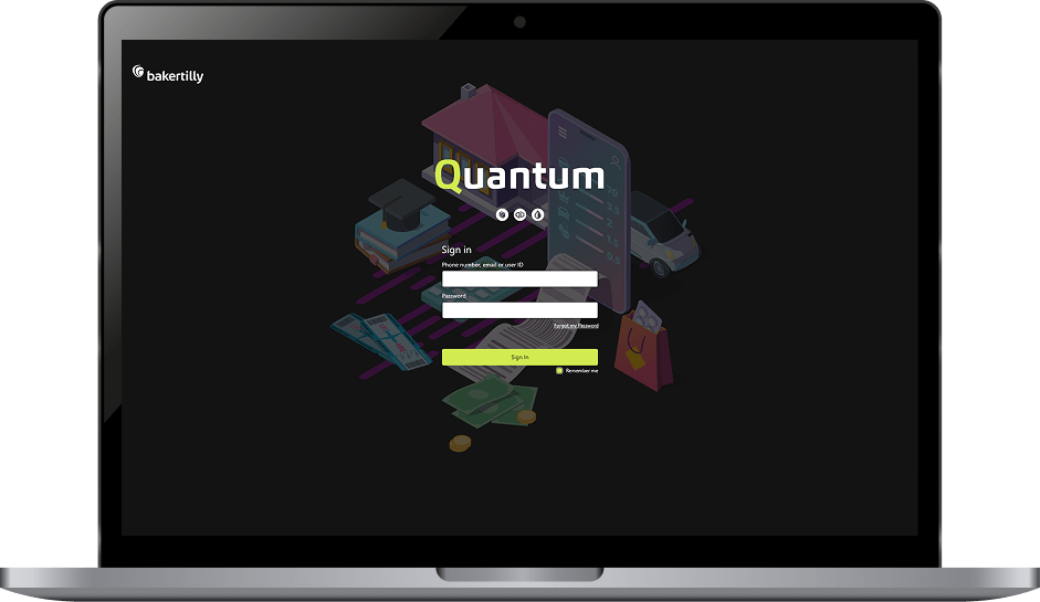
LOGIN SCREEN STREAMLINED ENTRY & CORE WORKFLOWS
Designing a clear, intentional first impression that supports efficiency, focus, and brand trust.
Key entry points and core screens were redesigned with a focus on usability, task efficiency, and visual consistency. Design decisions were guided by established UX performance goals: reducing cognitive load, improving scanability, and enabling users to move through the platform with minimal friction while reinforcing the Quantum brand.
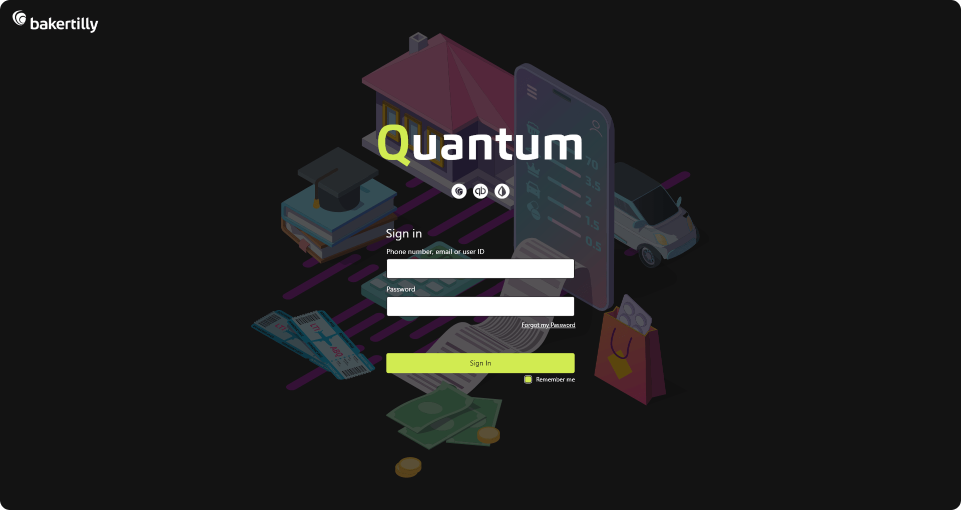
The login experience was redesigned to streamline access and reduce time to entry. A simplified layout, clear visual hierarchy, and accessible form design help users sign in quickly and confidently, minimizing friction at the first point of interaction.
UX / UI APPROACH
The UX approach emphasized clarity, predictability, and task efficiency. Screens were structured to highlight primary actions, limit visual noise, and guide users through natural interaction paths. Consistent spacing, typography, and component patterns support faster recognition and reduce the learning curve, enabling users to engage with the platform more confidently from their first session.
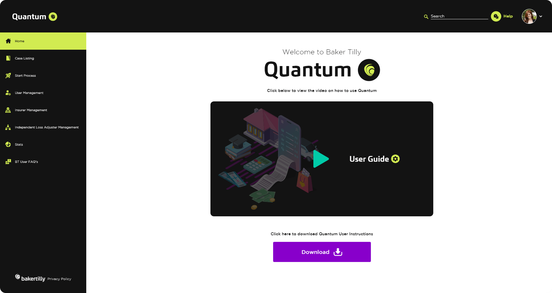
The landing page was designed to improve user orientation and comprehension. By prioritizing an introduction video and a guided walkthrough, the page helps users understand the platform’s value early, reducing confusion and supporting faster onboarding. Content is intentionally focused to direct attention toward key actions and next steps.
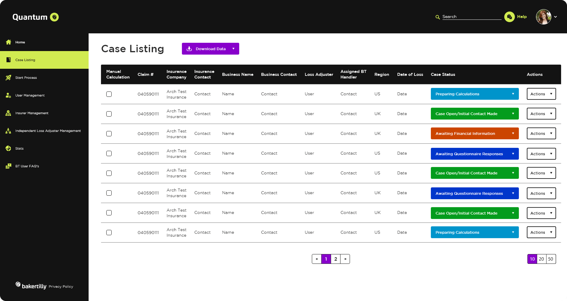
The case listing screen was designed to support high-frequency, operational workflows where speed, clarity, and accuracy are critical. The layout prioritizes scannability and information density without overwhelming the user, enabling fast recognition of case status, ownership, and next actions at a glance.
A structured table layout, consistent column alignment, and strong visual hierarchy reduce time spent searching for information and support quick decision-making. Color-coded status indicators allow users to instantly assess case progress, while clearly defined action controls minimize interaction friction and support efficient task execution.
UX OUTCOMES & PERFORMANCE GOALS
From a UX perspective, the screen was optimized for repeat use and large data sets. Filtering, pagination, and bulk selection patterns were designed to scale with volume, helping users manage multiple cases efficiently without losing context. Interaction patterns remain consistent across rows, reinforcing predictability and reducing the cognitive effort required to perform routine tasks.
UX outcomes & performance goals:
- Reduced time-to-scan for active and priority cases
- Improved task efficiency for high-volume case management
- Minimized context switching through clear status visibility
- Faster decision-making supported by color-coded state indicators
- Reduced user fatigue during prolonged, repeated usage
By combining functional clarity with visual consistency, the case listing screen enables users to stay focused on their workflow while reinforcing the Quantum brand through a clean, structured, and professional interface.
By combining functional clarity with visual consistency, the case listing screen enables users to stay focused on their workflow while reinforcing the Quantum brand through a clean, structured, and professional interface.
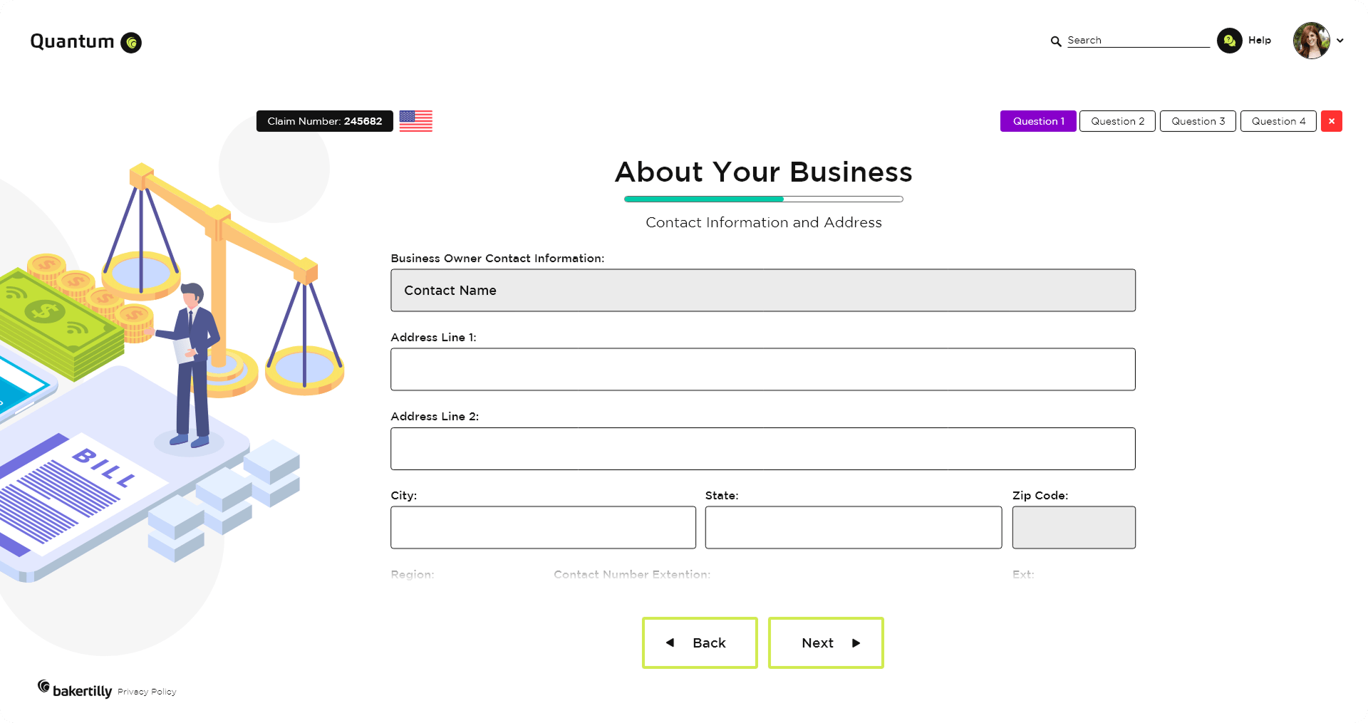
GUIDED DATA COLLECTION & ADAPTIVE FLOWS
Improving completion rates, reducing errors, and simplifying complex input through structured guidance.
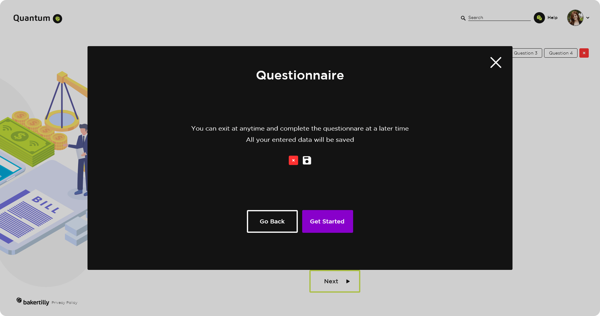
The questionnaire experience was designed to support accurate data collection while minimizing user effort. By introducing a guided, adaptive wizard, the flow was structured to reduce cognitive load, improve form completion, and increase user confidence when navigating complex requirements.
UX / UI APPROACH
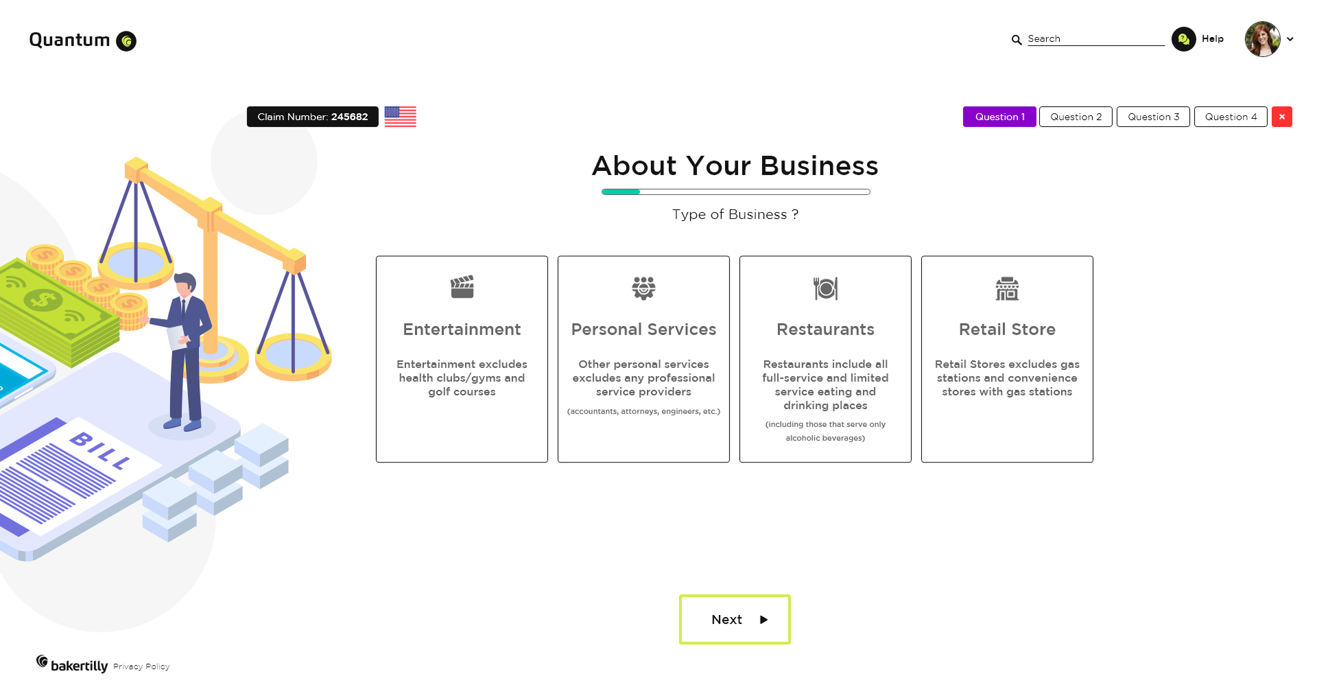
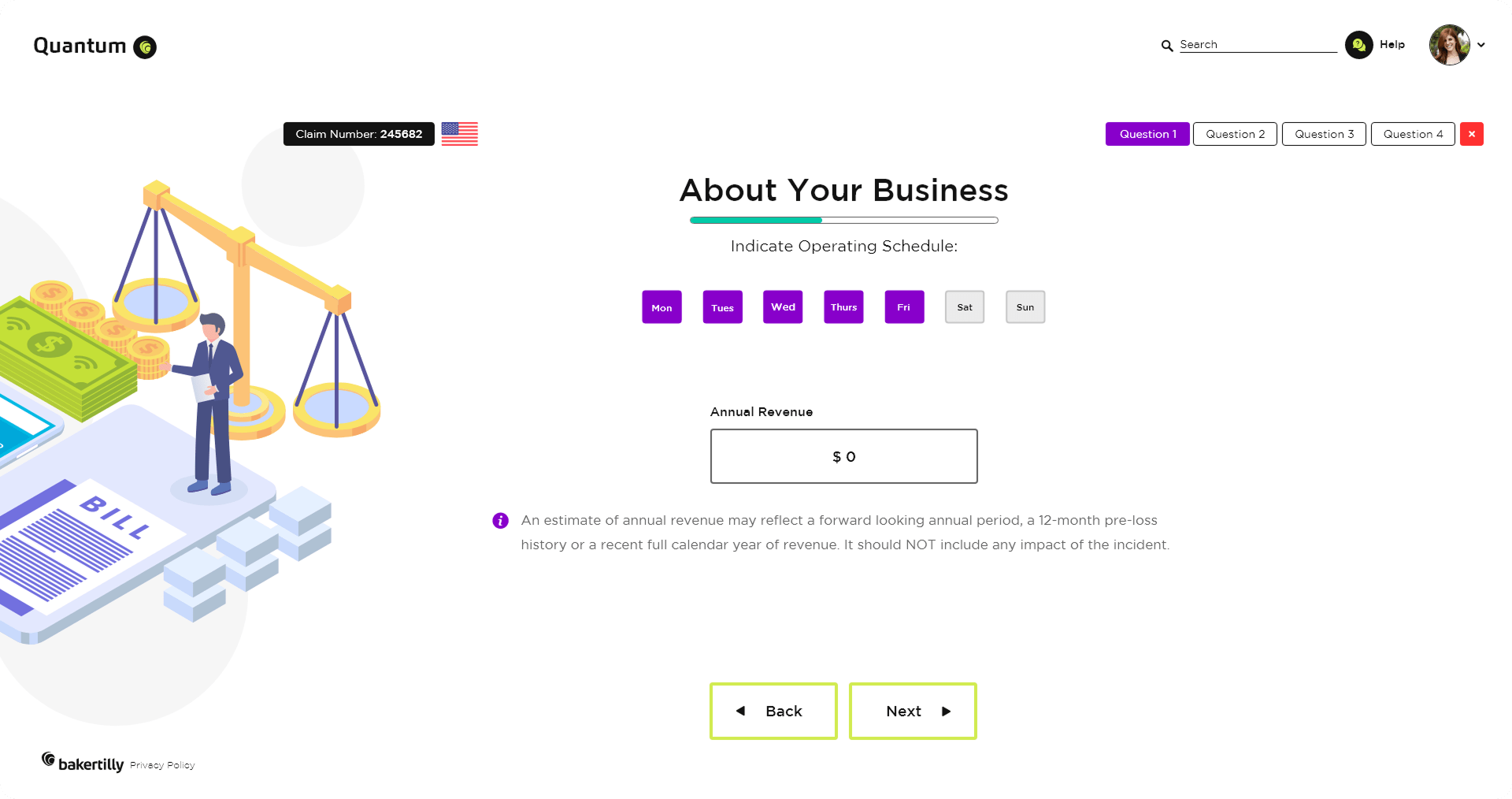
- Progressive Disclosure: Complex information is broken into manageable steps to prevent overwhelm and keep users focused on one decision at a time.
- Clear Hierarchy & Feedback: Visual hierarchy, progress indicators, and real-time validation help users understand their current position in the process and what’s required next.
- Adaptive Logic: Region-based logic ensures users only see relevant questions, reducing unnecessary effort and shortening time-to-completion.
- Error Prevention Over Correction: Inline guidance and contextual pop-ups help prevent mistakes before they occur, improving data quality and reducing rework.
- Consistency & Predictability: Reusable components, consistent layouts, and familiar interaction patterns support faster learning and confident progression.
OUTCOME-FOCUSED GOALS
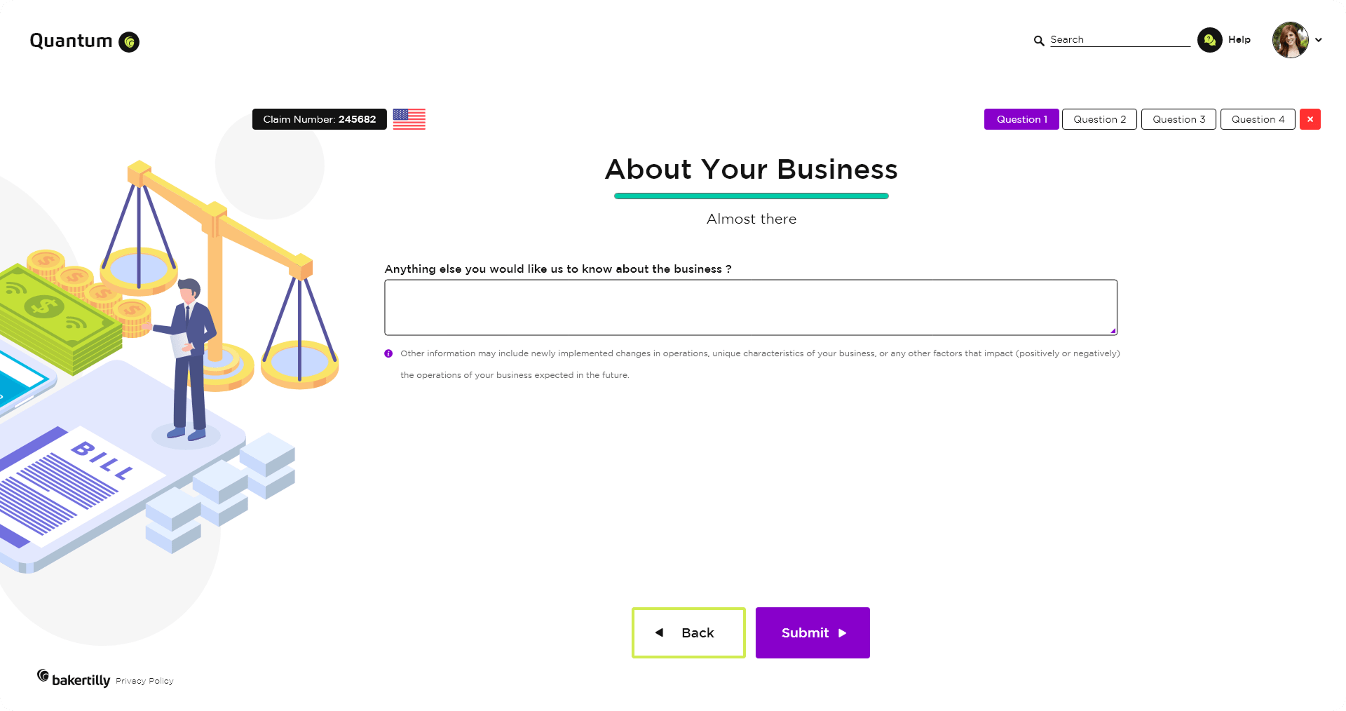
The interactive questionnaire wizard was designed to reduce form abandonment and improve data accuracy. Step-by-step navigation, clear progress indicators, and contextual prompts help users understand what’s required at each stage. Real-time feedback and validation reduce errors at the point of entry, minimizing rework and follow-up.
- Reduced cognitive load during multi-step processes
- Improved completion rates for complex questionnaires
- Decreased input errors through real-time validation
The interactive questionnaire wizard was designed to reduce form abandonment and improve data accuracy. Step-by-step navigation, clear progress indicators, and contextual prompts help users understand what’s required at each stage. Real-time feedback and validation reduce errors at the point of entry, minimizing rework and follow-up.
Outcome-focused goals:
Reduced cognitive load during multi-step processes
Improved completion rates for complex questionnaires
Decreased input errors through real-time validation
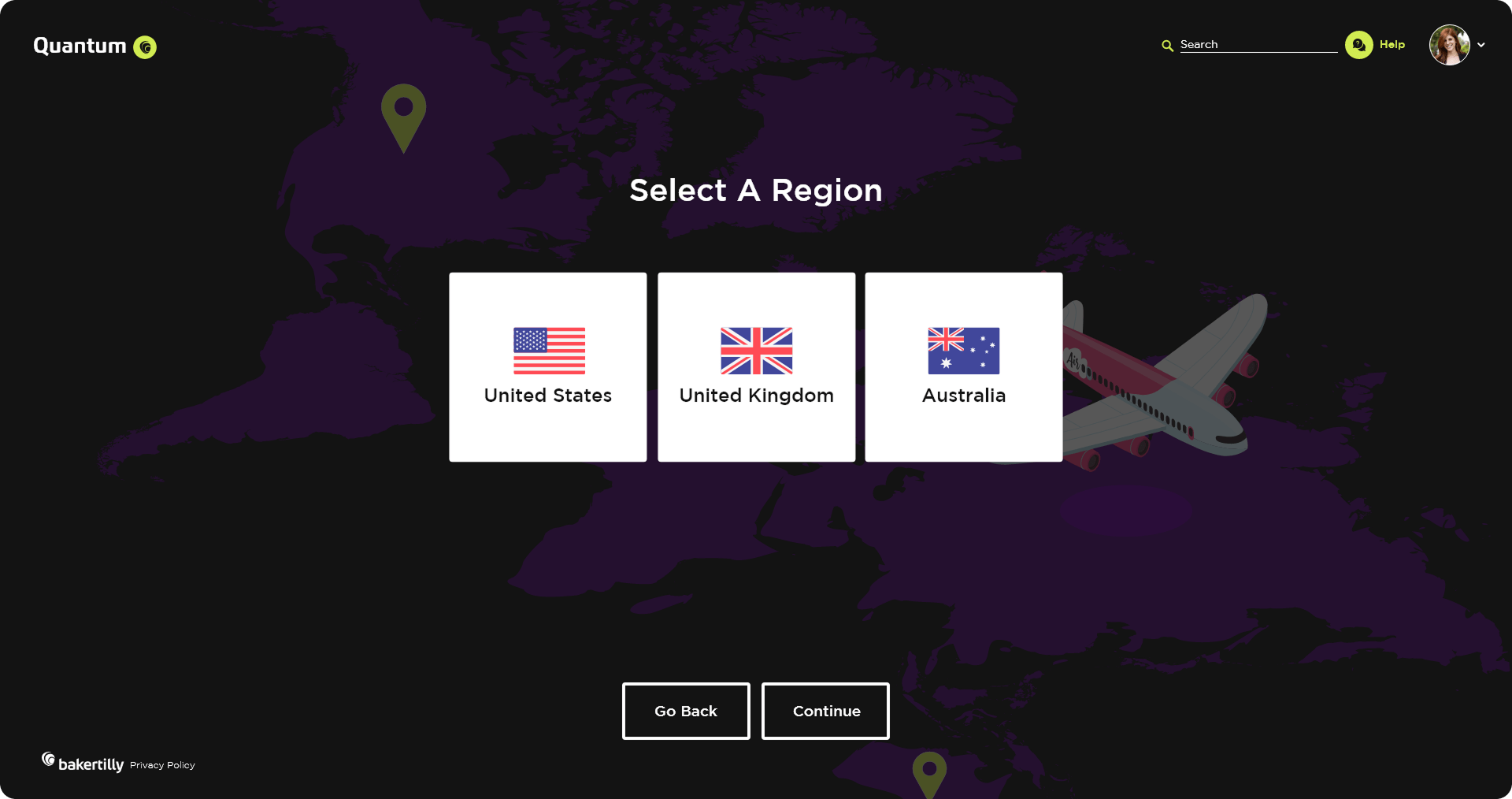
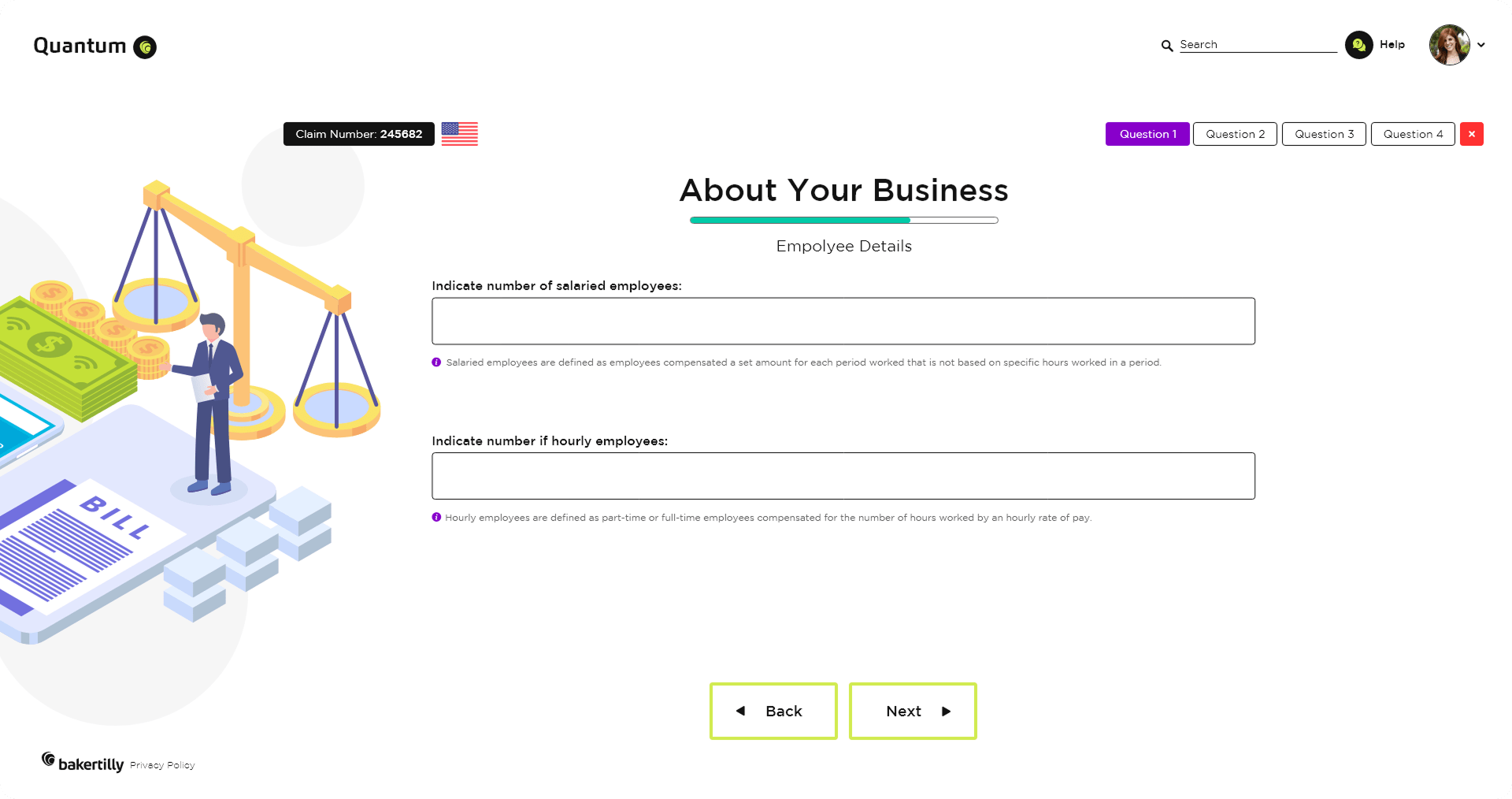
This section was structured to support faster comprehension and cleaner data capture. Questions are logically grouped and sequenced to align with user mental models, reducing hesitation and supporting confident progression.
Outcome-focused goals:
Improved scanability and question comprehension
Reduced hesitation and backtracking
Consistent, high-quality data input across submissions
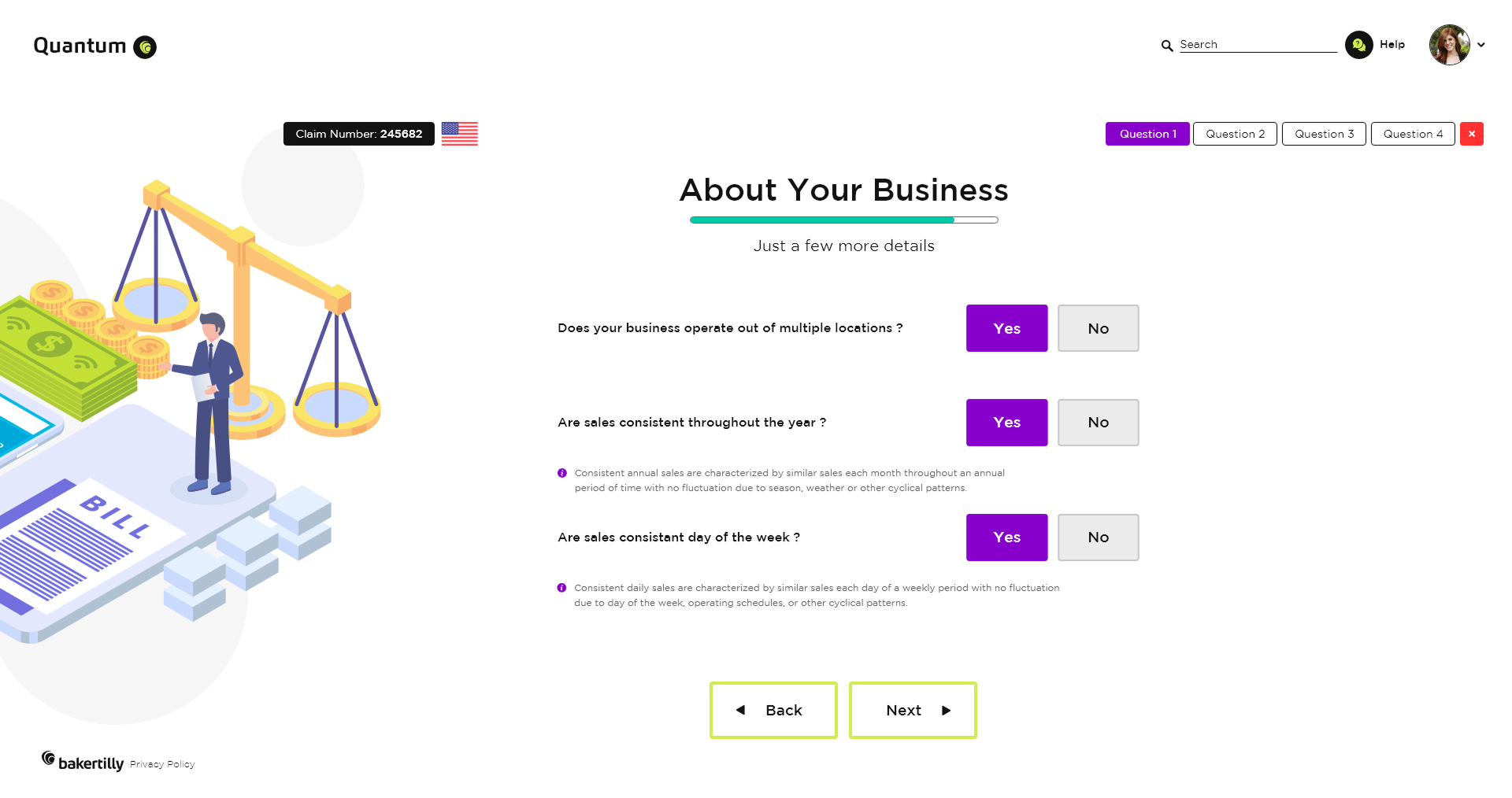
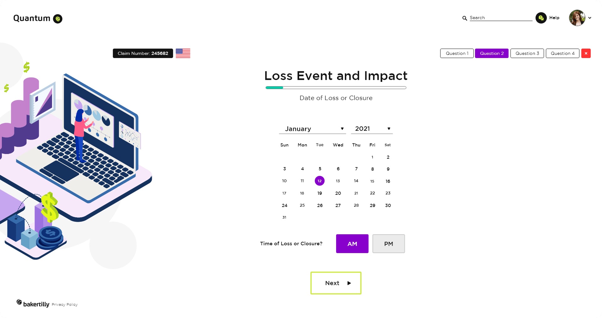
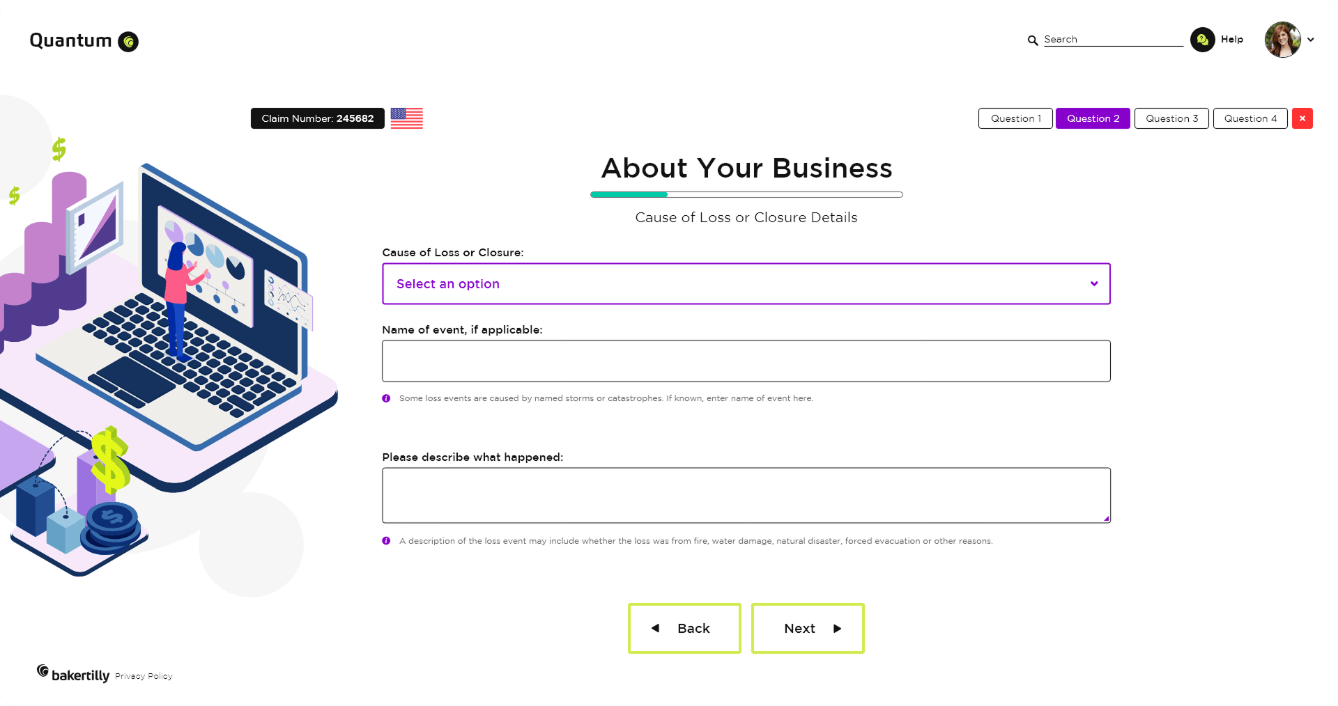
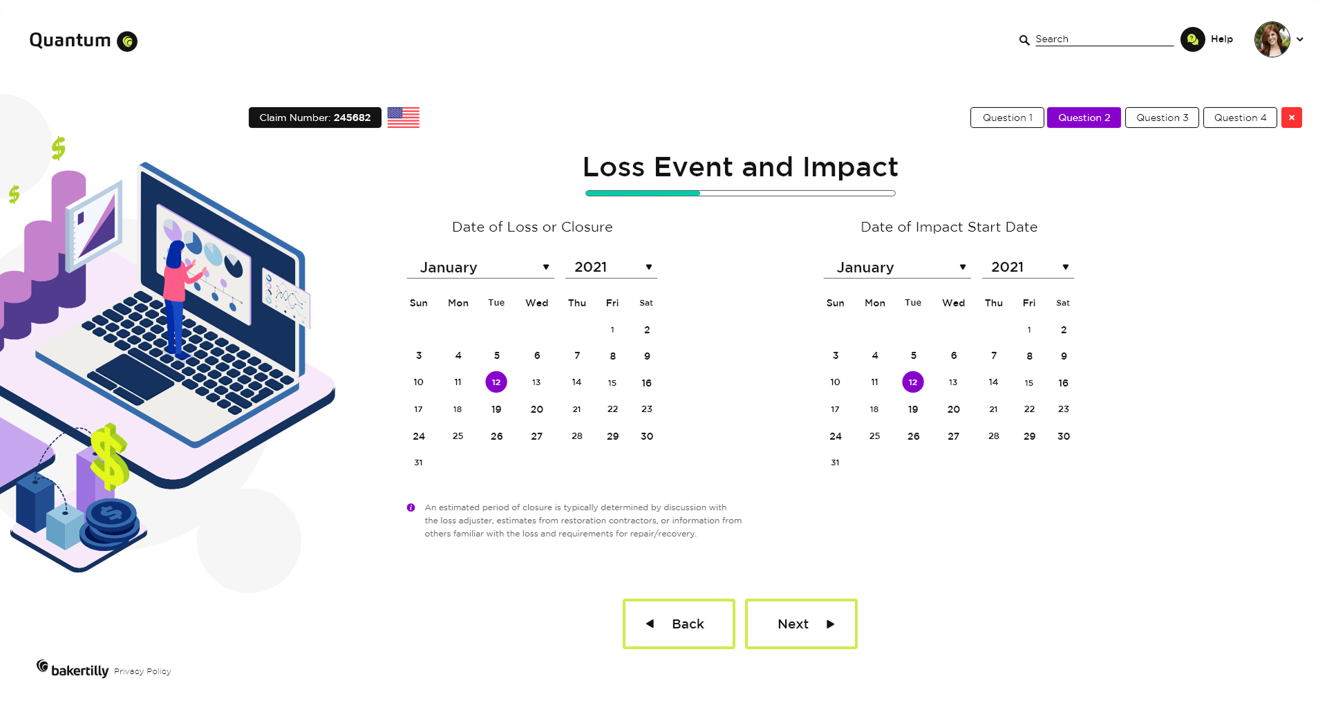
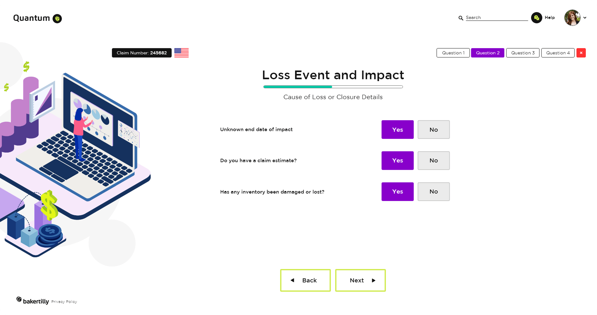
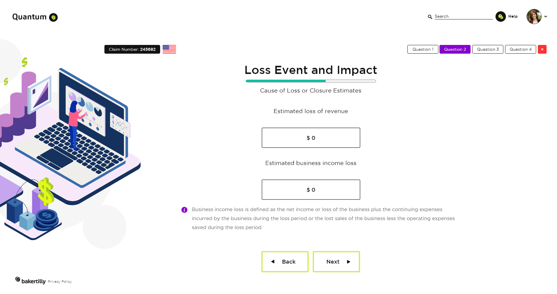
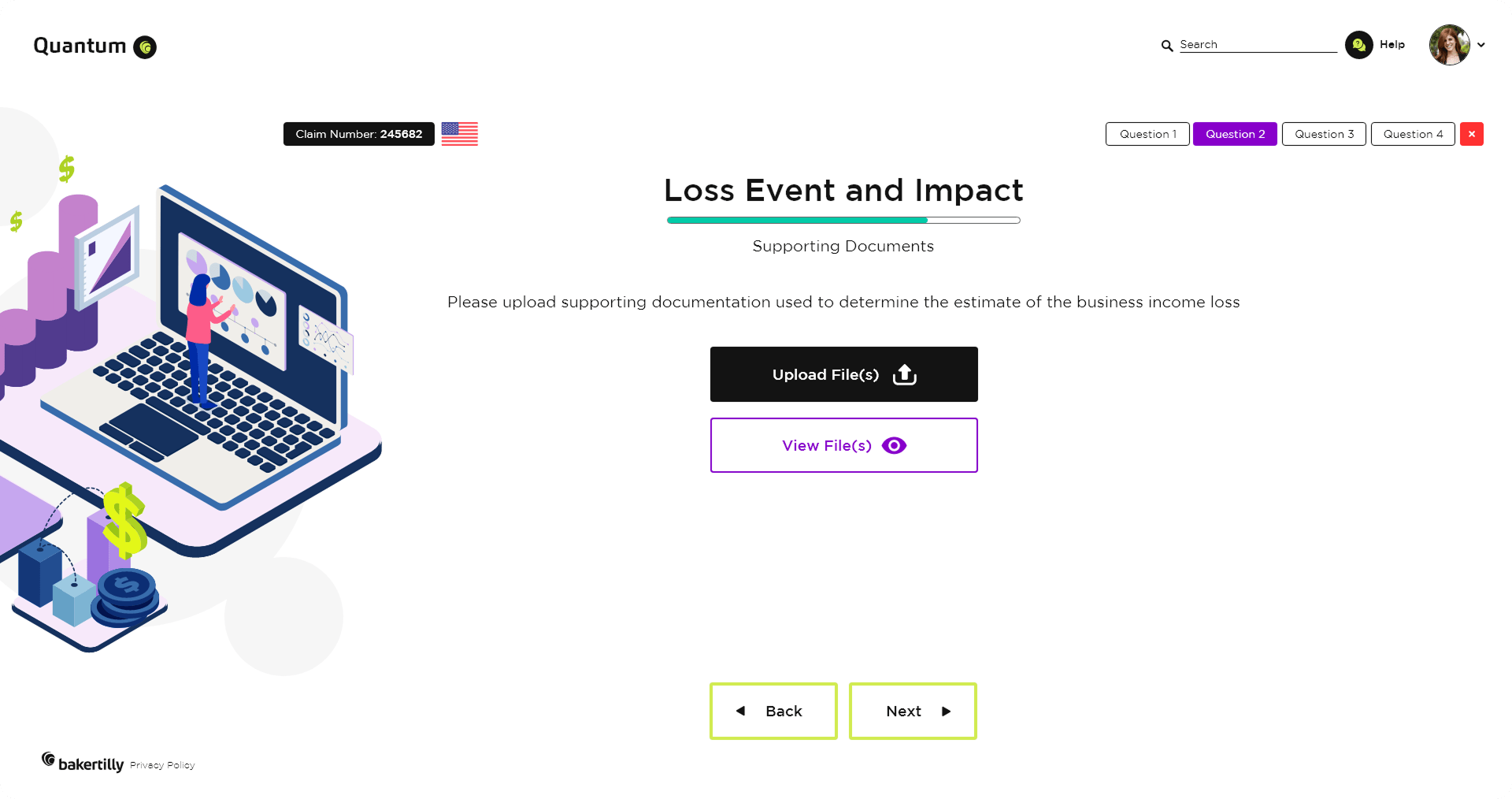
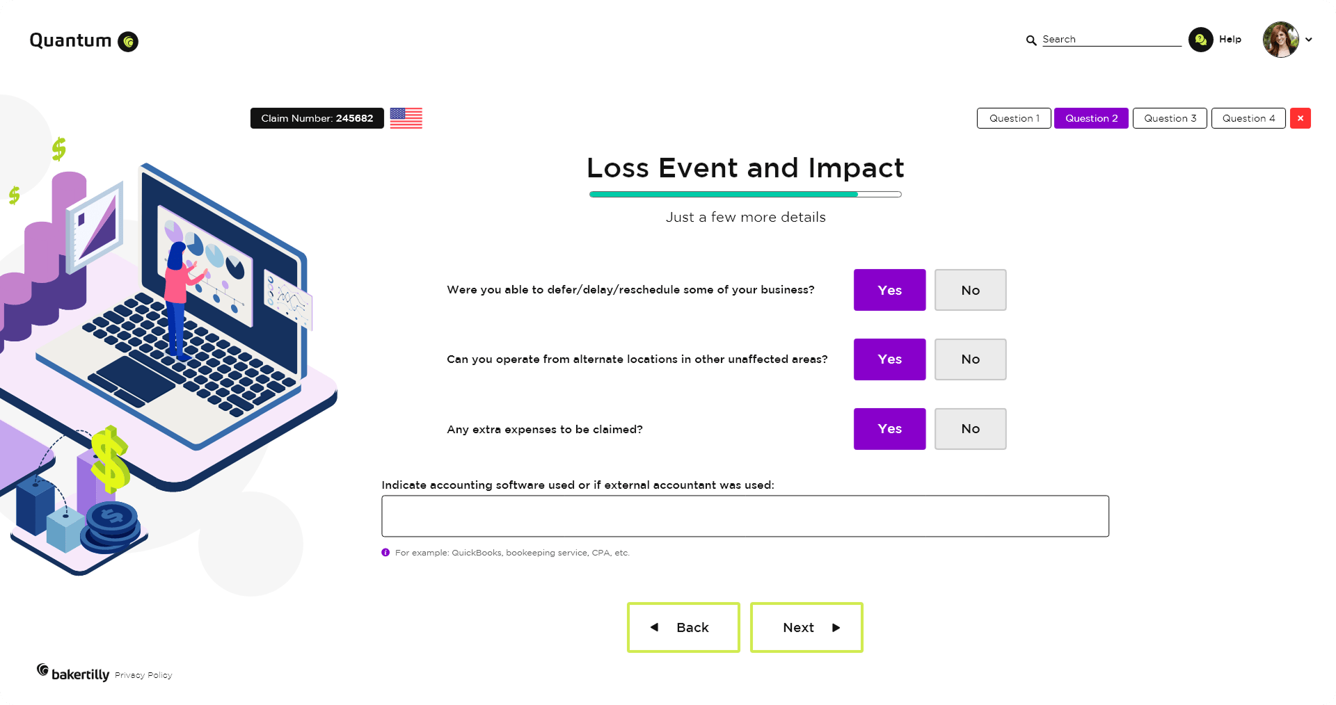
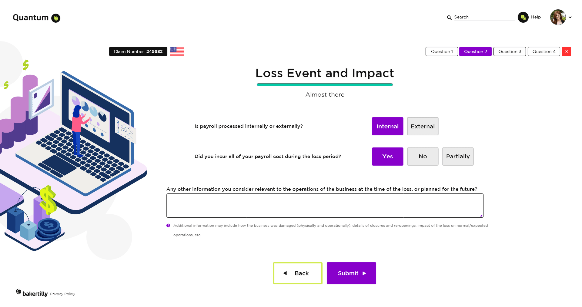
The loss event and impact flow addresses high-detail, high-stakes input by breaking information into manageable steps. Progressive disclosure and clear labeling help users stay focused, reducing overwhelm while supporting thorough, accurate responses.
Outcome-focused goals:
Reduced user fatigue during detailed data entry
Increased data completeness in complex scenarios
Increased user confidence in high-impact reporting tasks
REFLECTIONS & KEY LEARNINGS
Balancing Aesthetics and Functionality: Designing Baker Tilly Quantum reinforced that visual appeal and usability are not competing priorities. Every aesthetic decision, from the color system to the component library, was made in direct service of the user experience, ensuring the platform felt as professional and trustworthy as the firm behind it.
Brand Identity Consistency: Rebranding key screens emphasized how critical visual cohesion is across every touchpoint. When color, typography, and interaction patterns all align, the brand becomes memorable and credible in a way that no single screen can achieve alone. For a platform operating in insurance and risk management, that trust is not optional.
User-Centric Design Principles: Designing the Case Listing Screen and Questionnaire Wizard deepened my understanding of what it means to design around the user’s actual workflow, not the feature list. The best decisions in this project came from asking what users needed to accomplish, not what the platform needed to include.
Information Density & Hierarchy: Designing for enterprise data workflows meant making constant trade-offs between information density and clarity. Features like color-coded status indicators, structured table layouts, and progressive disclosure were not just design choices, they were necessary solutions to the challenge of surfacing complex data without overwhelming the user.
Guided Complexity: Integrating multi-step processes like the Questionnaire Wizard and region-based adaptive logic into a clean, approachable interface required creative thinking at every stage. The challenge was not building the flows, it was making them feel manageable.
Accessibility and Inclusivity: Designing readable layouts, strong color contrast, and clear navigation patterns reinforced how important it is to build for a diverse user base from the start. Baker Tilly Quantum needed to serve both seasoned insurance professionals and less experienced users alike, and that range of needs shaped every design decision throughout the project.
CHALLENGES I OVERCAME
Establishing a Cohesive Brand Identity: Rebranding Baker Tilly Quantum required more than updating colors and fonts. It required building a visual language that communicated innovation, precision, and professionalism across every screen. Every typographic choice, color decision, and component pattern had to feel intentional and consistent, whether a user was logging in for the first time or managing a complex caseload. Maintaining that visual cohesion across screens with very different functional demands was one of the most discipline-intensive challenges of the project.
Navigating Complex Workflows: Designing tools like the Questionnaire Wizard and Case Listing Screen presented significant information architecture and interaction design challenges. The underlying workflows were sophisticated, but sophistication in the process cannot translate to complexity on the screen. Simplifying these flows for users while fully preserving their depth demanded careful iterative testing, close attention to progressive disclosure, and a constant focus on reducing cognitive load without sacrificing data completeness.
Information Density & Layout Management: The case listing screen required balancing a high volume of structured data against the need for clarity and fast scannability. The solution was not to reduce information but to rethink how it was organized. Implementing consistent column alignment, color-coded status indicators, and clear action controls allowed the full depth of the data to remain accessible without overwhelming users during high-frequency, repeat use.
Onboarding New Users: The login and landing experience had to accomplish something genuinely difficult: orient a new user to a feature-rich enterprise platform quickly and confidently. Every screen in the entry flow had to balance visual clarity with actionable guidance. Too much information and users disengage. Too little and they feel lost. The use of a focused landing page, an introduction video, and a guided walkthrough helped ease users into the platform’s core concepts naturally, building confidence before they reached the more complex workflows.
Iterative Design Process: No design in this project was finished after the first pass. Addressing feedback from stakeholders and real-world usage was a continuous and essential part of the process. Each round of iteration surfaced new pain points, edge cases, and opportunities for refinement that were not visible at the concept stage. The willingness to revisit, revise, and rebuild was what ultimately produced an experience that met the high standards of the Baker Tilly brand.