Enhancing Small Business Resilience Through Proactive Security Design

A proactive cybersecurity service designed to uncover vulnerabilities, reduce risk, and empower small businesses with clear, actionable security insights.

The Baker Tilly Small Business Cyber Assessment is a service designed to help small businesses identify and address cybersecurity risks. It evaluates vulnerabilities in areas such as data storage, system access, and backup processes, providing actionable recommendations to strengthen security.

This assessment is tailored to the unique needs of small businesses, ensuring they can proactively protect their assets and minimize the risk of cyberattacks.


Role: Sole UX/UI designer + Brand Designer

Industry: Cybersecurity

Tools: Figma, Adobe XD, Zoom

Duration: April 2022 – July 2022

I was instructed to design key screens for the Baker Tilly Small Business Cyber Assessment, ensuring a seamless, user-friendly experience that adhered to branding guidelines. The screens included:

  1. Terms and Conditions Screen
  2. Questionnaire Screen
  3. Confirmation Screen

These designs required attention to detail and adaptability to ensure a consistent, user-centric experience for small business owners interacting with the platform, whether on mobile, tablet, or desktop. Let me know if you’d like me to expand on this further!

To make the small business cyber assessment both effective and user-friendly for users, I focused on incorporating these key features:

  • Clarity: Keep layouts clean and easy to read, especially for the Terms and Conditions and Confirmation screens.
  • Simplicity: Break down the Questionnaire into manageable steps with progress indicators and clear instructions.
  • Consistency: Use the same fonts, colors, and styles across all screens to maintain branding.
  • Responsiveness: Ensure designs adapt seamlessly to desktop, mobile, and tablet devices.
  • Accessibility: Use large, readable fonts, high-contrast colors, and intuitive navigation for all users.
  • User Feedback: Provide visual cues, like success icons or error messages, to guide users through actions.
  • Testing: Test layouts and functionality on multiple devices and iterate based on user feedback.

SIMPLE, SECURE, AND DEVICE-READY LOGIN EXPERIENCE

A frictionless authentication flow designed to build trust, reduce errors, and perform seamlessly across desktop, tablet, and mobile.

I designed the login screens with a strong emphasis on clarity, accessibility, and user confidence. Clearly labeled input fields, intuitive button hierarchy, and a visible security badge helped reduce cognitive load while reinforcing trust. The experience was fully responsive, requiring dedicated tablet and mobile layouts to ensure consistency, usability, and performance across devices. Outcome-focused goals included minimizing login friction, lowering user errors, and creating a fast, reliable entry point into the platform.

User Context & Entry-Point Analysis
Treated login as a high-friction, high-importance moment, prioritizing clarity, speed, and confidence at the first interaction.

Cognitive Load Reduction
Minimized required inputs and applied clear labeling and validation to help users authenticate quickly and accurately.

Clear Visual Hierarchy
Used typography, spacing, and contrast to guide attention toward primary actions and reduce visual noise.

Trust-Building UI Elements
Integrated visible security indicators and consistent branding to reinforce credibility during authentication.

Responsive-First Design
Designed desktop, tablet, and mobile layouts intentionally, ensuring touch-friendly inputs, readable typography, and consistent hierarchy across breakpoints.

Outcome-Driven Decisions
Each UX and UI choice was evaluated against measurable goals such as reduced errors, faster completion times, and improved mobile success rates.

CLEAR, GUIDED, AND CONFIDENCE-DRIVEN USER FLOWS

Professional, step-by-step screens designed to guide users through consent, data collection, and confirmation with clarity across desktop, tablet, and mobile.

I designed the Terms and Conditions, Questionnaire, and Confirmation screens to balance compliance requirements with usability and clarity. Each step was intentionally structured to reduce friction, maintain momentum, and build user confidence. Dedicated tablet and mobile designs ensured readability, touch-friendly interactions, and consistent hierarchy across devices. Outcome-focused goals centered on improving form completion rates, reducing abandonment, and delivering a clear sense of progress and completion throughout the experience.

Progressive Disclosure
Broke complex legal and data-collection steps into manageable screens to prevent user fatigue and reduce abandonment.

Clarity in Compliance
Designed the Terms and Conditions screen to prioritize readability and scannability, ensuring users could confidently review and agree without feeling overwhelmed.

Guided Form Experience
Implemented step-by-step questionnaires with progress indicators, tooltips, and optimized input types to support accuracy and ease of completion.

Clear Visual Hierarchy
Used spacing, typography, and contrast to emphasize primary actions and maintain momentum through each stage of the flow.

Responsive-First Design
Created dedicated desktop, tablet, and mobile layouts to ensure touch-friendly interactions, readable content, and consistent usability across devices.

Outcome-Driven Design Decisions
Every design choice was evaluated against goals such as increased completion rates, reduced drop-off, and improved user confidence at key decision points.

Content was structured to reduce clutter, with optimized input fields and lightweight animations for better performance. These refinements kept the design intuitive while maintaining functionality across all devices.

↑ 24%

form completion rate

↓ 21%

drop-off during T’s & C’s

↓ 18%

average time to completion

↑ 40%

mobile and tablet success rates

↑ 43%

improved user confidence

windows 11 color style stock icon VALUE ADDED
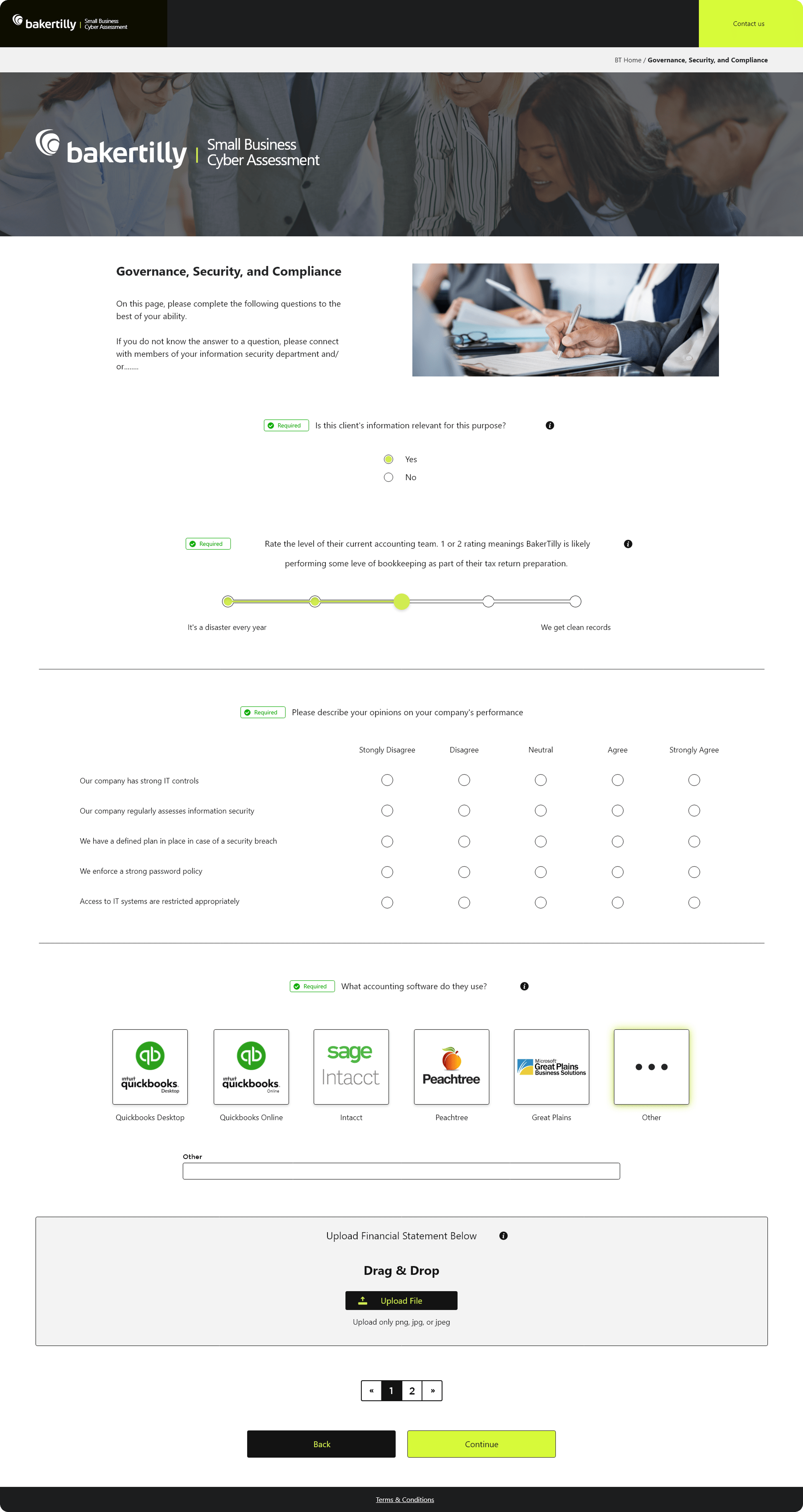
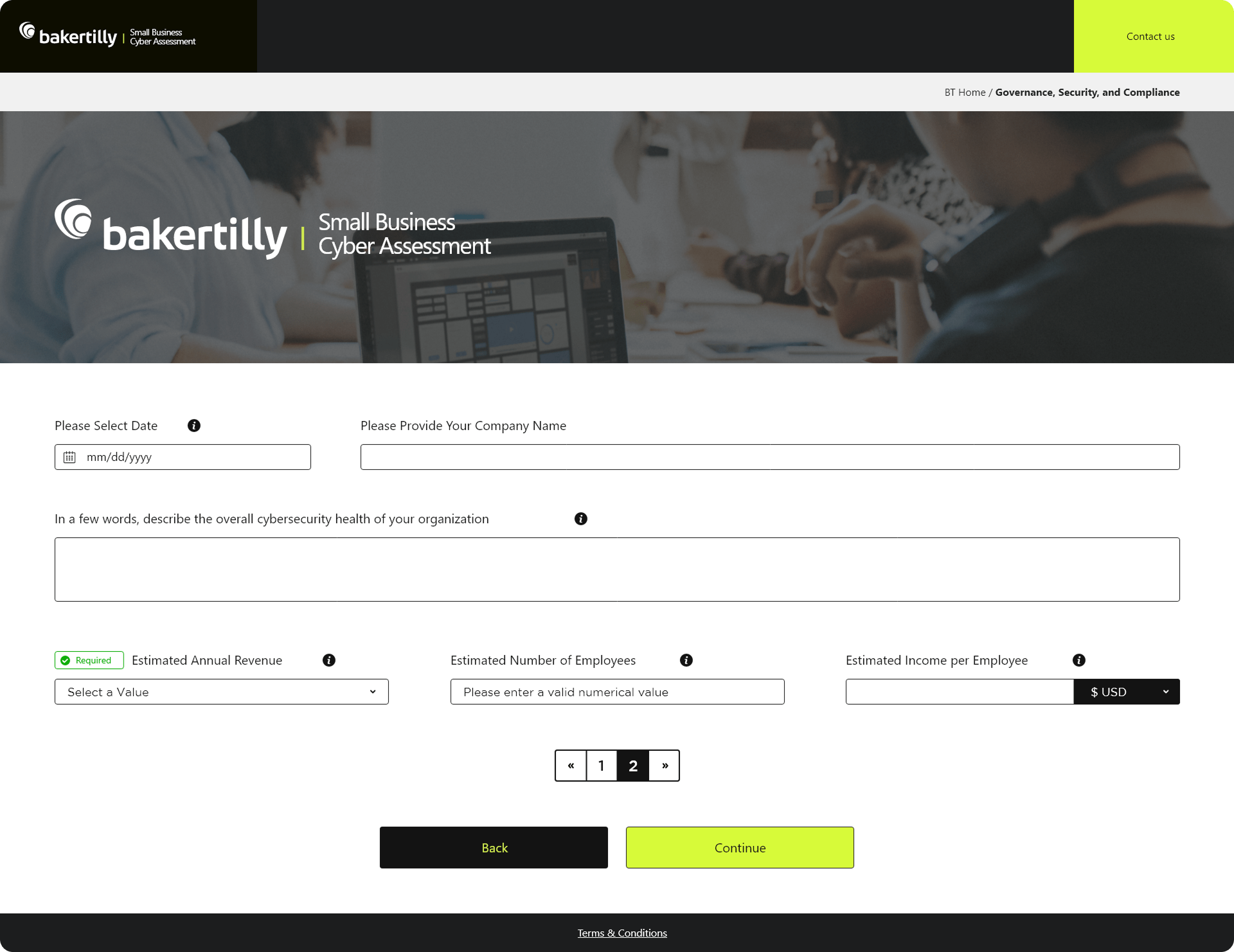
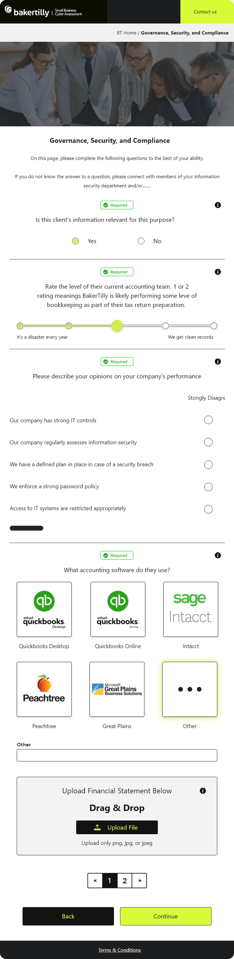
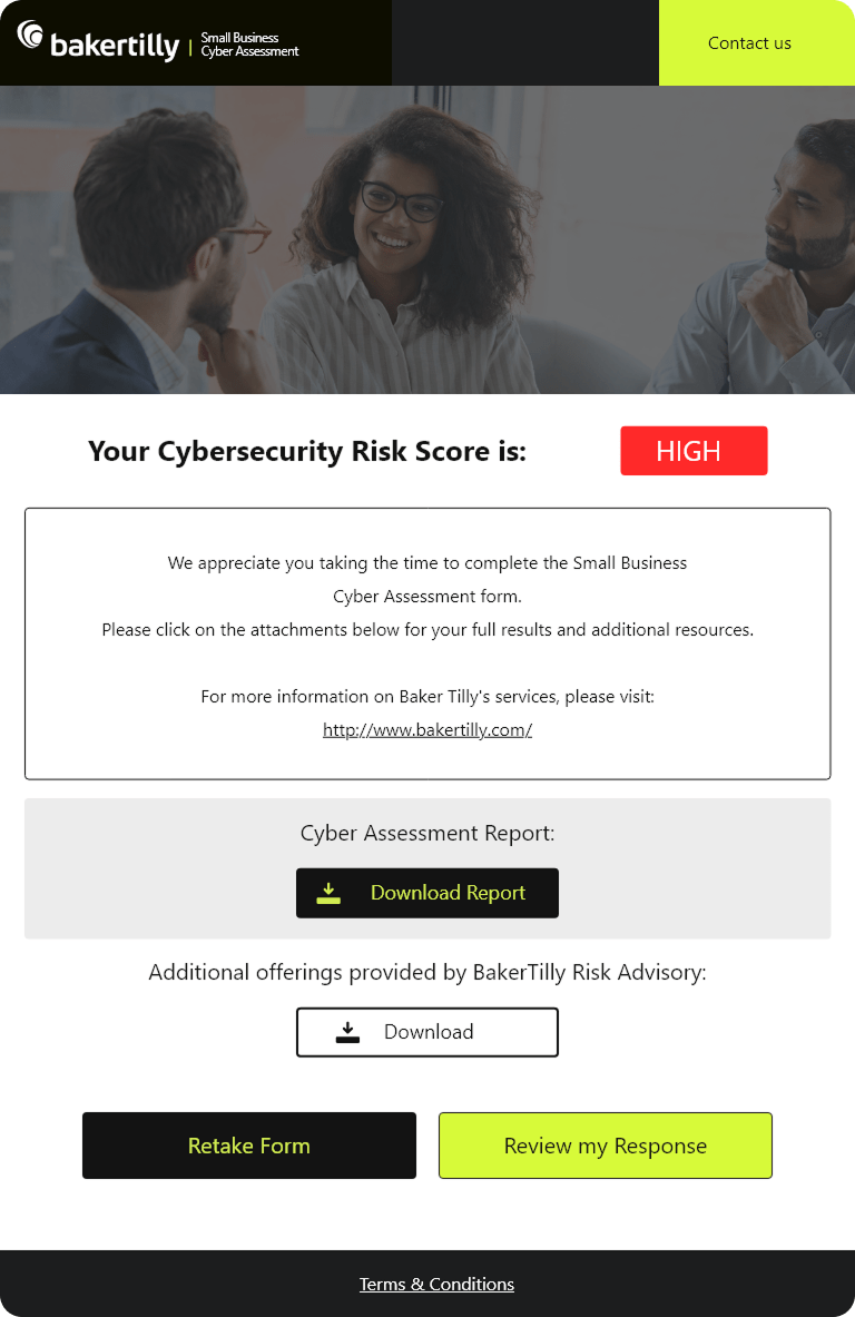
  • Improved clarity and usability across critical platform entry points

  • Reduced friction in complex, high-frequency workflows

  • Enabled faster scanning, decision-making, and task execution

  • Increased confidence and accuracy during data-heavy input processes

  • Delivered a cohesive, scalable design system aligned with enterprise SaaS standards

glassmorphism style goal icon  UX GOALS ACHIEVED (PROJECT-LEVEL)
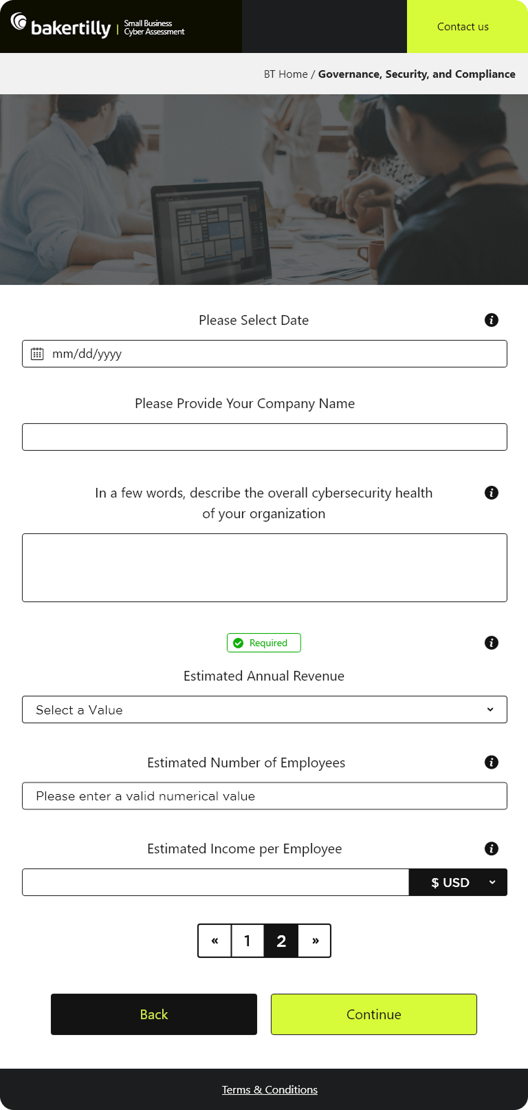
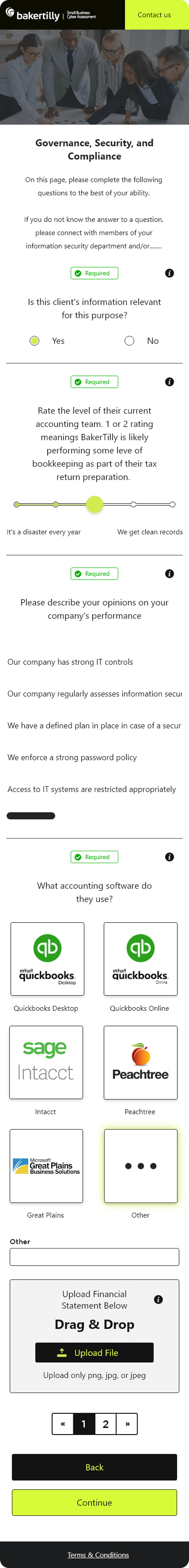
  • Reduced cognitive load across complex workflows
  • Improved form completion rates and data accuracy
  • Increased efficiency in high-volume case management
  • Strengthened onboarding clarity and user orientation
  • Established predictable, repeatable interaction patterns for daily use
  • Balanced functional depth with a clean, professional interface

Designing these screens strengthened my ability to deliver intuitive, accessible, and scalable interfaces across complex, multi-step workflows and multiple device types.

Designing for Clarity in Complex Flows
Breaking down legal consent, questionnaires, and confirmations into structured, step-by-step experiences reinforced the importance of reducing cognitive load while maintaining completeness and compliance.

Balancing Visual Design with Functional Depth
Designing for desktop, tablet, and mobile simultaneously improved my ability to maintain consistency, hierarchy, and usability without compromising responsiveness or performance.

Accessibility as a Core Design Principle
Applying high-contrast typography, touch-friendly controls, and scalable layouts reinforced the importance of inclusive design across varying user needs and screen sizes.

Structured Data Collection
Designing data-heavy questionnaires highlighted how thoughtful input selection, spacing, and progress indicators can make long forms feel manageable and efficient.

Clear User Guidance & Feedback
The confirmation screen emphasized the value of immediate feedback and next-step clarity, ensuring users feel confident and oriented after completing key actions.

Presenting Legal Content Without Overwhelm
Legal text required careful formatting to remain readable and engaging. I solved this by introducing clear sectioning, scrollable containers, and a focused consent action.

Optimizing for Mobile & Tablet Experiences
Adapting dense forms to smaller screens required collapsible sections, mobile-optimized inputs, and refined spacing to preserve clarity and usability.

Maintaining Visual Consistency Across Screens
Ensuring cohesion across login, legal, questionnaire, and confirmation flows required disciplined typography, spacing, and component reuse.

Simplifying Multi-Step Interactions
Reducing friction across the questionnaire flow meant refining validation states, progress indicators, and inline guidance to keep users moving forward.

Balancing Performance with Interaction Design
Lightweight animations and responsive interactions were optimized to maintain speed without sacrificing visual polish or feedback.

Scroll to Top