
Caroline Swart
Bringing a Dark World to Life. From Lens to Cover.
Compositing a Dark Fantasy Book Cover for an Independent Author
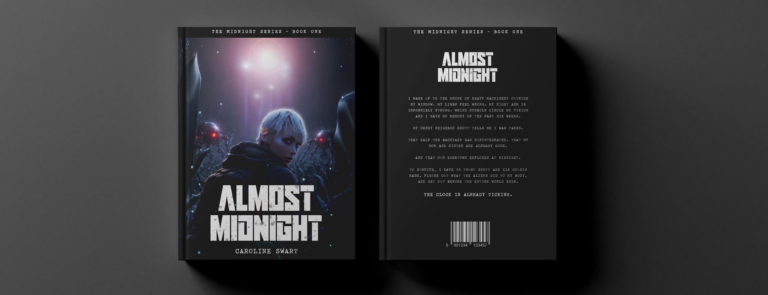
Caroline Swart is a South African author of young adult sci-fi fantasy fiction. Her debut novel, Almost Midnight, follows a young woman who wakes with alien enhancements implanted in her body and must escape a hometown set to self-destruct by midnight. It is the first entry in The Midnight Series.
The cover brief required a cinematic, atmospheric image rooted in real photography but elevated into a dark fantasy world. A location shoot in a cornfield established the character’s pose and lighting foundation. Assets including creature designs, costume elements, and environmental details were hand-sketched and drawn in Procreate before being composited in Photoshop to build the final scene, with atmospheric grading, lens flare, and particle effects completing the mood.
Role:
Graphic Designer and Compositor
Industry:
Independent Publishing / YA Fiction
Tools:
Photoshop and Procreate
Duration:
2024
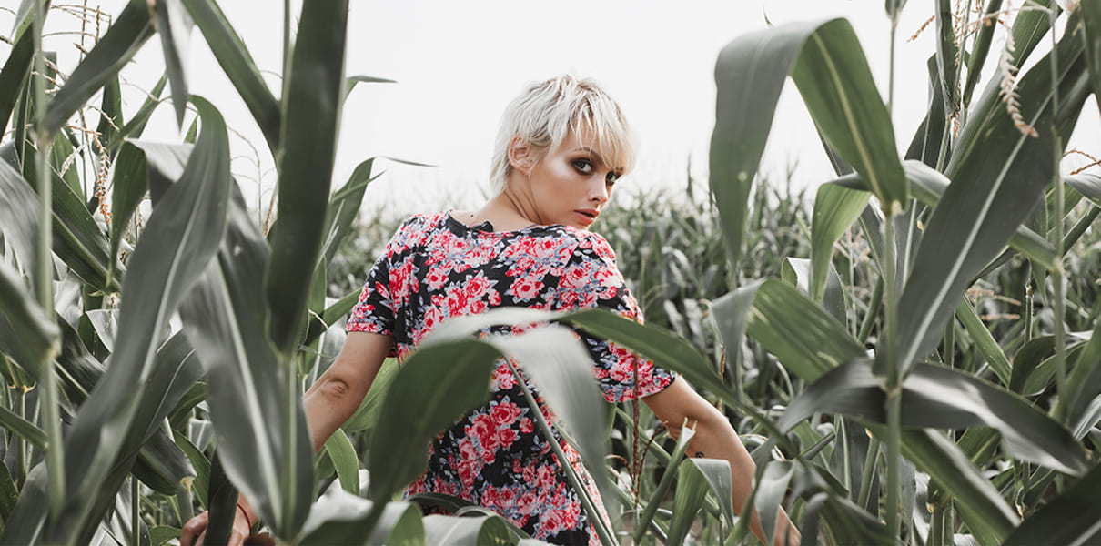
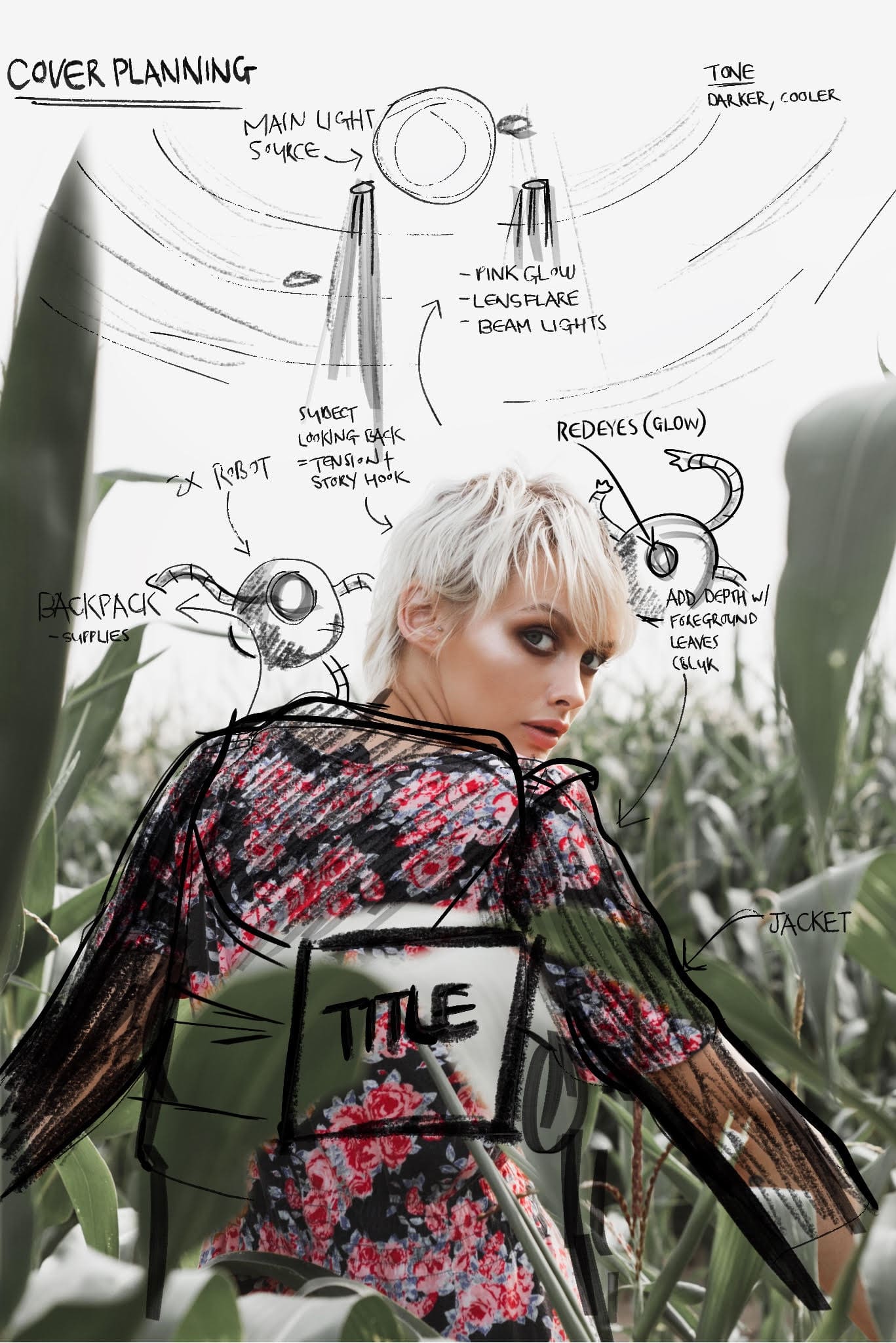
From Reference to Composite
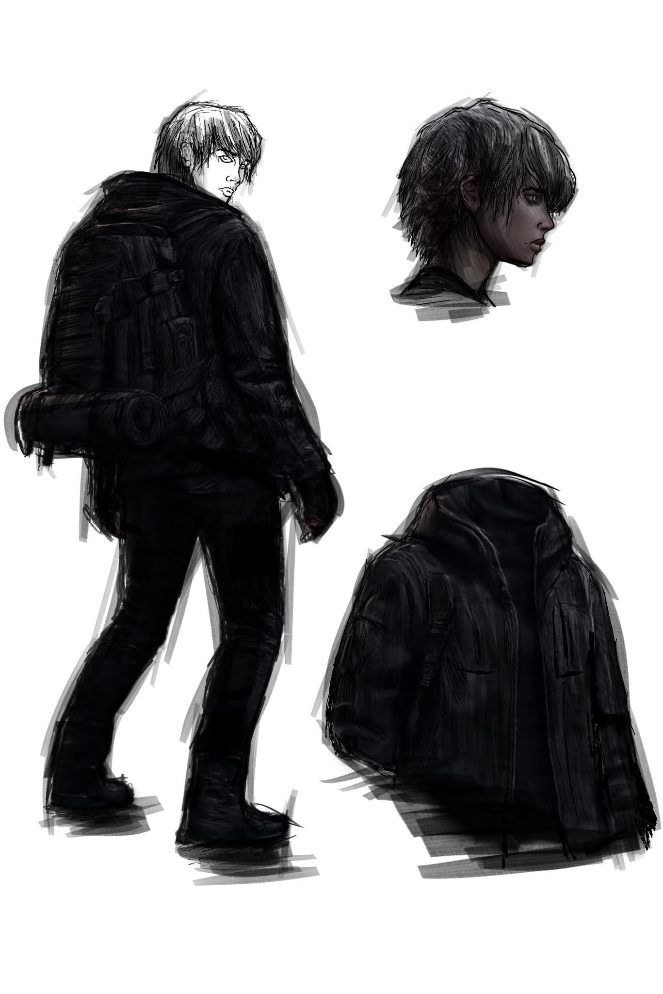
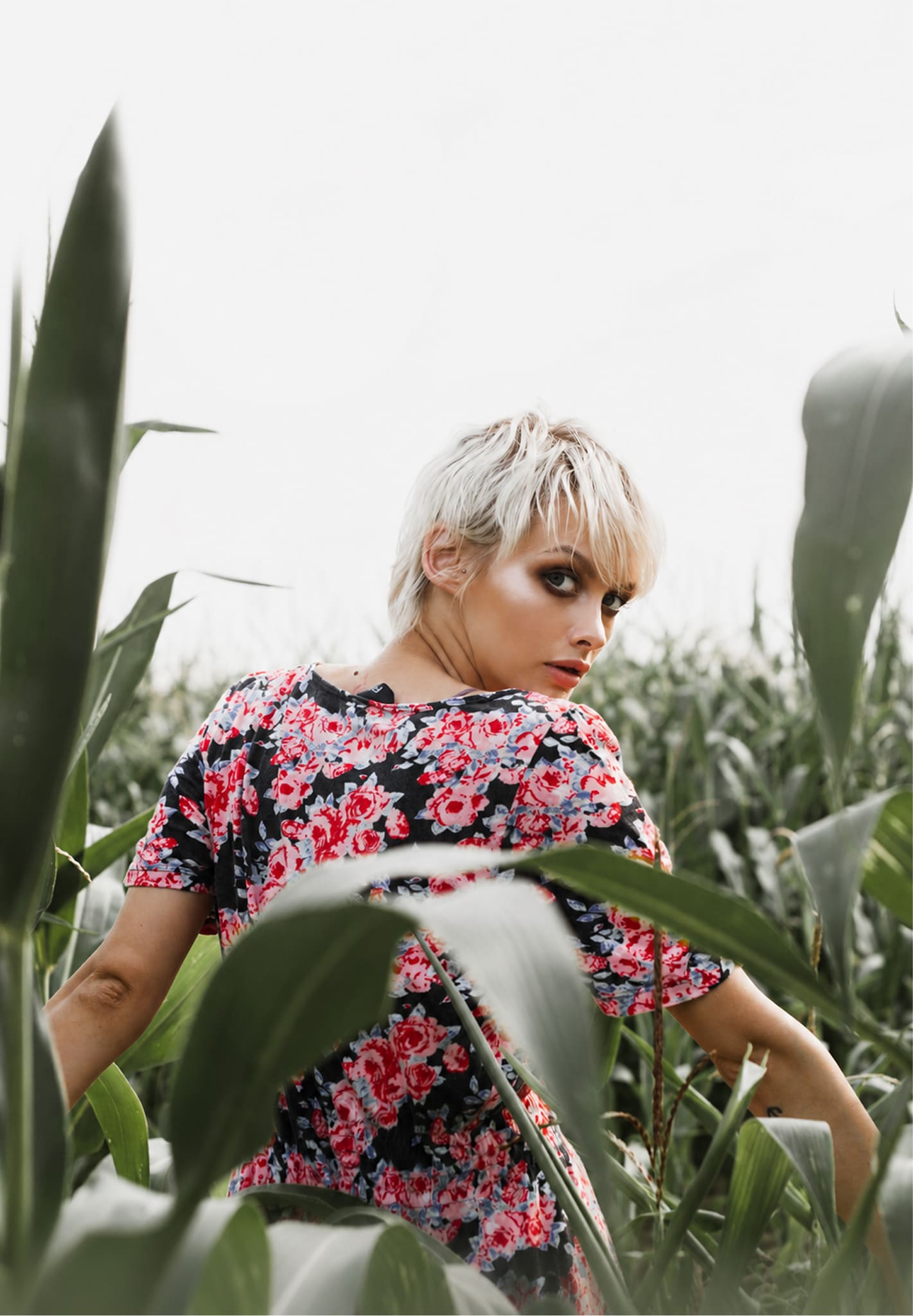
The floral dress version was tested against the brief but ultimately the black tactical jacket won out, reading far more convincingly against the dark, cool-toned composite environment and better reflecting the character’s role in the story.
Asset Development
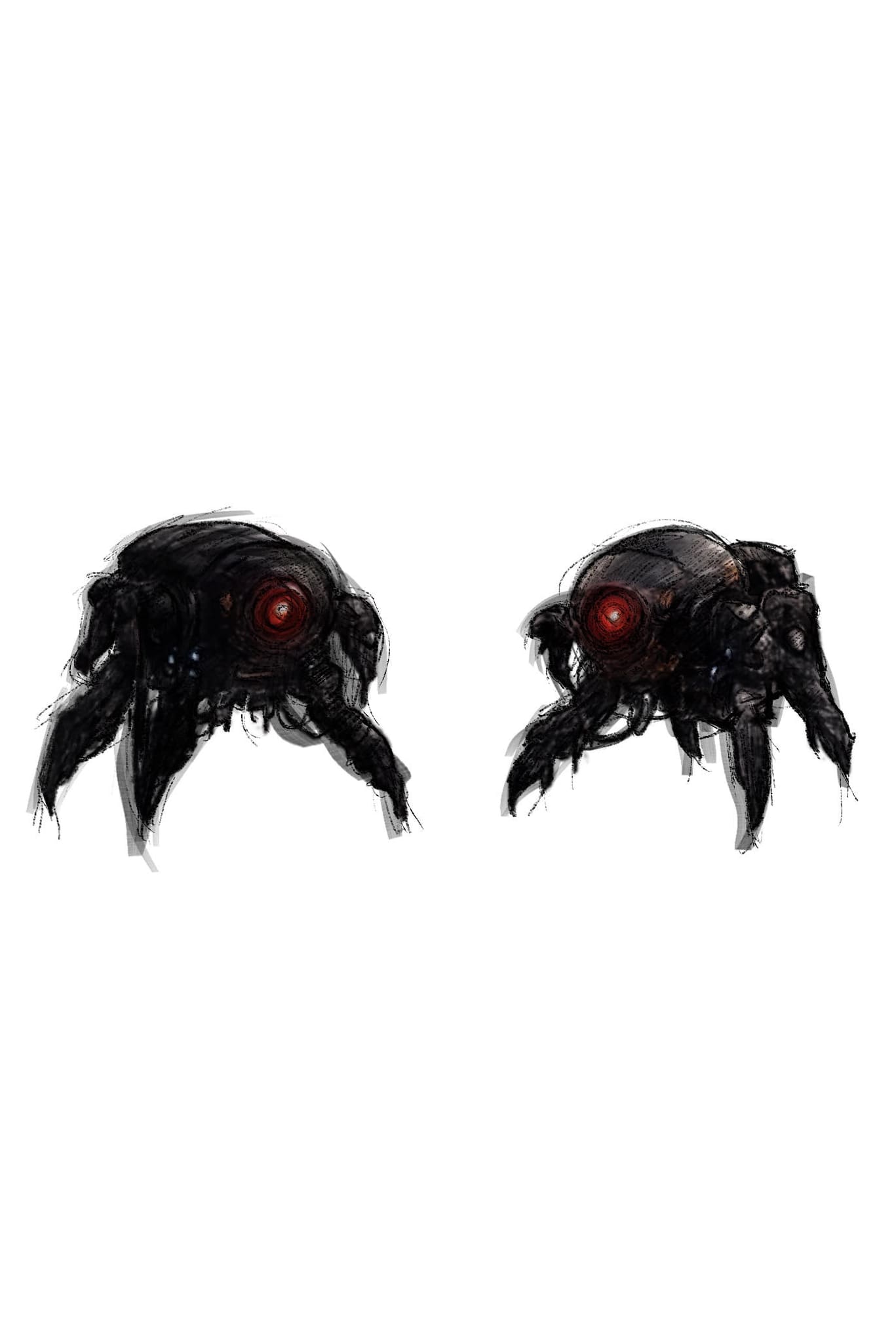
With the hero photography locked, attention shifted to building the world around the character. Creature designs were sketched and refined in Procreate through multiple iterations, exploring different silhouettes, scales, and viewing angles to find the right balance of threat and presence.
The goal was a design that felt grounded in the story’s sci-fi aesthetic without overwhelming the character. Costume details, backpack elements, and environmental foliage were developed alongside the creature work, ensuring every asset was built with the final composite in mind rather than treated as isolated illustrations.
Compositing and Grading
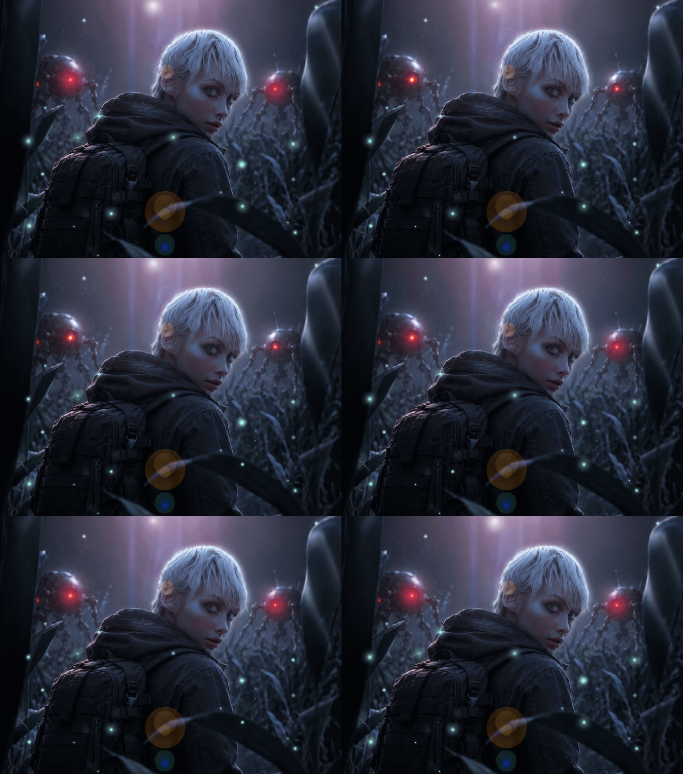
Atmospheric lighting, lens flare, and scattered particle effects were added to reinforce the otherworldly mood.
A unified cool-toned grade was applied across the entire composition to tie every element together into a single coherent world.
Typography was set and positioned to complement the image without competing with the character, following established conventions of the dark fantasy genre.

Final Design
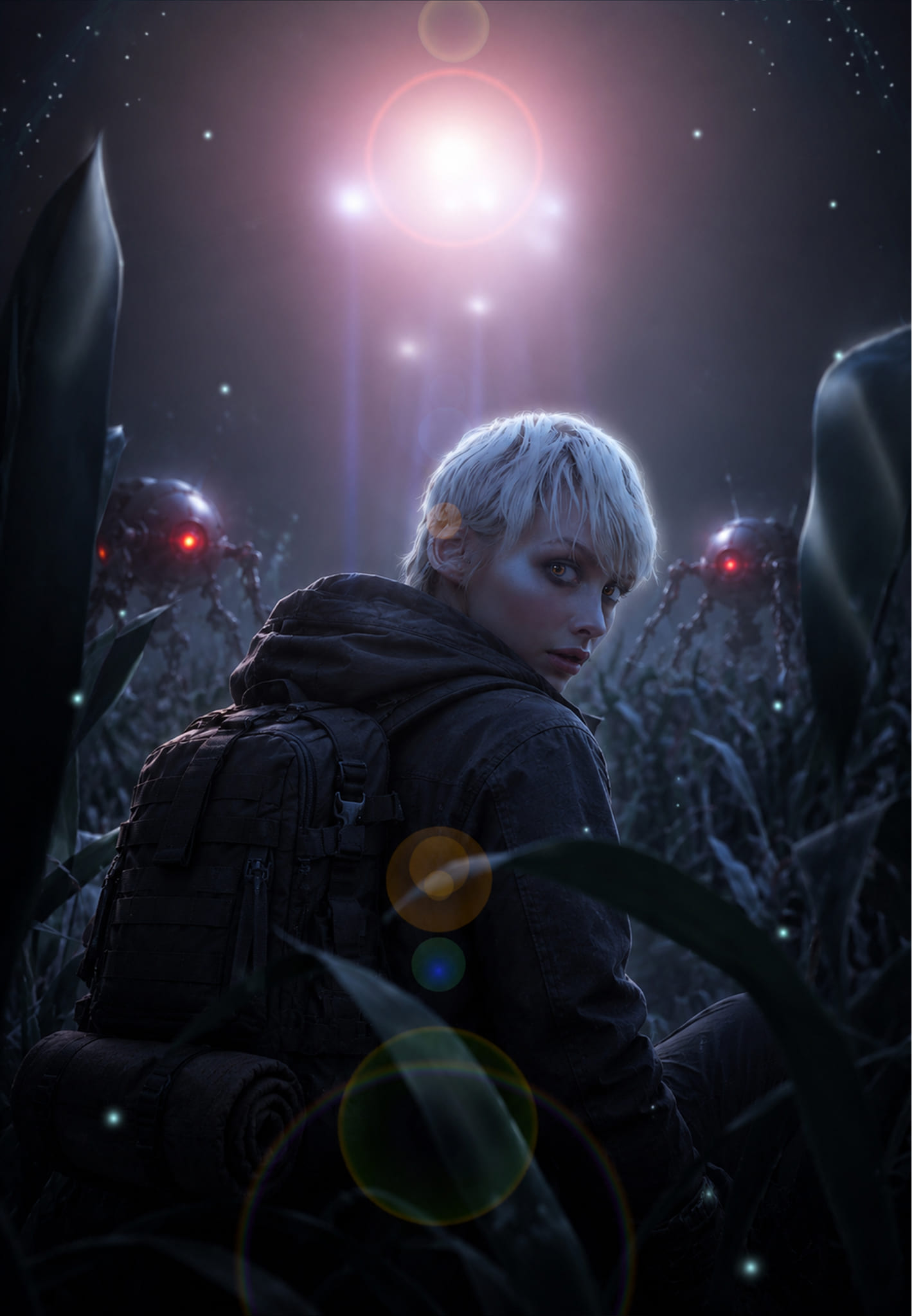
The completed cover brings together real photography, hand-drawn illustration, and digital compositing into a single cohesive image. The result is a print-ready book cover that positions Almost Midnight confidently within the dark YA fantasy genre, balancing cinematic atmosphere with strong character presence.
Colour grading and mood were refined across multiple iterations. Early composites leaned too warm, softening the tension the story required. The final grade pushed toward a cool, de-saturated blue-teal tone, pulling the scene into night and reinforcing the sense of threat.
The creatures’ red glowing eyes were left intentionally warm to create contrast against the cold environment, drawing the eye and adding a focal point of danger flanking the character.
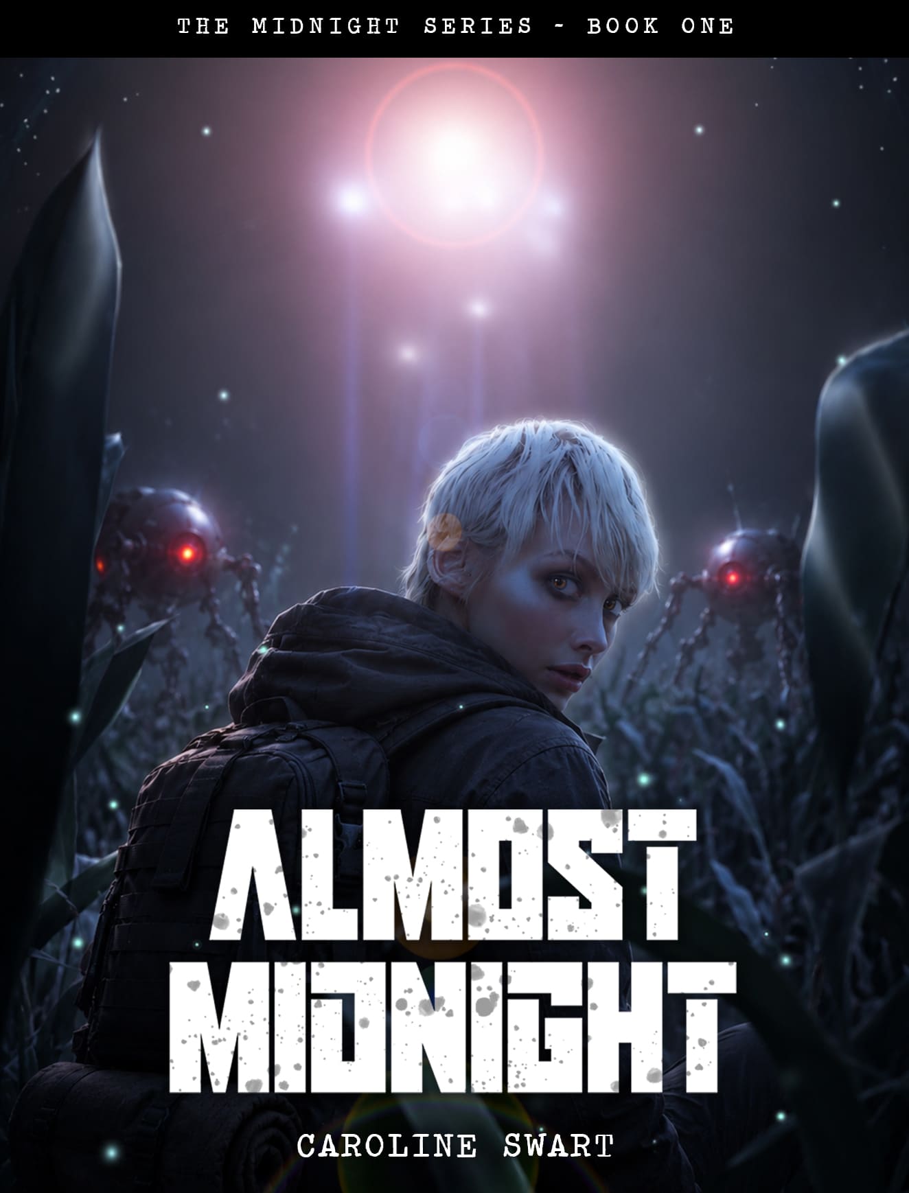
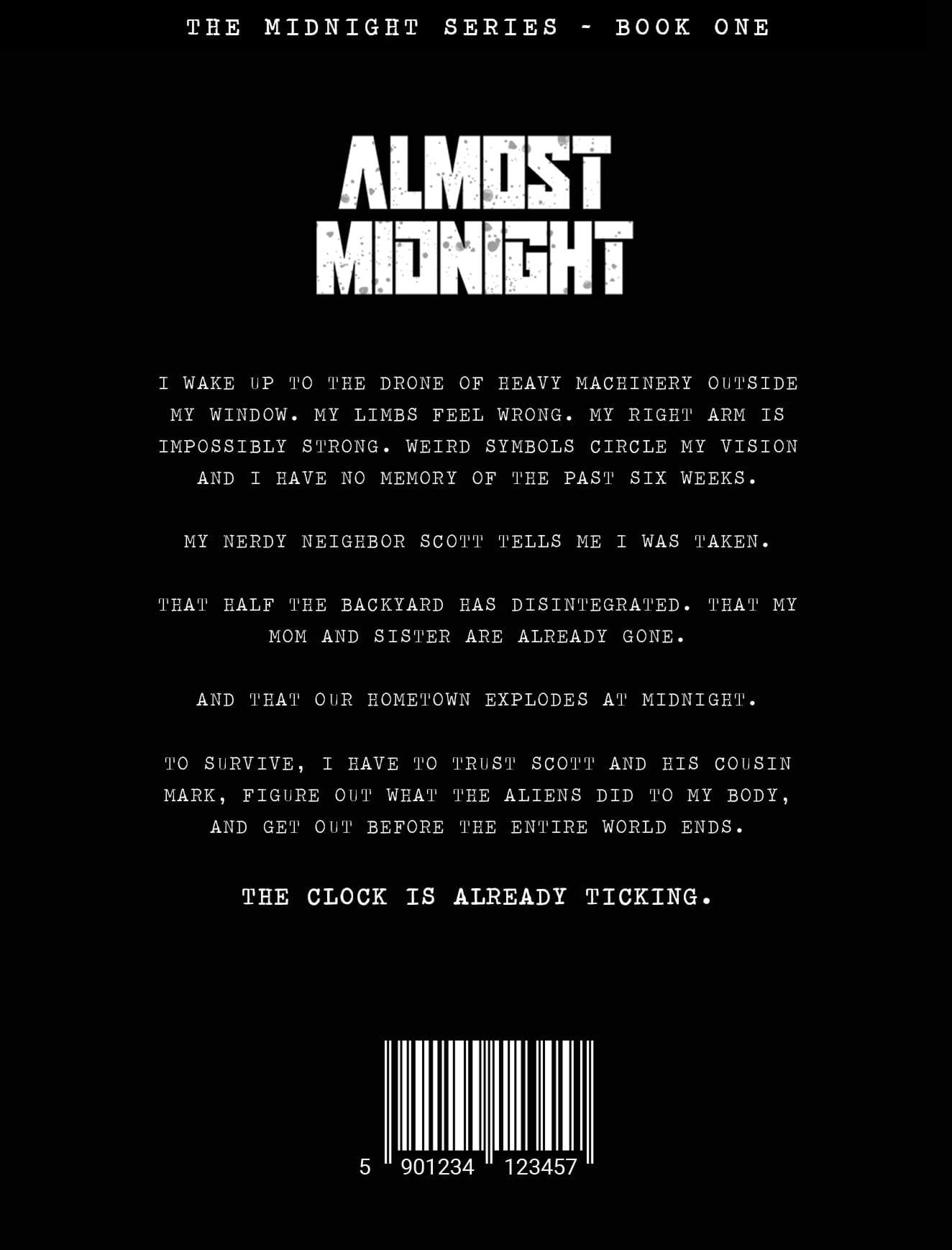
The title treatment was positioned low on the cover, allowing the character’s face and the atmospheric light source above to dominate the upper two thirds. This follows established dark fantasy genre conventions while keeping the composition uncluttered and cinematic.
For the back cover, the layout was kept minimal. A concise blurb was written from scratch in the first-person present tense to match the voice of the novel, dropping the reader directly into the protagonist’s disorientation. Rather than summarising the plot, the copy was structured to raise questions and build tension, closing on a single line designed to sit just above the barcode area. No author bio was included, keeping the focus entirely on the story.