
![]()
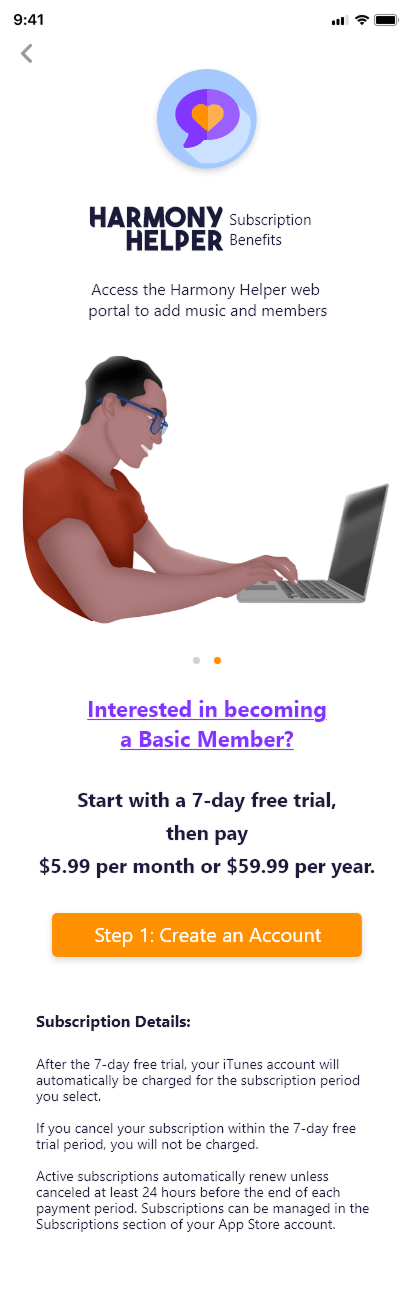
Mobile App Design
![]()
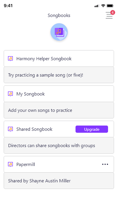
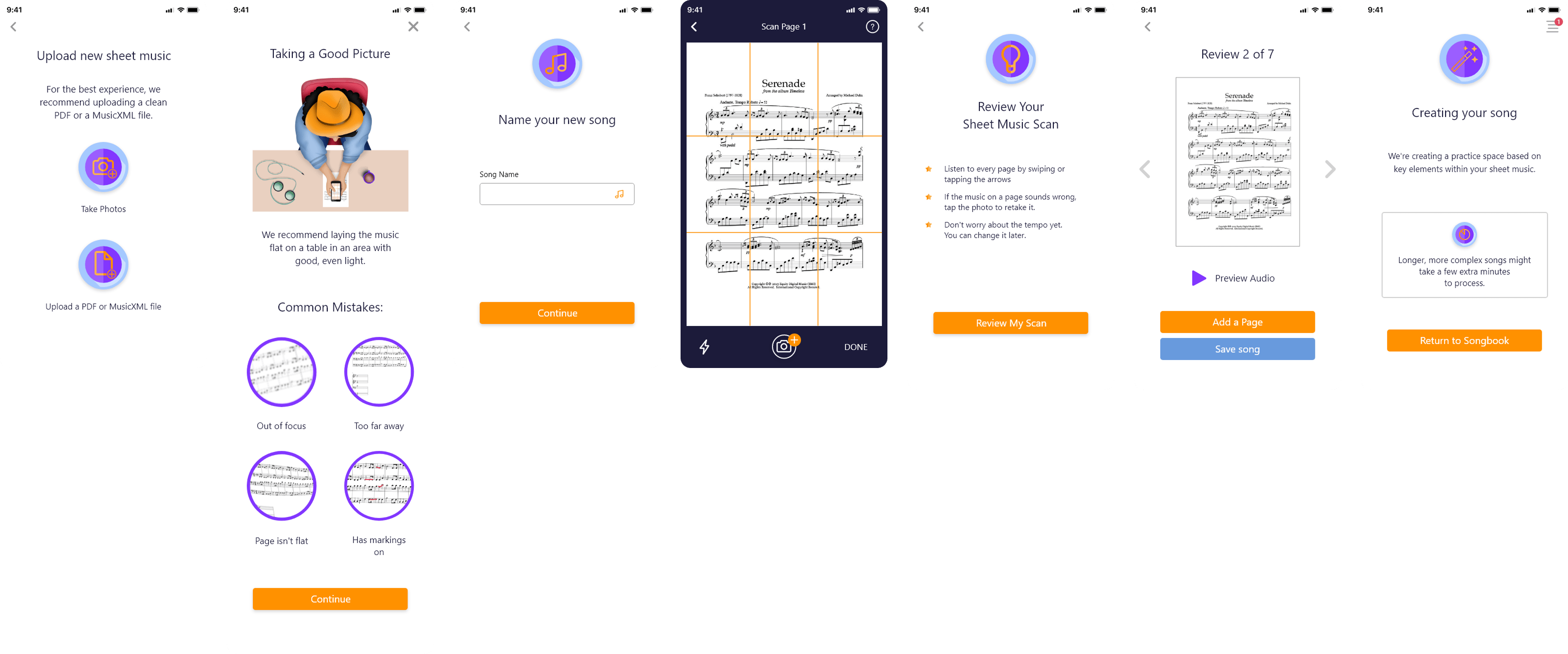
Song Library and Upload Features

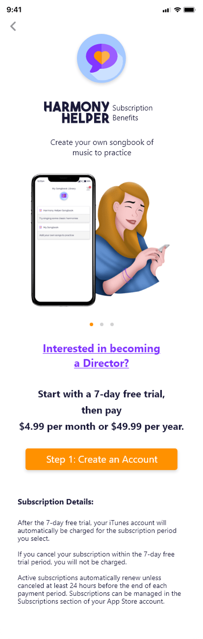
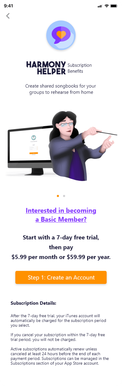
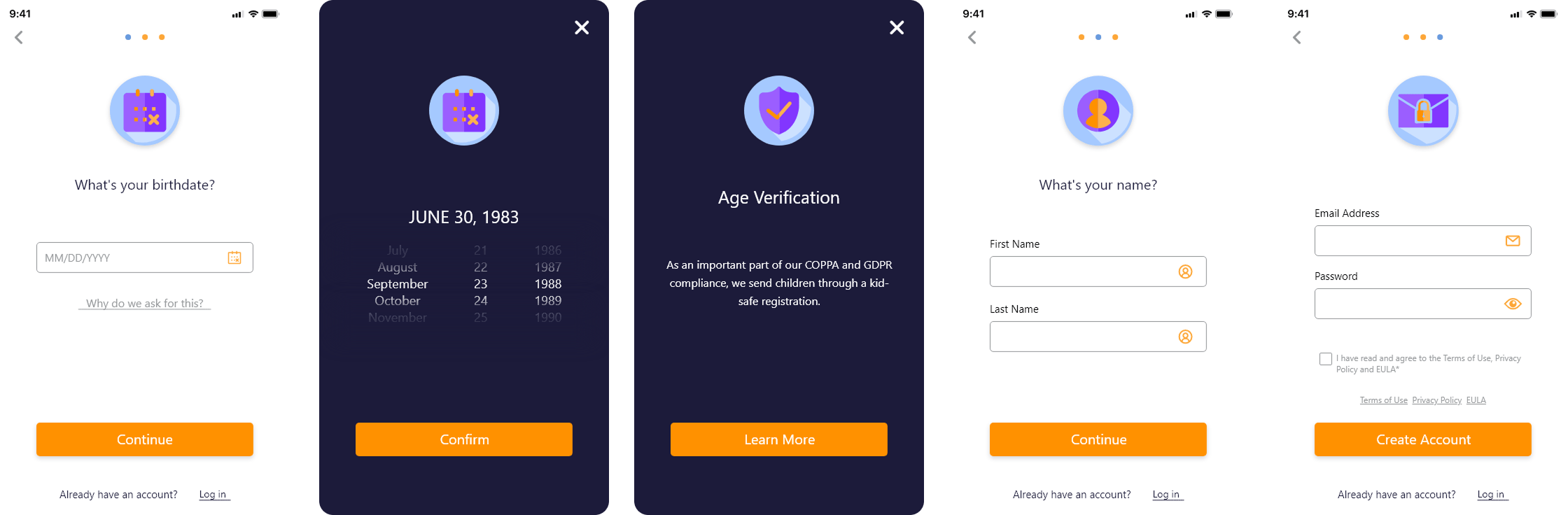
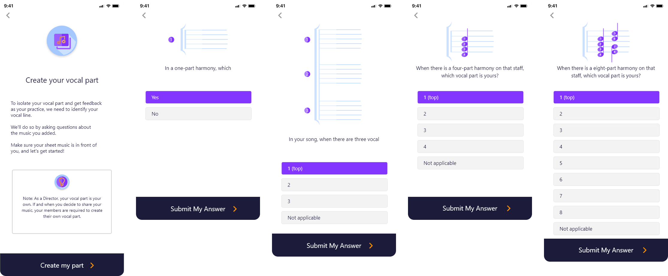
Questionnaire Walkthrough Wizard
![]()
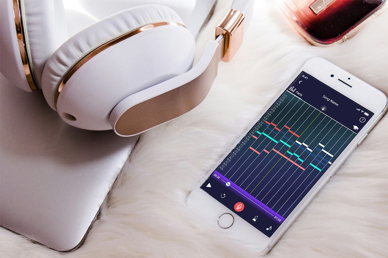
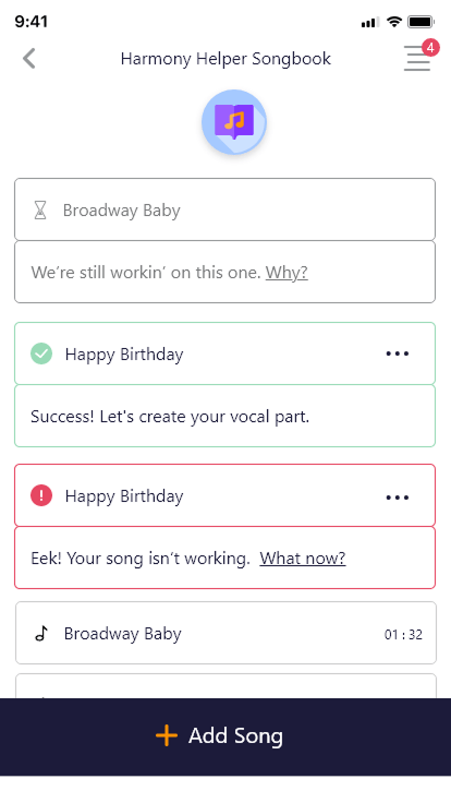
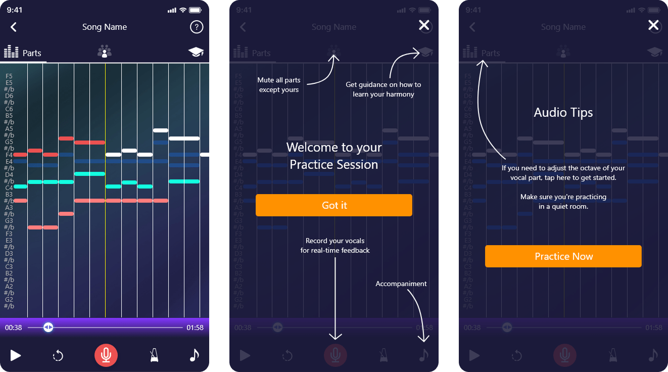
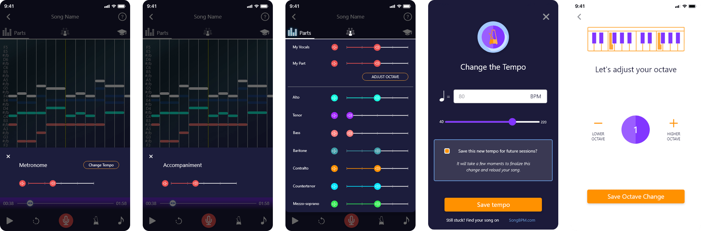
Practice Screen
![]()
Tooltips for Guidance
![]()
Website Redesign
- Improved accessibility to vocal rehearsal anytime, anywhere through a mobile-first experience
- Reduced setup time between discovery and meaningful practice
- Enabled personalized learning paths for individual singers and ensemble members
- Supported both solo practice and collaborative rehearsal workflows
- Established a cohesive brand and visual system across app, web, and marketing touchpoints
- Reduced cognitive load during onboarding, uploads, and practice setup
- Increased clarity and confidence through real-time visual and auditory feedback
- Delivered predictable, repeatable interaction patterns for daily rehearsal use
- Balanced advanced musical functionality with an approachable, beginner-friendly interface
- Created a scalable design system adaptable to future features and platforms