![]()
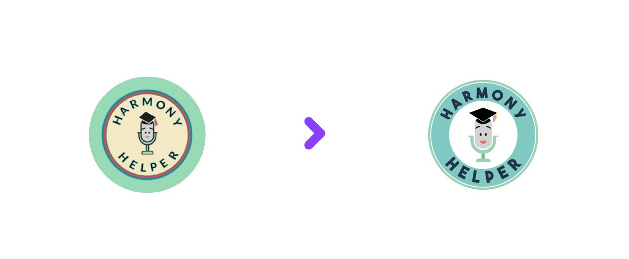
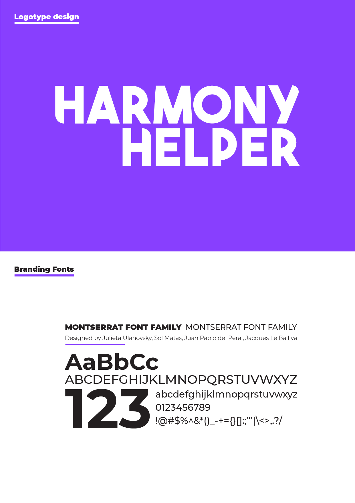
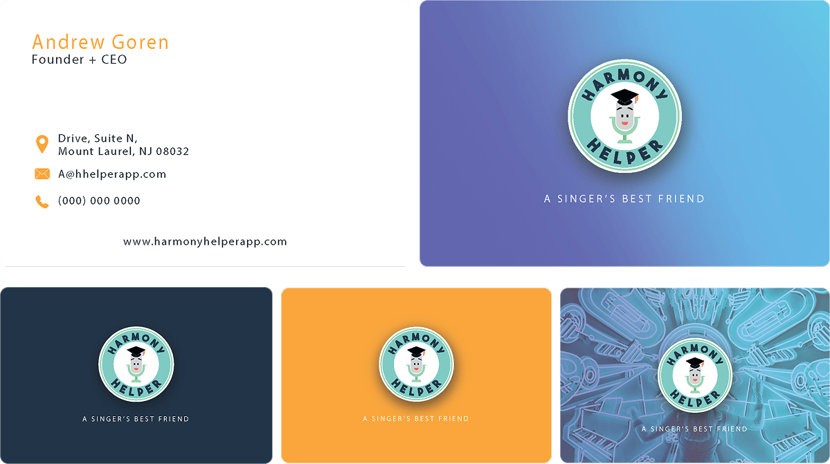
Logo Redesign
![]()
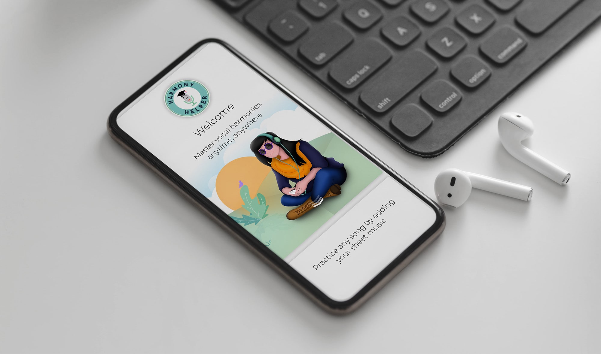
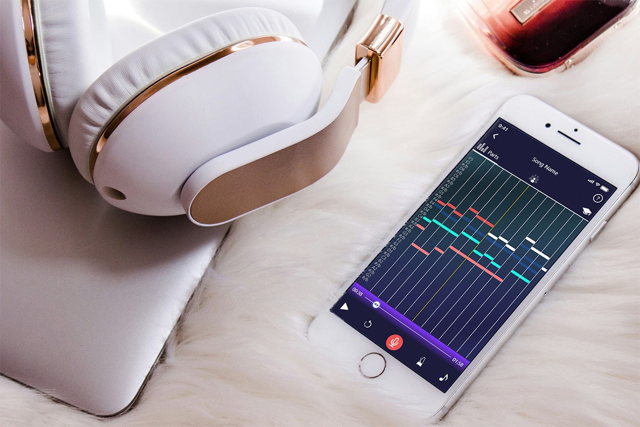
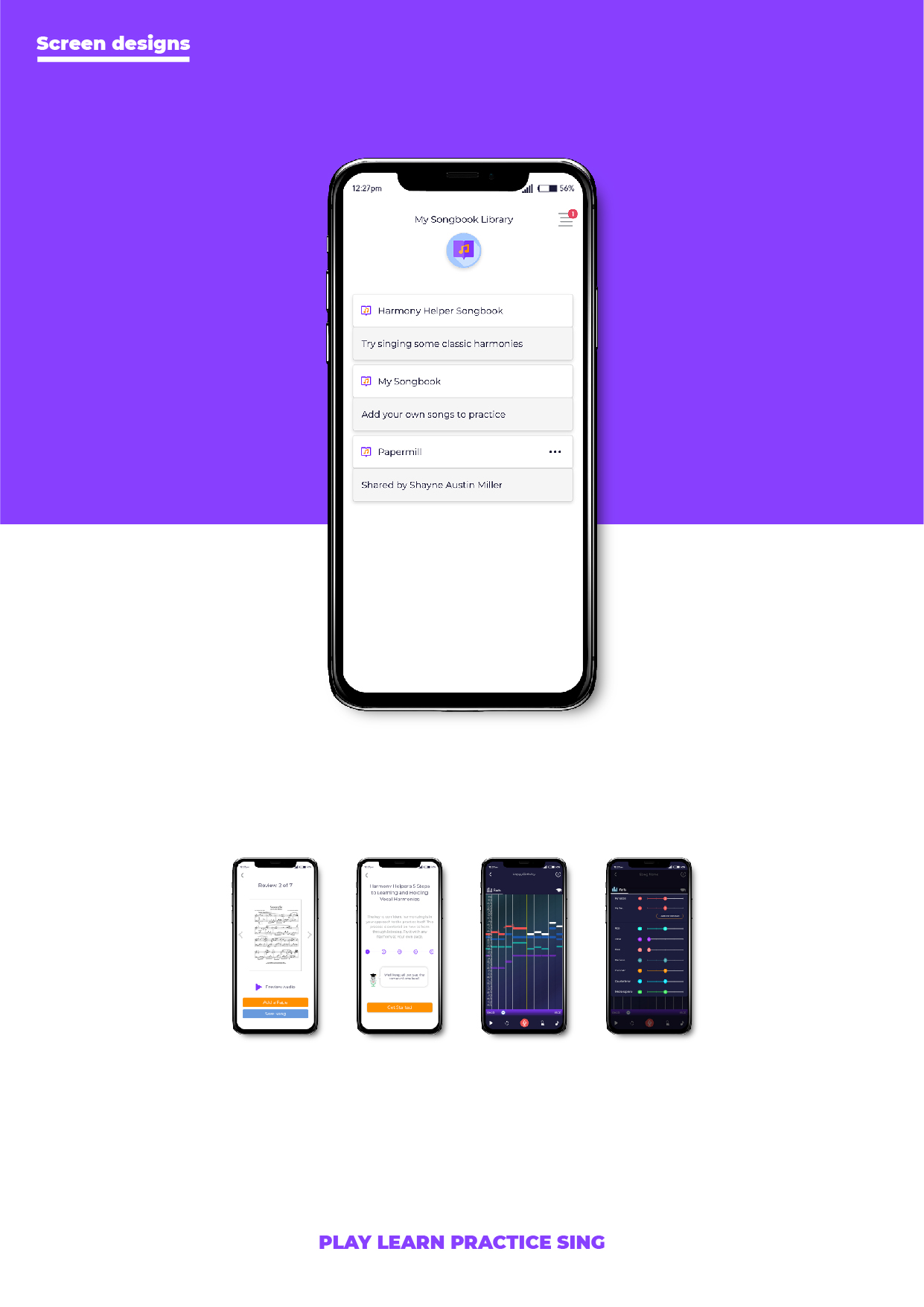
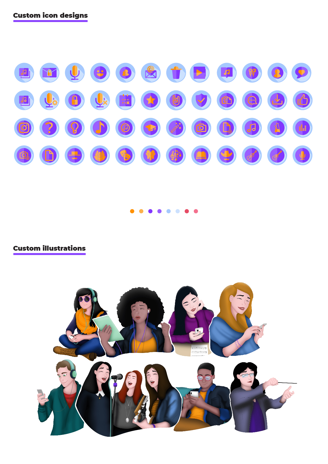
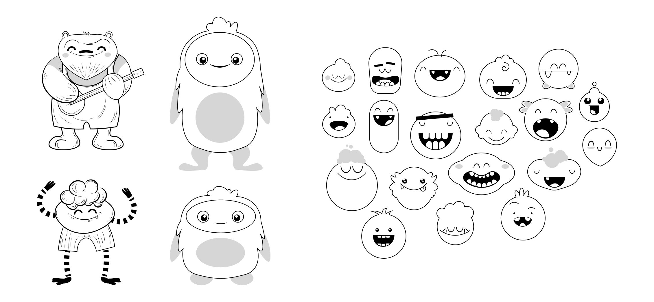
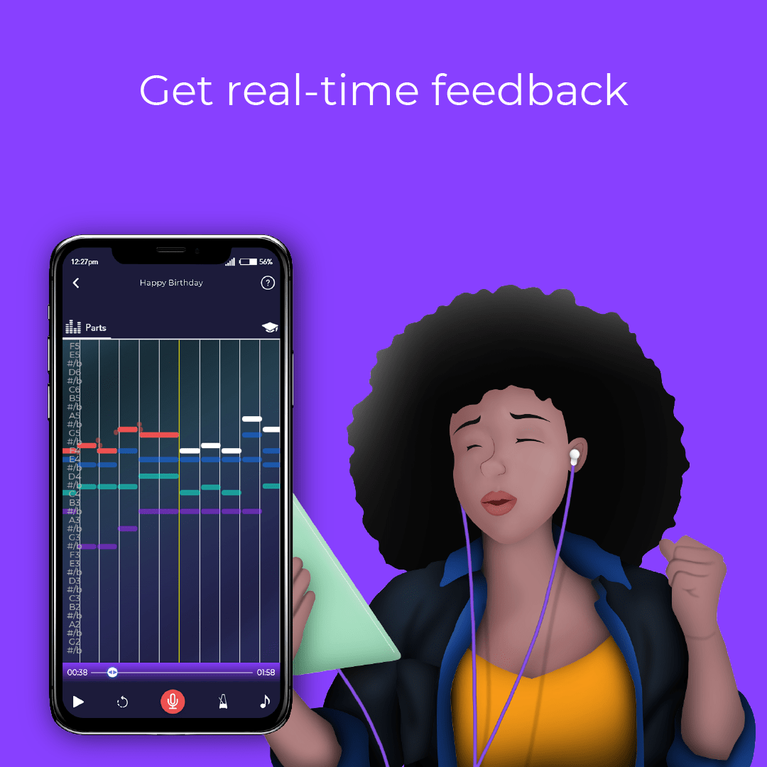
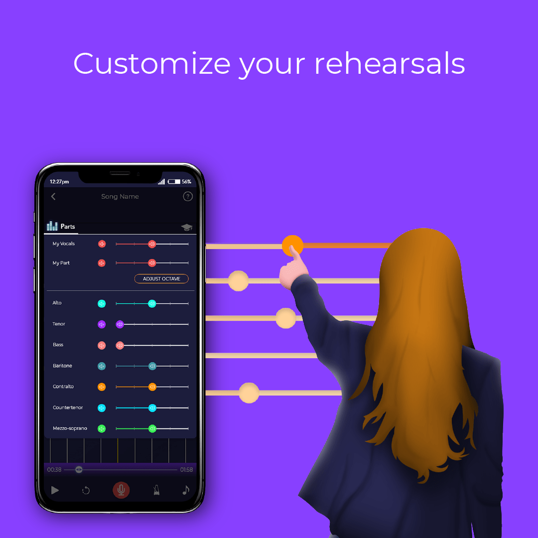
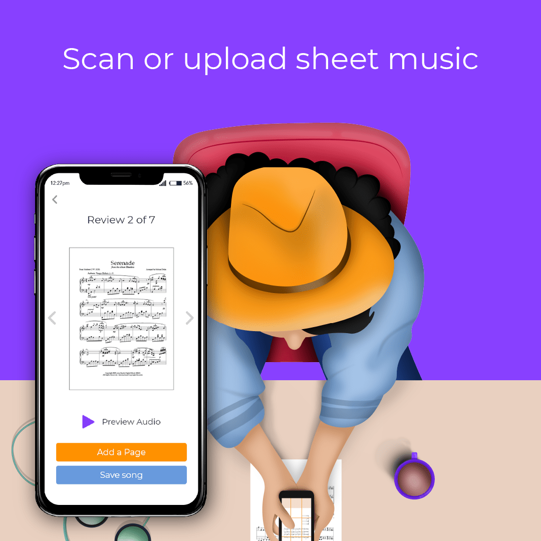
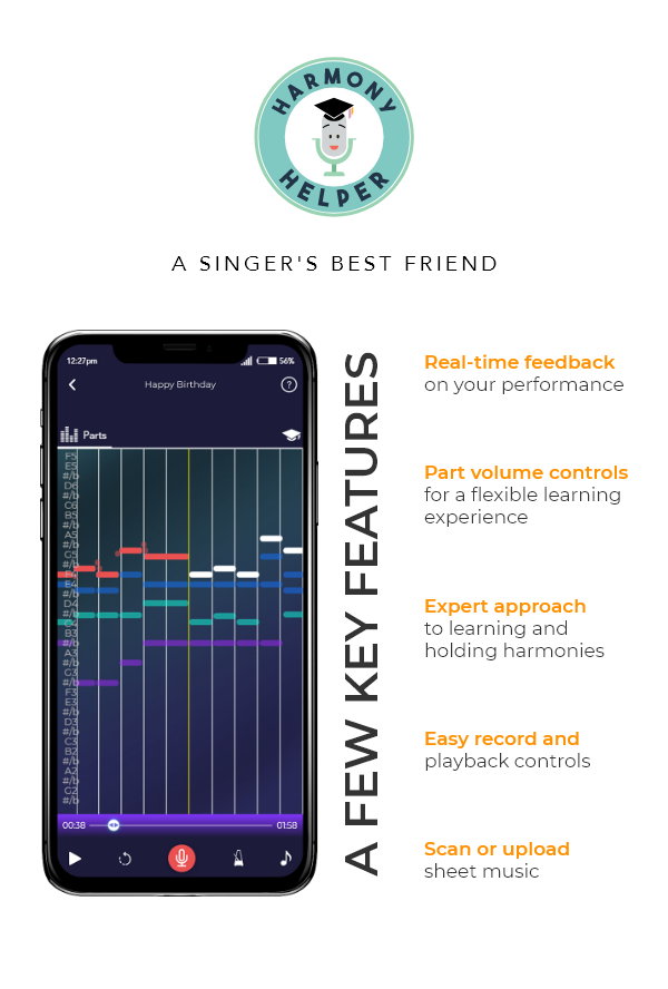
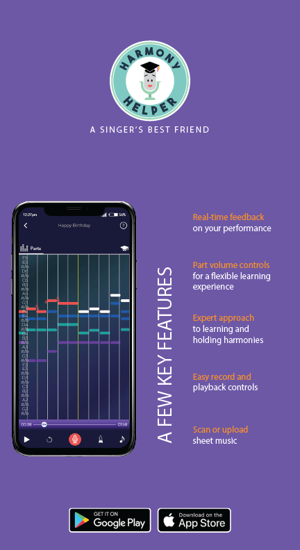
App Illustrations & Design
![]()
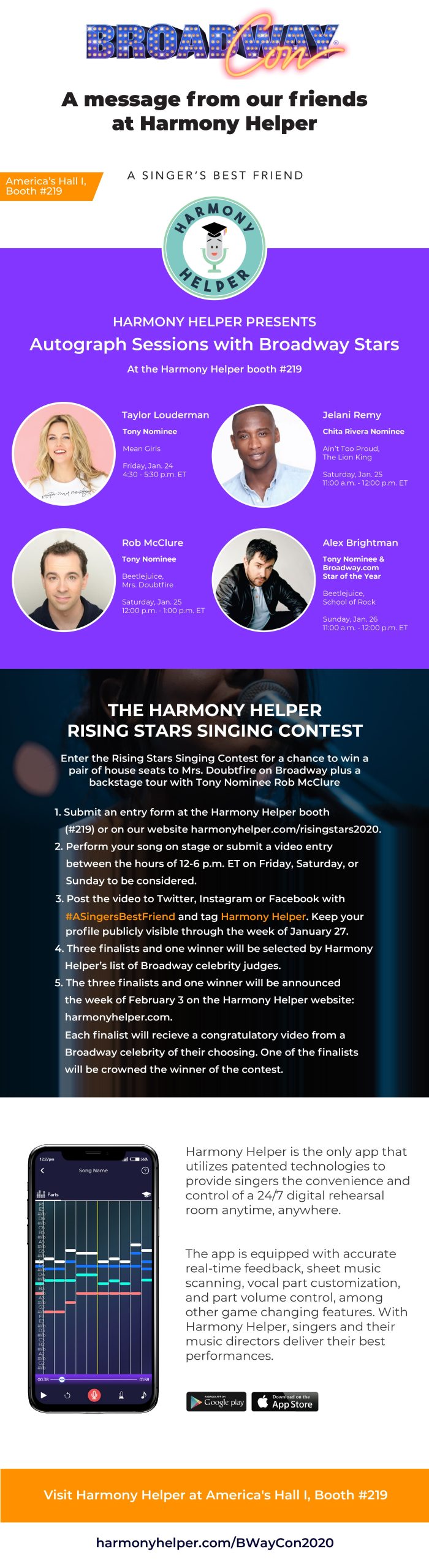
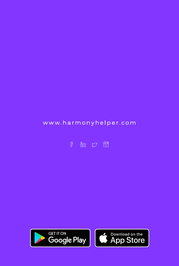
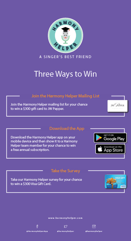
Promo Assets for Social and Web
![]()
Email and Newsletter Layouts
![]()
App Store Graphics

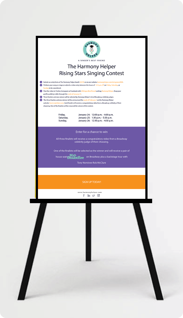
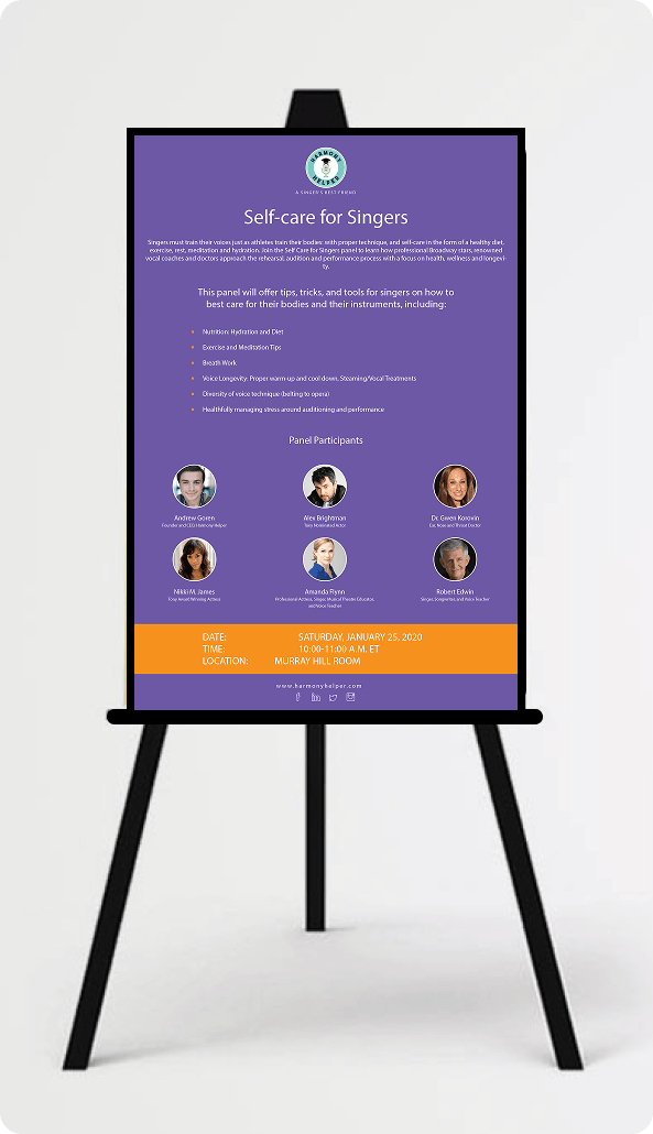
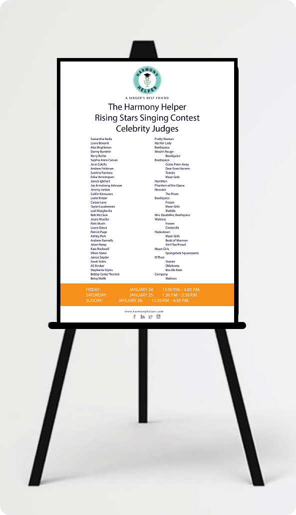
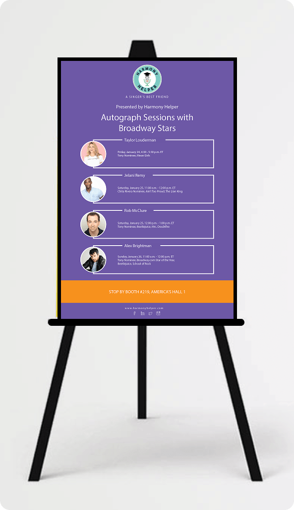
Flyers and Rack Cards

Print and Digital Advertisements
![]()
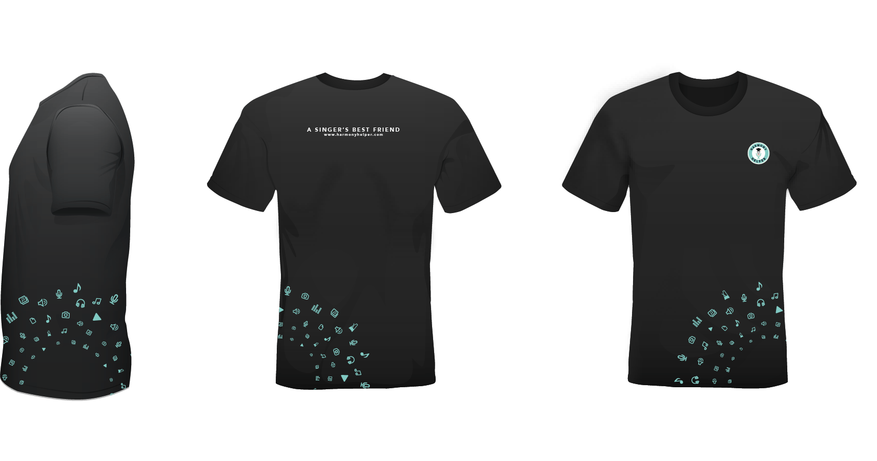
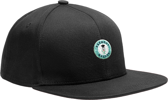
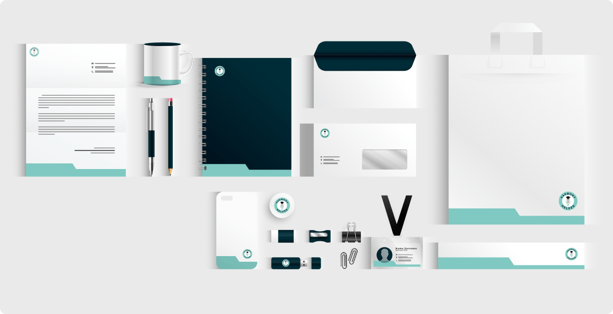
Brand Touchpoints & Merchandise


![]()
Logo Redesign
![]()
App Illustrations & Design
![]()
Promo Assets for Social and Web
![]()
Email and Newsletter Layouts
![]()
App Store Graphics
Flyers and Rack Cards
Print and Digital Advertisements
![]()
Brand Touchpoints & Merchandise