User-Centric Design for Healthcare Onboarding and Course Discovery
Improving Accessibility, Engagement, and Learning Experiences Across Northwell Health’s Platforms
Northwell Health is New York’s largest healthcare provider, serving millions of patients across New York City, Long Island, and Westchester. It operates 21 hospitals and over 900 outpatient facilities, offering a wide range of medical services, including cancer treatment, neurology, cardiology, and pediatrics.
Northwell is recognized for its deep commitment to medical research, education, and innovation, with ongoing initiatives aimed at advancing healthcare solutions at scale. This project focused on improving the digital experience across Northwell’s internal platforms, with a direct impact on how healthcare professionals and learners access, navigate, and engage with onboarding and course discovery tools.
Role:
Sole UX/UI Designer + Brand Designer
Industry:
Medical Research & Education
Tools:
Figma, Adobe XD, Zoom
Duration:
March 2023 – April 2023
Value Added +
- Transformed a fragmented healthcare platform experience into a clear, accessible, and cohesive user journey
- Reduced friction across high-frequency workflows including login, account setup, and course enrollment
- Improved course discoverability and learning engagement through structured layouts and intuitive navigation patterns
- Strengthened user confidence through real-time validation, accessible design, and consistent visual language
- Delivered a scalable design system aligned with enterprise healthcare standards and WCAG accessibility guidelines
Goals Achieved 𖣠
- Reduced cognitive load across authentication, onboarding, and course discovery workflows
- Improved form completion and accuracy during account creation and enrollment
- Increased efficiency in high-frequency platform interactions for clinical and administrative users
- Strengthened onboarding clarity through focused, guided entry-point design
- Created predictable, repeatable interaction patterns built for daily platform use
- Balanced functional depth with a clean, accessible interface meeting healthcare industry standards
- Ensured WCAG compliance across all screens to support users with diverse accessibility needs
I was entrusted with designing key screens for Northwell Health, one of the largest and most complex healthcare organizations in the country. Working as the sole UX/UI and Brand Designer, I owned the end-to-end design process across interaction design, visual design, and brand alignment. Every decision was made with the goal of delivering a platform that feels as trustworthy, accessible, and professional as the institution behind it.
My work spanned critical user-facing experiences, from the first point of authentication to course discovery and enrollment. This required balancing healthcare-grade accessibility standards with a clean, intuitive interface, ensuring that users, whether clinical staff or administrative professionals, could navigate the platform with clarity and confidence.
My responsibilities included designing:
Login Page: Streamlined for fast, secure user authentication across all devices
Create Account Page: Structured to simplify onboarding and reduce friction during account setup
Courses Page: Organized for clear course discovery, engagement, and efficient enrollment
Pain Points Identified:
- Inconsistent visual language across login, account creation, and course screens
- No clear onboarding structure to guide first-time users through account setup
- Course discovery lacked organization, making it difficult to browse, filter, and enroll
- Poor accessibility standards across typography, color contrast, and touch targets
- Absence of real-time feedback during form input and account creation steps
- No progress visibility to keep users oriented through multi-step flows
Goals:
- Deliver a consistent visual and functional experience across all platform screens
- Establish a cohesive design language aligned with Northwell Health’s brand identity and accessibility standards
- Simplify account creation and login flows to reduce cognitive load and improve task completion
- Improve course discoverability through clear information hierarchy and intuitive filtering
- Embed real-time validation and interactive feedback to reduce errors and support confident navigation
- Meet WCAG accessibility guidelines across all screens and device types
NOTES
To make the Northwell Health platform both effective and user-friendly, I focused on these key features:
- User-Centered Design: All screens were designed around the real workflows of clinical and administrative users, ensuring every interaction felt purposeful and task-oriented rather than generic.
- Accessibility-First Thinking: WCAG-compliant color contrast, focus states, and touch targets were applied across every screen to support users with diverse visual and motor needs.
- Visual Consistency: Color, typography, and iconography remain uniform across all screens, maintaining alignment with Northwell Health’s brand identity while standardizing UI components throughout the platform.
- Interactive Feedback: Micro-interactions, hover states, inline validation, and progress indicators make navigation predictable and keep users informed at every step.
- Course Organization: The courses page was structured with clear filtering, logical grouping, and progress tracking to support efficient learning journeys and reduce time spent searching.
- Iterative Prototyping: Wireframes and high-fidelity prototypes were used to validate design decisions through stakeholder and user feedback before final execution.
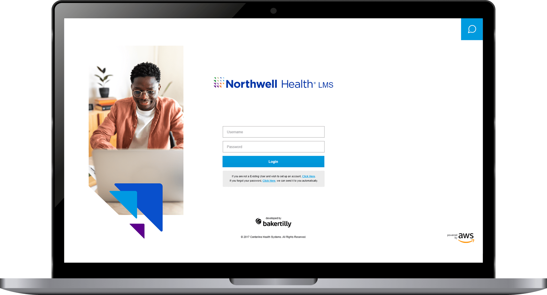
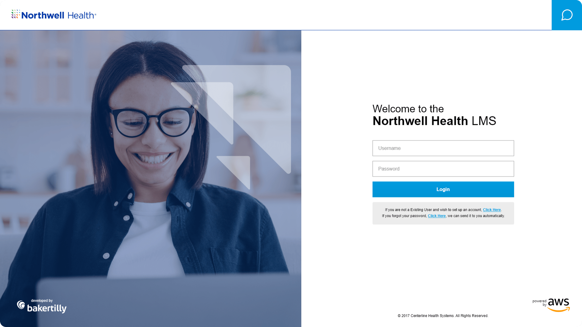
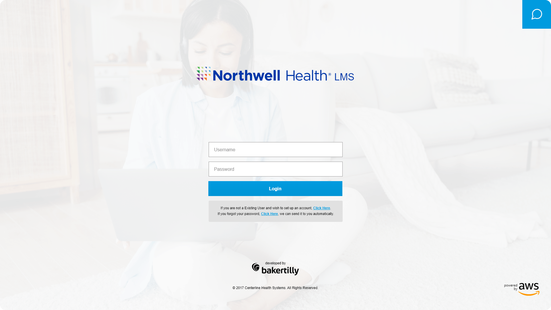
CREATING INTUITIVE LOGIN EXPERIENCES FOR DESKTOP, TABLET, AND MOBILE
For a platform serving clinical and administrative healthcare professionals, the login screen is more than an entry point. It is the first signal of whether the platform can be trusted. A cluttered, confusing, or inconsistent authentication experience undermines confidence before a user has completed a single task. This design eliminated that risk.
I designed a clean, professional login interface that prioritized ease of use, trust, and accessibility from the first interaction. Clearly labeled input fields, deliberate button hierarchy, and a structured layout work together to reduce hesitation and guide users through authentication quickly and accurately. Error states were designed to be informative without being alarming, giving users the context they needed to correct mistakes without frustration.
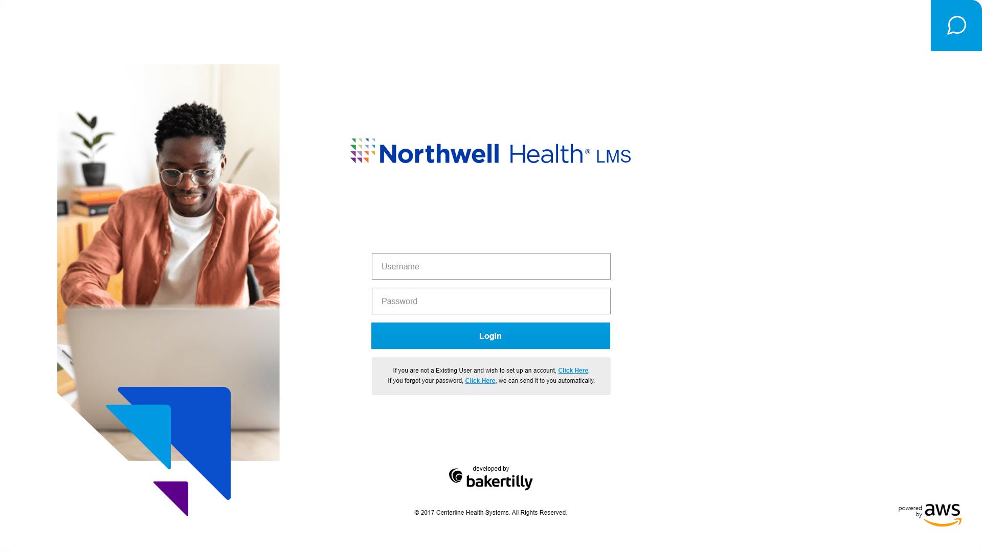
The experience was built responsive-first, with dedicated layouts for desktop, tablet, and mobile. Each breakpoint was treated as its own design problem, not simply a scaled version of another. Touch-friendly input targets, preserved visual hierarchy, and consistent component behavior ensure that the login experience feels intentional and reliable regardless of how or where a user accesses the platform.
Multiple alternative designs were explored and evaluated to identify the approach that best balanced visual clarity, brand alignment, and usability performance. Each alternative tested different layout configurations, typographic treatments, and form structures, with decisions guided by measurable outcome-focused goals: reducing login errors, improving task completion speed, and increasing user confidence at the platform’s most critical entry point.
DESIGNING A SIMPLE AND INTUITIVE ACCOUNT CREATION EXPERIENCE
The account creation screen represents one of the highest-friction moments in any platform experience. For users who are often time-constrained healthcare professionals, a lengthy, confusing, or error-prone sign-up process is enough to cause permanent drop-off. This design was built to prevent that.
I designed the account creation flow to provide a structured, guided sign-up process across desktop, tablet, and mobile. Fields are logically grouped to match natural user mental models, reducing the cognitive effort required to move from one input to the next. Clear, plain-language instructions appear at each stage, ensuring users always know exactly what is being asked and why.
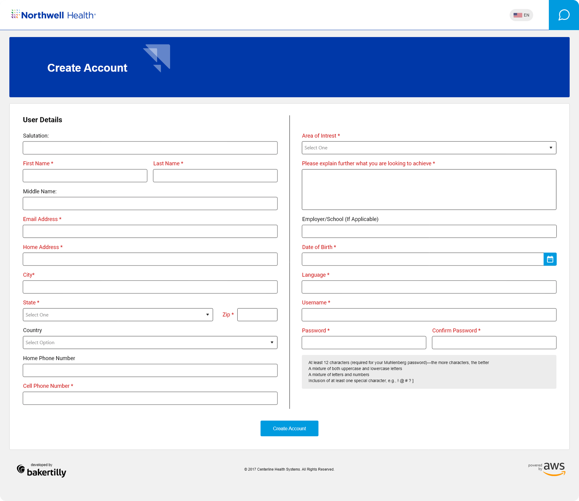
Real-time input validation catches errors at the point of entry rather than after submission, reducing frustration and minimizing the need to re-engage with completed fields. Progressive disclosure keeps the screen focused, surfacing only what is immediately relevant and avoiding the overwhelming effect of presenting every requirement at once.
Touch-friendly interactions and scalable layouts ensure the experience holds up across all device types, with accessible typography, sufficient color contrast, and appropriately sized tap targets supporting users across a wide range of abilities and device contexts. Outcome-focused goals included reducing sign-up errors, increasing completion rates, and delivering a smooth, confidence-building onboarding experience from the very first session.
ORGANIZING COURSES FOR CLEAR NAVIGATION AND ENGAGEMENT
For healthcare professionals with limited time and specific learning objectives, a disorganized course library is a significant barrier to engagement. If users cannot find what they need quickly and confidently, they disengage. The courses screen was designed to eliminate that barrier entirely.
I designed the courses page to deliver a clear, organized, and engaging learning experience across desktop, tablet, and mobile. The layout prioritizes course discoverability, using structured content groupings, clear visual hierarchy, and intuitive filtering to help users locate relevant courses without unnecessary searching or backtracking.
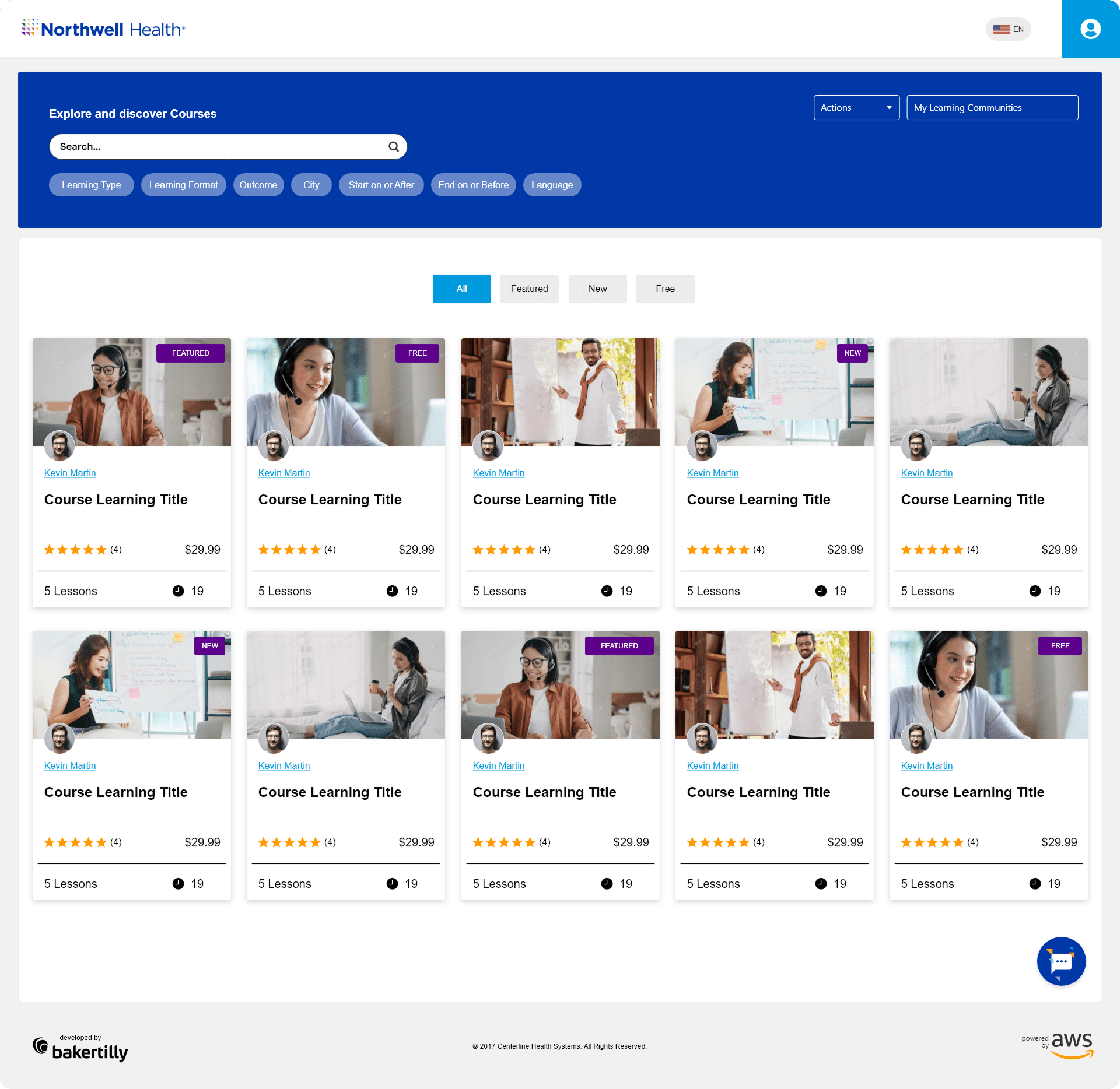
Enrollment actions are clearly surfaced and consistently positioned, reducing the number of steps required to move from discovery to participation. Progress tracking indicators give users visibility into their learning journey, supporting motivation and making it easy to pick up where they left off across sessions and devices.
Interactive elements, including hover states, filter controls, and status indicators, were designed to be responsive and informative, giving users immediate feedback on their actions without interrupting their flow. The layout scales across desktop, tablet, and mobile with dedicated breakpoint considerations, ensuring that course content remains readable, navigable, and engaging regardless of screen size.
Outcome-focused goals included improving course discoverability, streamlining the enrollment process, reducing time-to-action for returning users, and supporting efficient, self-directed learning journeys across the platform.
REFLECTIONS & KEY LEARNINGS
Balancing Accessibility and Professionalism: Designing for Northwell Health reinforced that meeting WCAG accessibility standards and delivering a visually polished interface are not competing goals. Every decision, from color contrast ratios to typography scale, was made in service of both, ensuring the platform felt credible and professional without excluding any user.
Designing for a High-Stakes Audience: This project deepened my understanding of what it means to design for healthcare professionals whose time is limited and whose tolerance for friction is low. The best decisions came from prioritizing speed, clarity, and confidence at every interaction, not from adding features or visual complexity.
Accessibility as a Design Foundation: Working within healthcare accessibility standards from the start, rather than retrofitting them at the end, changed how every screen was built. Focus states, contrast ratios, touch targets, and readable typography were not additions; they were the foundation every other decision was built on top of.
Responsive Design Across Three Breakpoints: Delivering a consistent, high-quality experience across desktop, tablet, and mobile reinforced that responsive design is a discipline, not a checkbox. Each breakpoint introduced its own layout challenges, and addressing them required independent design thinking rather than simple adaptation from a master layout.
Onboarding as a Trust-Building Moment: Designing the login and account creation screens for a healthcare platform made clear how much weight those early interactions carry. For users accessing sensitive professional tools, a clear, structured, and reassuring onboarding experience is not a convenience, it is a prerequisite for trust.
Course Discovery as a Workflow Problem: Designing the courses page reinforced that discoverability is an information architecture challenge as much as a visual one. Organizing content in a way that matches how users actually think about their learning goals, rather than how the content is categorized internally, was what made the design genuinely useful.
CHALLENGES I OVERCAME
Meeting Healthcare Accessibility Standards Without Sacrificing Visual Quality: Designing to WCAG compliance across every screen required constant evaluation of color choices, typographic decisions, and interactive states against strict contrast and legibility requirements. The challenge was not simply meeting the standard but doing so within a design that still felt considered, modern, and aligned with Northwell Health’s brand identity.
Designing for Users with Competing Priorities: Clinical and administrative healthcare professionals are among the most time-pressured users any platform can serve. Every screen had to accomplish its purpose with minimal friction and maximum clarity, because any unnecessary step, unclear label, or confusing layout directly costs users time they do not have. Designing with that constraint in mind shaped every layout, every input field, and every interaction pattern throughout the project.
Maintaining Consistency Across Three Screen Types: Aligning visual hierarchy, component behavior, and interaction quality across desktop, tablet, and mobile required significantly more than resizing layouts. Each breakpoint surfaced new challenges around content prioritization, touch target sizing, and typographic legibility that demanded dedicated design solutions at every stage.
Organizing a Complex Course Library: The courses page presented a genuine information architecture challenge. A large volume of content, spanning different specialties, formats, and completion states, had to be made immediately navigable without overwhelming the user. Developing a filtering system, clear content groupings, and visible progress indicators that worked intuitively across all devices required careful iteration and constant attention to how users scan and prioritize information.
Simplifying Account Creation for a Diverse User Base: The create account flow had to serve users with a wide range of technical familiarity, from administratively focused staff to clinicians engaging with a digital platform for the first time. Balancing the data requirements of a healthcare organization with the need for a simple, low-friction sign-up experience required careful decisions around field grouping, progressive disclosure, and plain-language guidance at every step.
Iterative Design Under Tight Timelines: With a project duration of just two months, the iterative design process had to be focused and disciplined. Feedback from stakeholders was incorporated quickly, and each revision had to move the design meaningfully forward rather than sideways. That constraint ultimately sharpened decision-making and reinforced the value of grounding every choice in clear UX principles and measurable outcomes from the start.