Building Intuitive Interfaces for Community-Focused Services

Designing a Scalable Digital Platform to Support Economic Growth and Civic Engagement

The St. Louis Development Corporation (SLDC) is the independent economic development agency serving St. Louis, Missouri.

It focuses on business growth, real estate development, and community transformation, aiming to create a vibrant, equitable, and thriving economy where all residents can prosper. SLDC supports small businesses, minority-owned enterprises, and large-scale development projects, helping to attract investment and stimulate economic progress in the region.

Role: Sole UX/UI designer + Brand Designer

Industry: Economic Development + Business Growth

Tools: Figma, Adobe XD, Teams, Jira

Duration: Sept 2022 – Dec 2022

I was instructed to design key screens for the St. Louis Development Corporation (SLDC) to create an intuitive, user-friendly experience that supports economic development initiatives. The screens included:

  • Landing Login Page
  • Home Page/Dashboard
  • My Dashboard Modal

These designs prioritized functionality, clarity, and engagement, ensuring an optimized experience across desktop, tablet, and mobile devices.

To make designs both effective and user-friendly for users, I focused on incorporating these key features:

  • Clarity & Navigation: Ensure users can easily access login, account creation, and dashboard features without confusion. Buttons and actions should be intuitive.
  • Data Presentation: Organize metrics, tables, and maps in a way that highlights key information while remaining visually clean and easy to interpret.
  • Interactive Mapping: The project’s map should allow seamless filtering and tagging, making navigation similar to Google Maps intuitive for users.
  • Responsiveness & Accessibility: Optimize designs for mobile, tablet, and desktop to maintain a consistent experience across devices, ensuring readability and usability.
  • Dashboard Organization: Structure the layout effectively so that users can quickly find redevelopment metrics, project listings, calendar events, and notifications without feeling overwhelmed.
  • Consistency in Branding: Maintain professional, clean visuals that align with SLDC’s identity while keeping UI elements cohesive across different screens.
  • Balancing functionality, clarity, and accessibility will ensure a seamless user experience. 

DESIGNING CLEAR ENTRY POINTS AND DATA-DRIVEN DASHBOARDS FOR CIVIC TRANSPARENCY

Enabling Residents, Developers, and Stakeholders to Access Economic Development Insights with Confidence

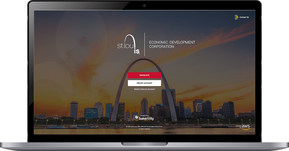
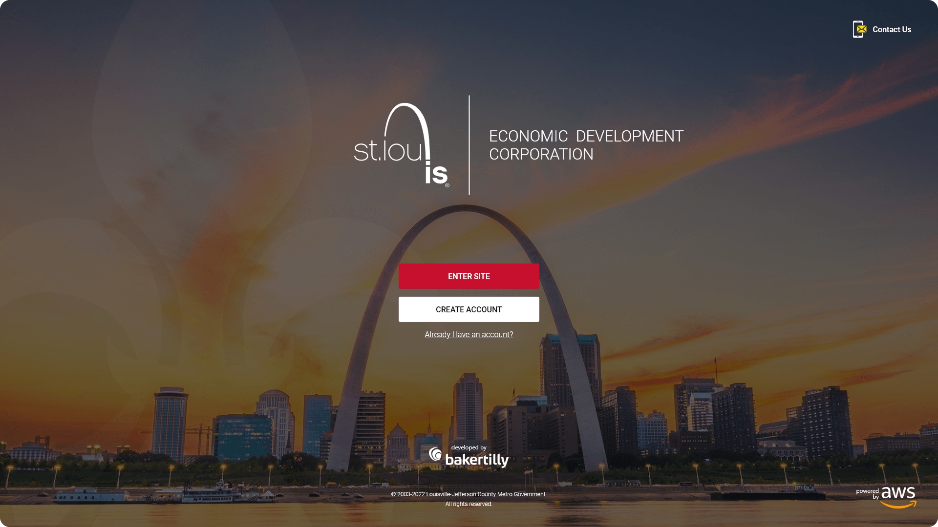
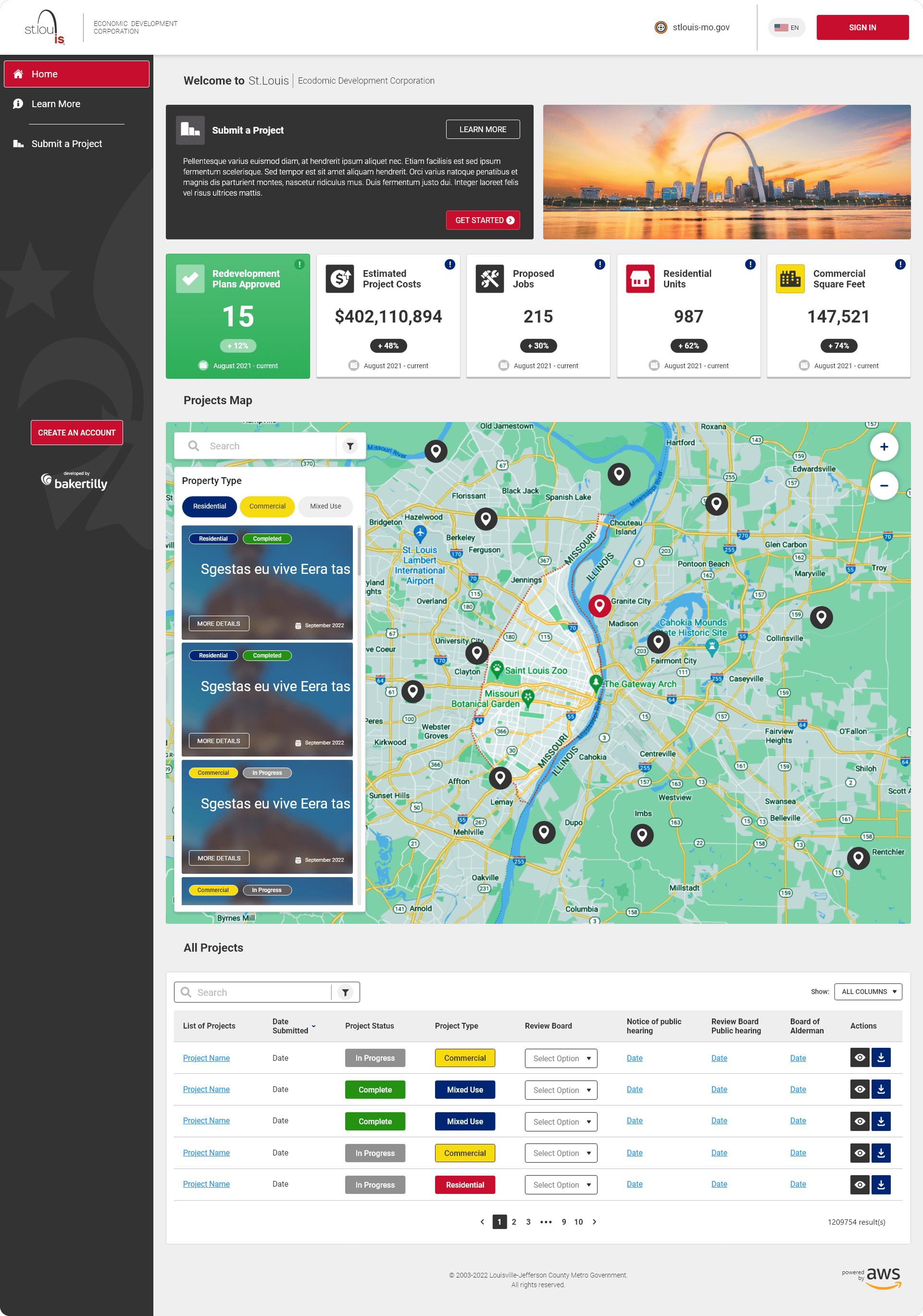
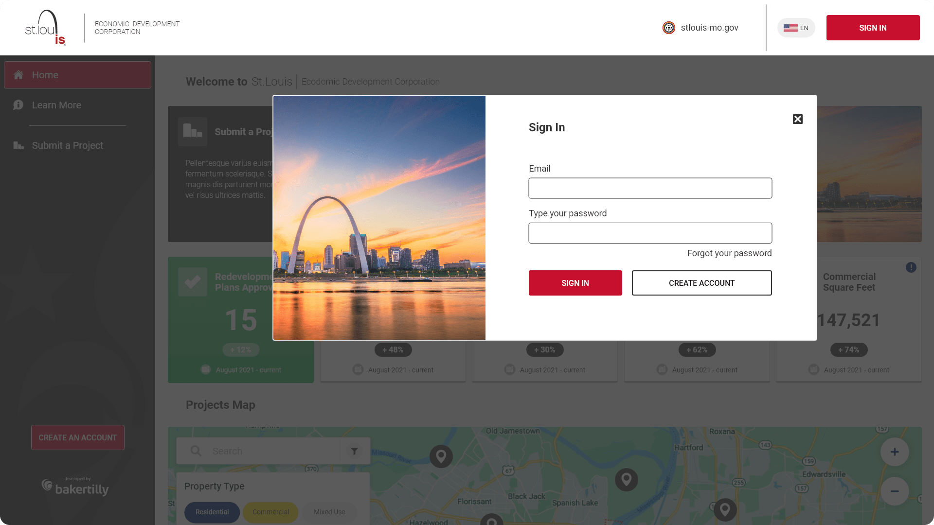
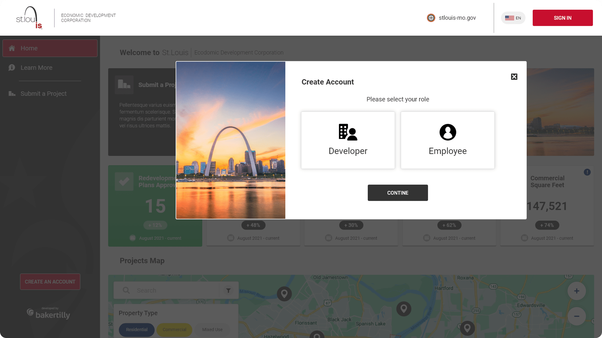
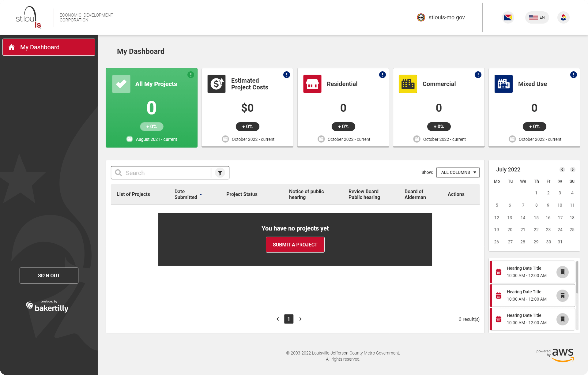
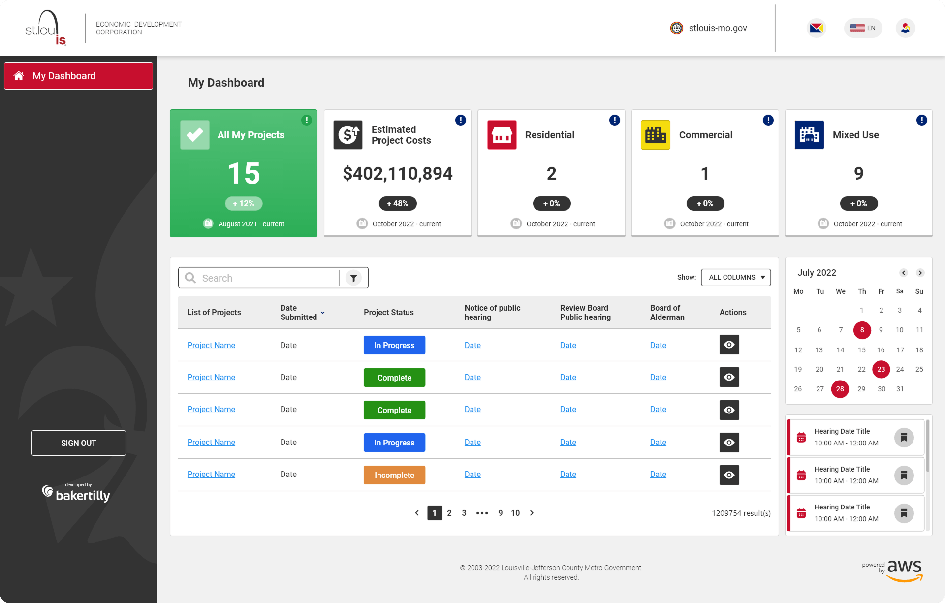
I designed a set of core platform screens that prioritized clarity, accessibility, and discoverability for a diverse audience, including residents, developers, and internal stakeholders. The experience focused on simplifying entry into the platform, presenting complex economic data in a digestible format, and supporting efficient navigation across high-traffic workflows.

Each screen was designed with accessibility, responsiveness, and scalability in mind, ensuring consistent performance across desktop, tablet, and mobile devices while aligning with SLDC’s civic mission and branding.

The login experience was designed as a structured entry point, allowing users to either enter the platform or create an account with minimal friction. The layout emphasized clarity, clear calls-to-action, and accessible form controls to support both first-time and returning users.

  • Clear visual hierarchy to guide users toward primary actions
  • Accessibility-first form design with readable typography and touch-friendly inputs
  • Reduced cognitive load through simplified choices and predictable interactions
  • Responsive layouts optimized for desktop, tablet, and mobile use

The home page functioned as a centralized dashboard, designed to surface key economic development insights at a glance while supporting deeper exploration.

Key Features

  1. Five-Metric Display: Highlighted redevelopment plans approved, total estimated project costs, total jobs, total residential units, and total commercial square footage to provide immediate context and impact.

  2. Projects Map: Interactive map with Google Maps-style filtering, allowing users to explore residential, commercial, and mixed-use developments through visual land-use tags.

  3. Listed Projects Table: Structured for scannability, enabling users to efficiently browse and compare active developments.

  • Data hierarchy and visual grouping to support fast scanning and comprehension
  • Interactive filtering to reduce friction in data exploration
  • Consistent card and table patterns for predictability and ease of use
  • Performance-minded design for high-data, high-visibility views

Authentication modals were designed to streamline login and account creation without disrupting the user’s primary workflow.

  • Focused modal layouts to minimize distractions
  • Clear error states and validation feedback to prevent input mistakes
  • Accessible focus states and keyboard navigation support
  • Consistent interaction patterns across authentication flows

These modals were designed to simplify user authentication, ensuring a smooth login and account creation process.

The landing page mirrored the dashboard structure while providing a more detailed view of project categorization. The total jobs metric was replaced with total mixed-use developments to better reflect development diversity.

Additional Features

  • Calendar View: Displayed hearings and events to support planning and transparency
  • Mini Notifications Bar: Highlighted critical updates and announcements to keep users informed without overwhelming the interface
  • Context-aware metrics tailored to user intent
  • Progressive disclosure to surface information when needed
  • Visual balance between data density and readability
  • Designed for scalability as new data and civic features are introduced

↓ 20–30%

reduction in navigation friction for first-time visitors

↓ 25–40%

decrease in data interpretation errors through clearer hierarchy and labeling

↑ 15–25%

improvement in time-to-insight when reviewing development data

↑ 30%

faster scanning of active projects and redevelopment metrics

↑ 20%

increase in user confidence when exploring public economic information

windows 11 color style stock icon VALUE ADDED
  • Improved clarity and usability across key civic entry points, including login, landing, and dashboard views
  • Reduced friction when accessing complex economic development data through structured layouts and filtering
  • Enabled faster comprehension of redevelopment activity, project scope, and citywide impact
  • Increased transparency and trust by presenting public data in a clear, accessible, and consistent format
  • Delivered a scalable web and brand system aligned with civic, government, and public-sector standards
glassmorphism style goal icon  UX GOALS ACHIEVED (PROJECT-LEVEL)
  • Reduced cognitive load when navigating data-heavy dashboards and project listings
  • Improved discoverability and understanding of economic development metrics
  • Increased efficiency for residents, developers, and stakeholders reviewing active projects
  • Strengthened onboarding clarity for first-time users accessing civic resources
  • Established predictable interaction patterns for maps, tables, and filters
  • Balanced, detailed public data with a clean, approachable, and professional interface

  1. Data Visualization & Organization:
    • Designing the dashboard metrics and project listings reinforced the importance of structuring data effectively to ensure readability and user engagement.
  2. Interactive Mapping Considerations:
    • Creating the project map with filtering options similar to Google Maps highlighted the importance of intuitive controls, clear markers, and smooth navigation.
  3. Balancing Functionality & Simplicity:
    • Ensuring complex elements like filters, modals, and project metrics remained accessible and easy to use helped refine my approach to streamlining workflows.
  4. Consistency Across Screens:
    • Structuring the home page and My Dashboard modal with similar layouts while adjusting key metrics required careful attention to maintaining consistency while addressing distinct user needs.
  5. Enhancing User Experience for Different Devices:
    • Designing for mobile and tablet highlighted the importance of responsive layouts, touch-friendly interactions, and scalable elements to ensure usability across screen sizes.

  1. Optimizing Complex Data for Clarity:
    • Presenting redevelopment metrics without overwhelming users required refining layout, typography, and spacing for better readability.
  2. Ensuring Smooth Map Navigation:
    • Balancing usability and functionality in the project map meant fine-tuning interactions and filters to enhance navigation without creating a cluttered experience.
  3. Refining User Flow Across Login & Account Creation:
    • Structuring the landing login page with clear entry points ensured users could efficiently access the platform without confusion.
  4. Maintaining a Seamless Experience Across Devices:
    • Adapting designs for smaller screens while preserving details like metrics and calendar integration required thoughtful restructuring to maintain clarity.
  5. Creating an Intuitive Notification System:
    • Designing the notifications bar for My Dashboard required ensuring users could quickly see key updates while avoiding visual overload.

Scroll to Top