Building Intuitive Interfaces for Community-Focused Services
Designing a Scalable Digital Platform to Support Economic Growth and Civic Engagement
The St. Louis Development Corporation (SLDC) is the independent economic development agency serving St. Louis, Missouri. It focuses on business growth, real estate development, and community transformation, working to create a vibrant, equitable, and thriving economy where all residents can prosper. SLDC supports small businesses, minority-owned enterprises, and large-scale development projects, helping to attract investment and stimulate economic progress across the region.
This project focused on designing a scalable digital platform that made complex civic and economic data accessible, navigable, and meaningful for a diverse audience of residents, developers, and internal stakeholders.
Role:
Sole UX/UI Designer + Brand Designer
Industry:
Economic Development + Business Growth
Tools:
Figma, Adobe XD, Zoom, Jira
Duration:
Sept 2022 – Dec 2022
Value Added +
- Transformed complex civic and economic data into a clear, structured, and immediately navigable platform experience
- Reduced friction at every entry point, from login to dashboard exploration, for a diverse public audience
- Enabled faster comprehension of redevelopment activity, project scope, and citywide economic impact
- Increased civic transparency and public trust by presenting development data in an accessible, consistent, and visually credible format
- Delivered a scalable web and brand system aligned with civic, government, and public-sector standards
Goals Achieved 𖣠
- Reduced cognitive load when navigating data-heavy dashboards and project listings
- Improved discoverability and understanding of economic development metrics across user types
- Increased efficiency for residents, developers, and stakeholders reviewing active projects
- Strengthened onboarding clarity for first-time users accessing civic resources
- Established predictable interaction patterns for maps, tables, and filters
- Balanced detailed public data with a clean, approachable, and professional interface
I was entrusted with designing key screens for the St. Louis Development Corporation, a platform built to support civic transparency, economic development, and community engagement across St. Louis. Working as the sole UX/UI and Brand Designer, I owned the end-to-end design process across interaction design, visual design, data visualization, and brand alignment. Every decision was made with the goal of making complex economic development data feel approachable, clear, and actionable for users with widely varying levels of technical and civic familiarity.
My work spanned the full platform experience, from the first point of authentication to data-driven dashboards and interactive project mapping. This required balancing information density with visual clarity, ensuring that residents, developers, and stakeholders could access the insights they needed without being overwhelmed by the volume and complexity of the underlying data.
My responsibilities included designing:
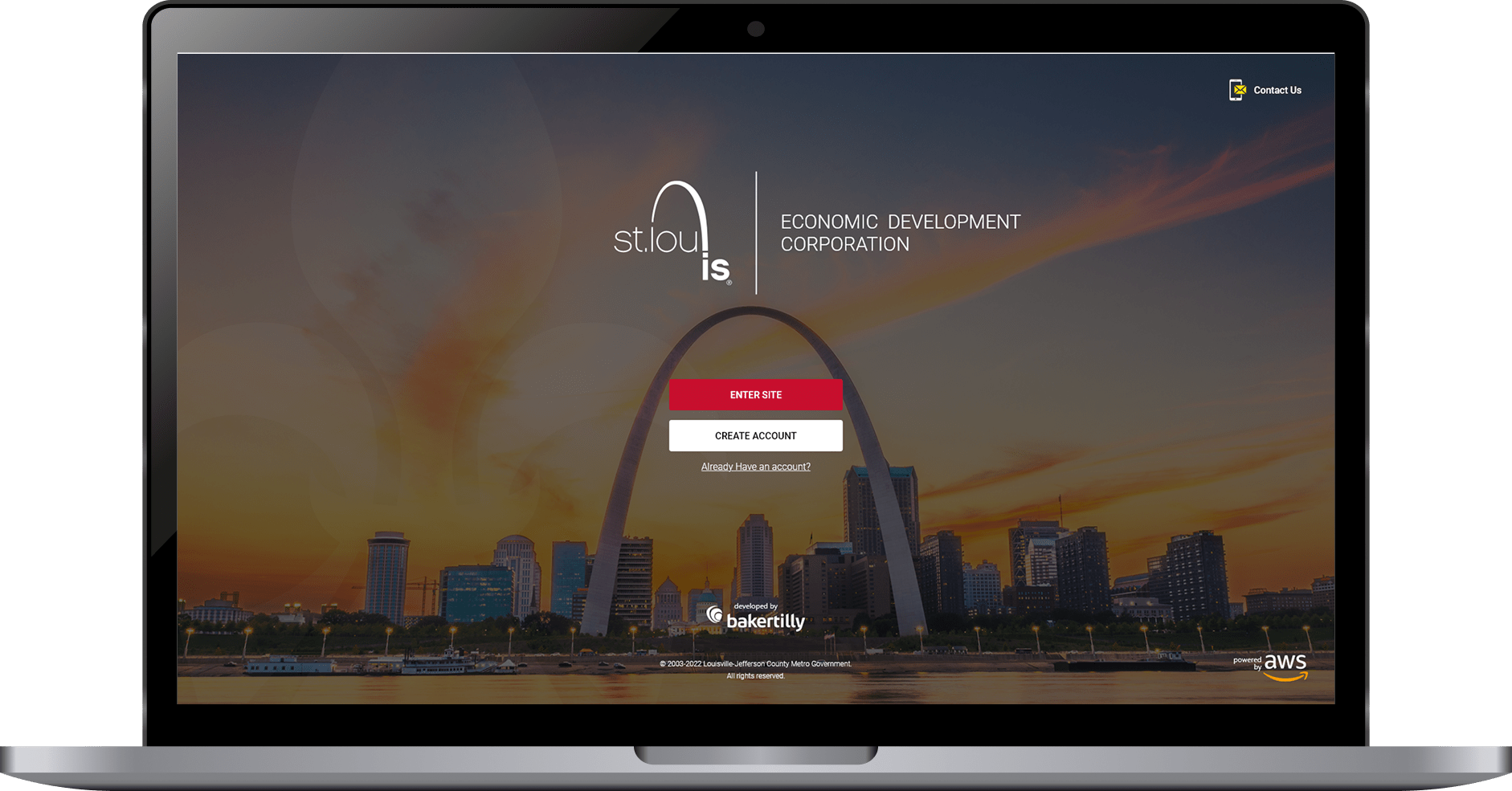
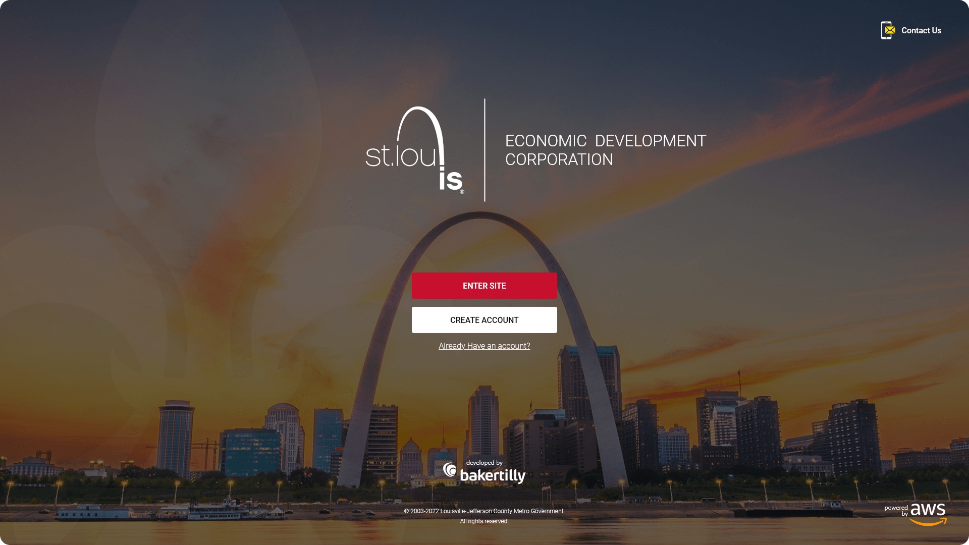
Landing Login Page: Structured for clear, low-friction platform entry across all devices
Home Page / Dashboard: Designed to surface key economic development metrics and support efficient data exploration
My Dashboard Modal: Built to streamline authentication and account management without disrupting primary workflows
Pain Points Identified:
- No clear entry-point experience to orient first-time users unfamiliar with civic development platforms
- Complex economic data presented without structure, making it difficult to interpret and act on
- Interactive mapping lacked intuitive filtering, limiting users’ ability to explore development activity by type or location
- Dashboard layouts surfaced too much information at once, creating cognitive overload for new and returning users
- Poor cross-device experience, with layouts that broke down on tablet and mobile
- Inconsistent visual language undermined the platform’s credibility as a trusted civic resource
- No clear notification system to keep users informed of critical updates and upcoming events
Goals:
- Design a clear, confidence-building authentication and entry experience across all devices
- Structure economic development data for immediate comprehension through strong visual hierarchy and logical content grouping
- Build an interactive project map with intuitive filtering comparable to a Google Maps experience
- Organize the dashboard so residents, developers, and stakeholders can quickly locate metrics, projects, and events without feeling overwhelmed
- Deliver full responsive parity across desktop, tablet, and mobile
- Establish a consistent visual language that reflects SLDC’s civic mission and communicates professionalism and transparency
- Introduce a notifications system and calendar view to surface critical updates without disrupting the primary workflow
NOTES
To make the SLDC platform both effective and user-friendly, I focused on these key features:
- Clarity & Navigation: All entry points, including login, account creation, and dashboard access, were designed for immediate clarity. Calls-to-action are prominent, predictable, and consistently placed across every screen.
- Data Presentation: Redevelopment metrics, project tables, and map views are organized to highlight the most critical information first, using visual hierarchy and logical grouping to prevent users from having to search for what matters.
- Interactive Mapping: The projects map was designed to support Google Maps-style filtering, allowing users to explore residential, commercial, and mixed-use developments through intuitive land-use tags and visual indicators.
- Responsiveness & Accessibility: Dedicated layouts for desktop, tablet, and mobile ensure the experience is never adapted as an afterthought, with readable typography, touch-friendly inputs, and preserved visual hierarchy at every breakpoint.
- Dashboard Organization: The home page dashboard was structured to surface five core metrics at a glance, with clearly defined sections for project listings, calendar events, and notifications to support efficient, self-directed exploration.
- Consistency in Branding: Color, typography, and UI components remain uniform across all screens, maintaining alignment with SLDC’s civic identity while reinforcing professionalism and trust throughout the platform.
ENABLING RESIDENTS, DEVELOPERS, AND STAKEHOLDERS TO ACCESS ECONOMIC DEVELOPMENT INSIGHTS WITH CONFIDENCE
Designing a clear, intentional first impression that supports efficiency, focus, and brand trust.
Key entry points and core screens were redesigned with a focus on usability, task efficiency, and visual consistency. Design decisions were guided by established UX performance goals: reducing cognitive load, improving scanability, and enabling users to move through the platform with minimal friction while reinforcing the Quantum brand.
For a platform serving such a diverse audience, including residents exploring neighborhood development, developers evaluating investment opportunities, and internal stakeholders managing active projects, clarity and accessibility are not design preferences. They are requirements. Any point of confusion in the entry flow or dashboard experience risks losing users who came to the platform with a specific, time-sensitive need.
I designed a set of core platform screens that prioritized clarity, accessibility, and discoverability across every user type. The experience focused on simplifying entry into the platform, presenting complex economic data in a digestible format, and supporting efficient navigation across high-traffic workflows. Each screen was built with responsiveness and scalability in mind, ensuring consistent performance across desktop, tablet, and mobile while aligning with SLDC’s civic mission and brand standards.
Clear visual hierarchy to guide users toward primary actions without distraction
Accessibility-first form design with readable typography and touch-friendly inputs
Reduced cognitive load through simplified choices and predictable interaction patterns
Responsive layouts optimized for desktop, tablet, and mobile use
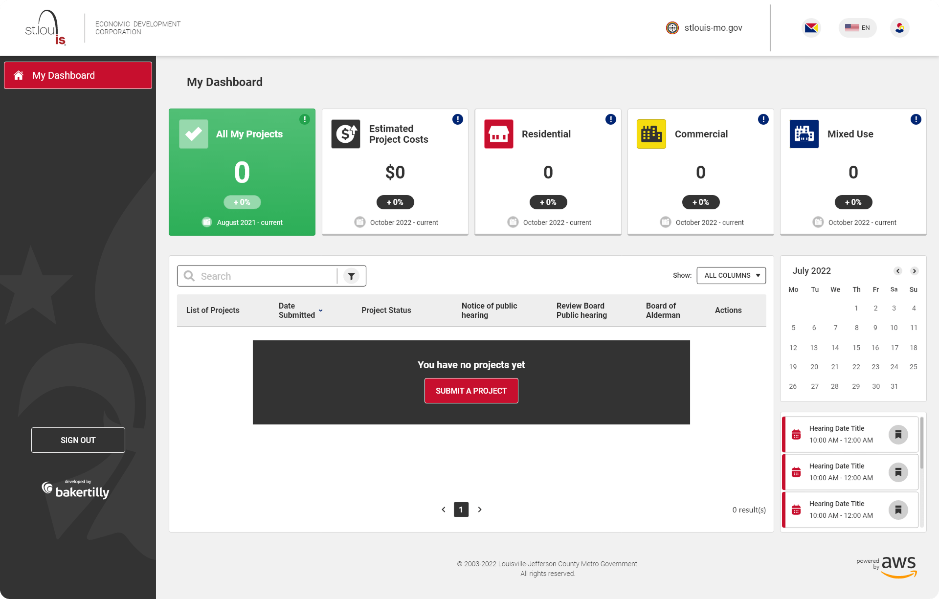
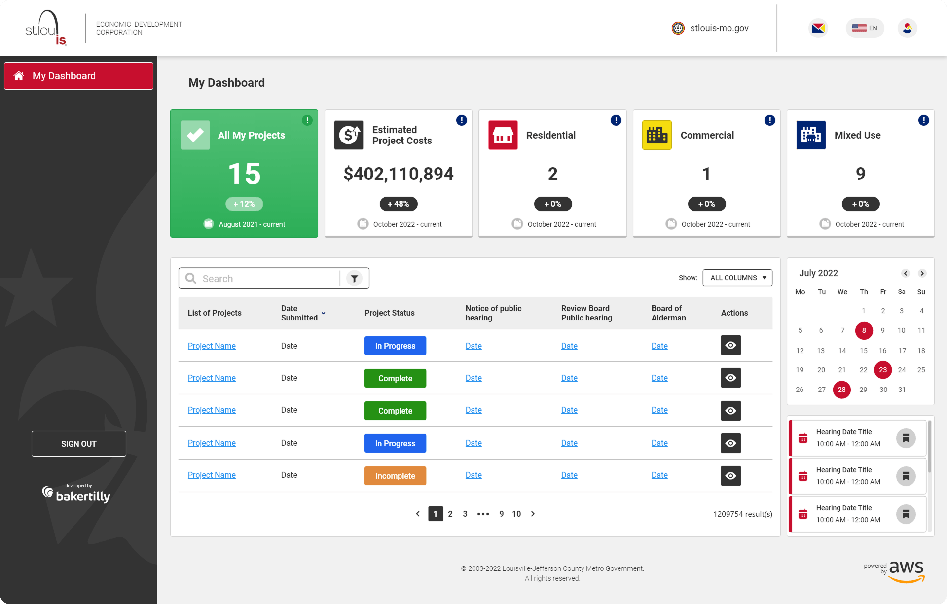
SURFACING KEY ECONOMIC METRICS, PROJECT ACTIVITY, AND INTERACTIVE MAPPING IN A SINGLE, SCANNABLE VIEW
The home page functioned as a centralized data dashboard, designed to surface key economic development insights at a glance while supporting deeper exploration for users who needed more detail. The challenge was significant: presenting a high volume of civic data in a format that felt immediately useful rather than overwhelming, for an audience ranging from data-literate developers to residents with no prior exposure to economic development metrics.
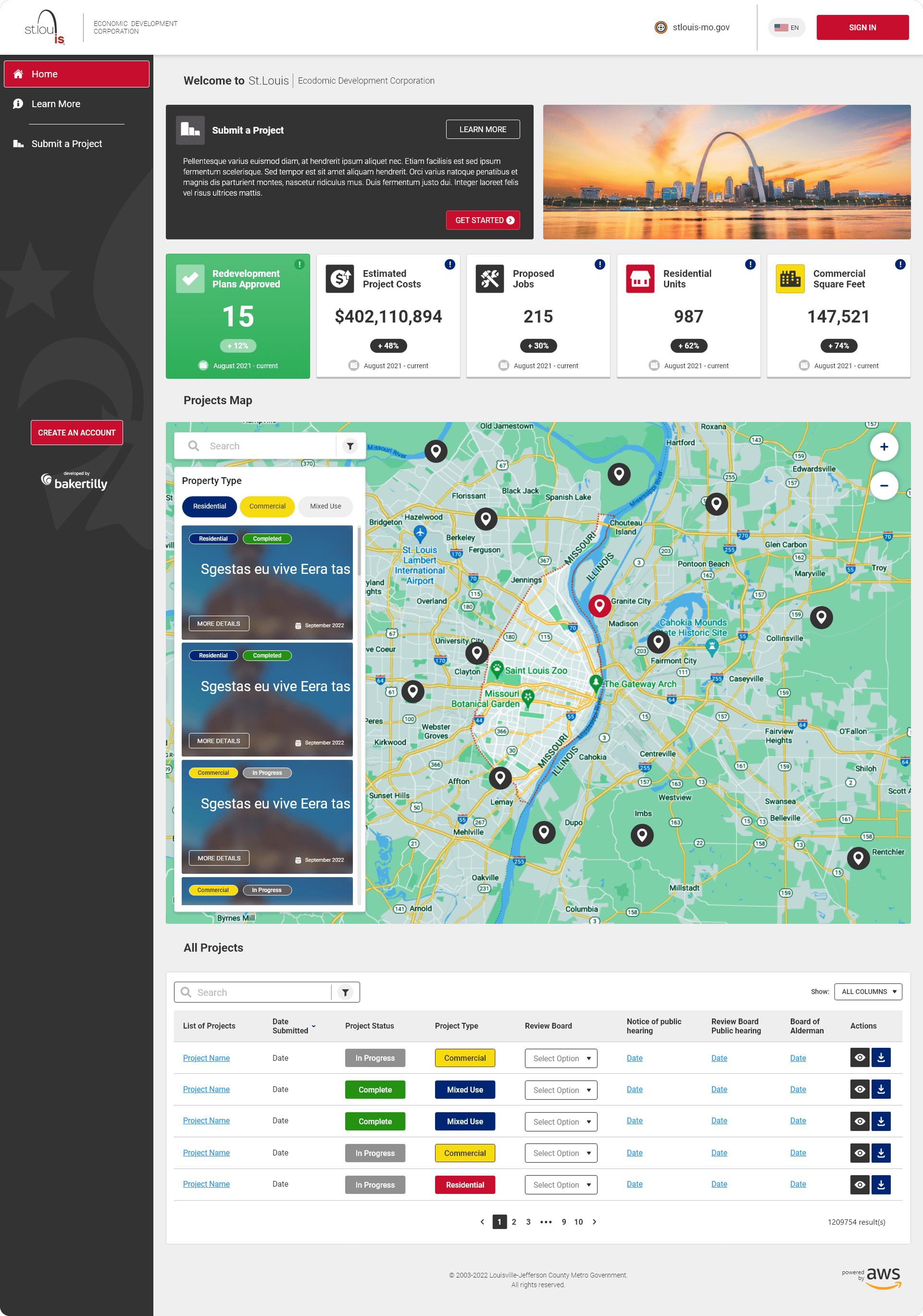
Five-Metric Display: Highlighted redevelopment plans approved, total estimated project costs, total jobs, total residential units, and total commercial square footage to provide immediate context and measurable impact at a glance.
Projects Map: An interactive map with Google Maps-style filtering, allowing users to explore residential, commercial, and mixed-use developments through intuitive visual land-use tags.
Listed Projects Table: Structured for scannability, enabling users to efficiently browse, compare, and evaluate active developments without losing context.
UX/UI APPROACHES
- Data hierarchy and visual grouping were applied throughout the home page dashboard to ensure users could scan and comprehend key economic development metrics quickly, regardless of their familiarity with the platform. The most critical information is always surfaced first, with supporting detail organized beneath it in a logical, predictable sequence.
- Interactive filtering on the projects map and listed projects table reduces friction during data exploration, allowing users to narrow results by development type, location, and project status without losing context or having to restart their search.
- Consistent card and table patterns are maintained across all data views, ensuring that users who interact with the platform regularly can move through information quickly and confidently, without having to relearn the layout from session to session.
- Performance-minded design was a core consideration throughout the dashboard, where high volumes of civic data, map rendering, and tabular content run simultaneously. Every layout decision was evaluated not just for visual clarity but for its impact on load efficiency and interaction responsiveness across all devices.
KEEPING LOGIN AND ACCOUNT CREATION FAST, FOCUSED, AND FRICTION-FREE
Authentication modals were designed to streamline login and account creation without pulling users away from their primary workflow. On a platform where users may arrive with a specific data need already in mind, a disruptive or poorly structured modal is enough to cause abandonment. These modals were built to handle authentication quickly, cleanly, and without friction.
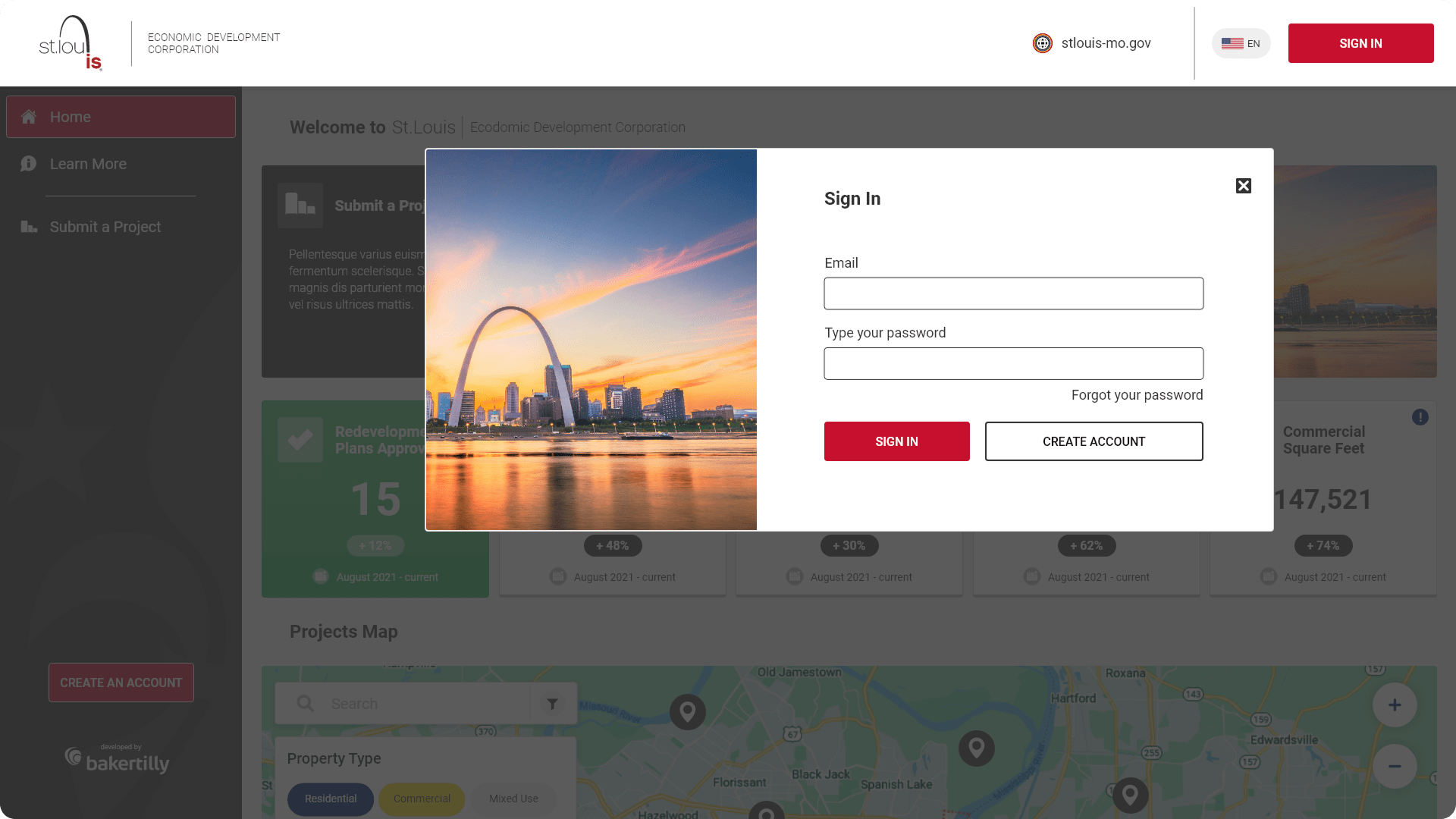
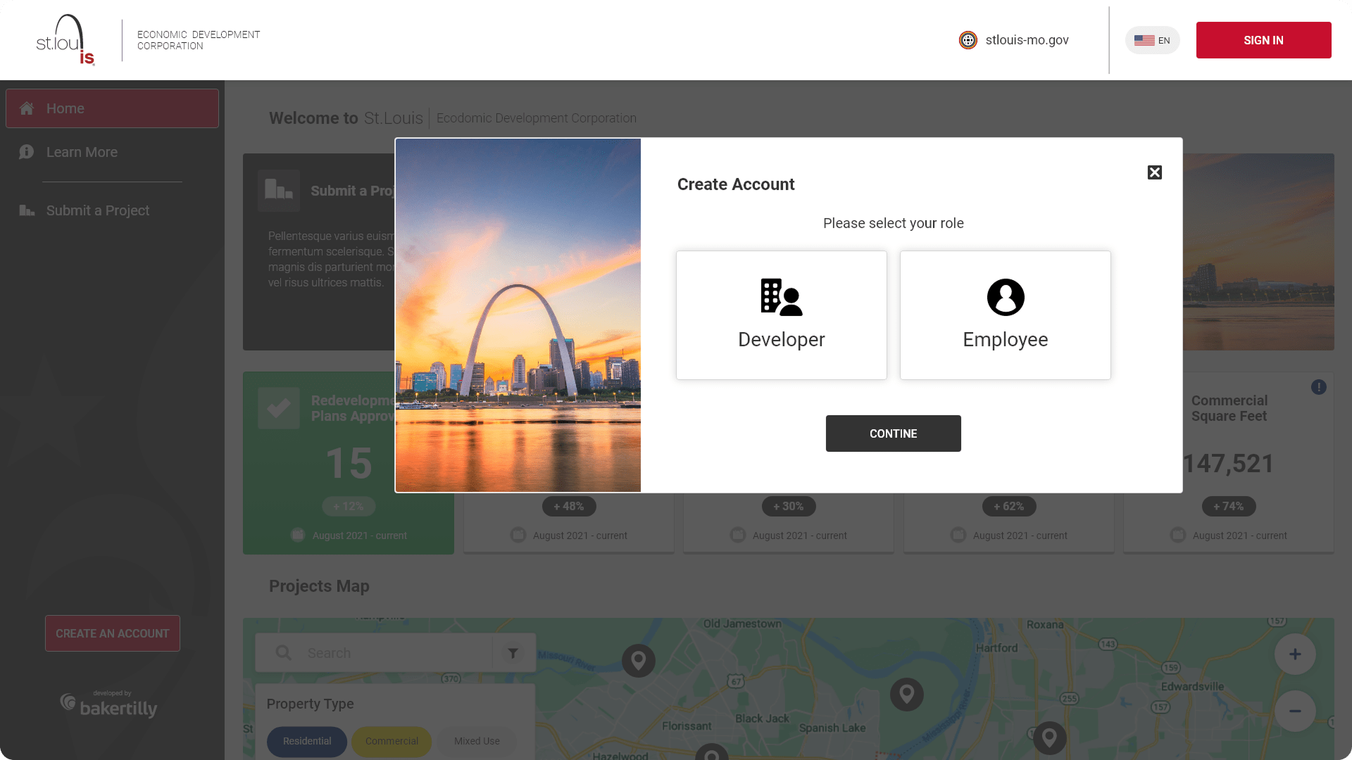
Focused modal layouts to minimize distractions and keep users oriented
Clear error states and validation feedback to prevent and correct input mistakes in real time
Accessible focus states and keyboard navigation support for diverse users
Consistent interaction patterns across all authentication flows
These modals were designed to simplify user authentication, ensuring a smooth login and account creation process.
EXPANDING ON DASHBOARD DATA WITH EVENT PLANNING, CIVIC NOTIFICATIONS, AND PROJECT CATEGORIZATION
The landing page mirrored the dashboard structure while providing a more detailed view of project categorization and civic activity. The total jobs metric was replaced with total mixed-use developments to better reflect the diversity of active development across the city. Additional features were introduced to support planning, transparency, and ongoing civic engagement.
Calendar View: Displayed upcoming hearings and civic events to support planning and community participation
Mini Notifications Bar: Surfaced critical updates and announcements to keep users informed without overwhelming the interface
Accessible focus states and keyboard navigation support for diverse users
Consistent interaction patterns across all authentication flows
UX/UI APPROACHES
- Context-aware metrics were tailored to reflect the specific intent of users arriving at the landing page, replacing the total jobs metric with total mixed-use developments to better represent the full scope and diversity of active civic development across the city. Every data point displayed was evaluated against one question: does this serve the user’s actual need at this stage of the experience?
- Progressive disclosure was used throughout the landing page to prevent information overload without sacrificing depth. Supporting details, project breakdowns, and civic event information are surfaced only when contextually relevant, keeping the primary view clean and focused while ensuring that users who need more can access it without friction.
- Visual balance between data density and readability was maintained across all screen sizes through deliberate decisions around white space, typographic scale, and content grouping. On a platform where the volume of information could easily overwhelm the interface, that balance was not a stylistic preference; it was a functional requirement that shaped every layout decision from the first wireframe to the final design.
- Scalability was built into the landing page architecture from the start, ensuring that new redevelopment metrics, civic features, calendar events, and community initiatives can be introduced over time without requiring a structural redesign. The layout was intentionally flexible, treating the current content as the first iteration of a platform designed to grow alongside SLDC’s mission and the city it serves.
REFLECTIONS & KEY LEARNINGS
Designing for Civic Transparency: Working on the SLDC platform reinforced that designing for public-sector audiences carries a distinct responsibility. When a platform exists to make civic and economic information accessible to all residents, every design decision around data hierarchy, readability, and navigation clarity has a direct impact on how informed and empowered users feel. Clarity here is not just a usability goal; it is a civic one.
Managing Information Density Without Losing Depth: This project deepened my understanding of how to present data-rich content without overwhelming the user. The best decisions came from identifying what each user type needed to know first and building the visual hierarchy around that priority, rather than trying to surface everything at once.
Interactive Mapping as a UX Challenge: Designing the projects map reinforced that interactive data visualization is one of the most complex problems in UX design. Creating a filtering experience that felt as intuitive as Google Maps while surfacing civic-specific land-use categories required careful iteration, close attention to interaction patterns, and constant evaluation of how users naturally approach spatial data.
Responsive Design for a Broad Public Audience: Delivering a consistent, high-quality experience across desktop, tablet, and mobile for a platform serving such a wide range of users, from data professionals to residents checking in on neighborhood projects, required independent design thinking at every breakpoint. What worked at desktop scale rarely translated directly, and each layout had to earn its place on smaller screens.
Brand Alignment in a Civic Context: Maintaining SLDC’s professional identity across a platform that had to feel both authoritative and approachable required careful decisions about color, typography, and component design. A civic platform must communicate credibility and openness simultaneously, and achieving that balance through visual design alone was one of the more nuanced challenges of the project.
Iterative Design with Stakeholder Complexity: Public-sector projects involve a wider range of stakeholder perspectives than most, and incorporating feedback from parties with different priorities required a disciplined, outcome-focused design process. Each iteration had to move the design closer to a measurable goal rather than simply accommodating new preferences, and that discipline was what ultimately kept the project on track and the experience coherent.
CHALLENGES I OVERCAME
Making Complex Civic Data Comprehensible: The SLDC platform required presenting a significant volume of economic development data, including project costs, job counts, residential units, and commercial square footage, in a format that felt immediately useful to users with very different levels of data literacy. Structuring that information through clear visual hierarchy, logical grouping, and a strong five-metric dashboard was a persistent design challenge that required constant iteration and user-focused decision-making.
Designing an Intuitive Interactive Map: Building a project map that felt as natural and low-friction as Google Maps while surfacing civic-specific content was one of the most technically and creatively demanding aspects of the project. Filtering by land-use type, visual tagging, and maintaining map performance across devices required careful attention to both interaction design and visual clarity, ensuring the map functioned as a genuine discovery tool rather than a decorative feature.
Serving a Diverse, Non-Technical Audience: The platform needed to work equally well for data-literate developers, internal stakeholders, and residents with no prior experience navigating civic development tools. Designing for that range without dumbing down the content or excluding more sophisticated users required precise decisions about progressive disclosure, plain-language labeling, and contextual guidance at every stage of the experience.
Maintaining Consistency Across a Complex Screen Set: Aligning visual language, component behavior, and interaction quality across the login, landing page, home dashboard, and modals required meticulous attention to detail throughout the project. Every typographic decision, color application, and UI pattern had to feel like it belonged to the same cohesive system, whether a user was authenticating for the first time or reviewing detailed project data on their third visit.
Balancing Data Density with Visual Clarity: The home page dashboard had to present five distinct metrics, an interactive map, a projects table, a calendar view, and a notifications bar, all without creating visual overwhelm. Finding the right balance between completeness and clarity required multiple rounds of layout iteration, and the final solution relied heavily on visual grouping, white space, and a disciplined typographic hierarchy to make the density feel manageable.
Delivering Full Responsiveness Across Three Devices: Ensuring the platform performed consistently across desktop, tablet, and mobile introduced unique challenges at every breakpoint, particularly for data-heavy views like the dashboard and interactive map. Each layout required independent design decisions around content prioritization, touch interaction, and component scaling, and maintaining quality across all three without compromising the integrity of the experience was one of the most demanding aspects of the project.