This case study dives into the challenges, solutions, and outcomes of redesigning a feature-rich fintech mobile experience.
Total Expert is a powerful customer engagement platform tailored for financial institutions, helping banks, credit unions, and lenders manage marketing, sales, compliance, and customer relationships. I was brought in to improve the mobile experience—specifically Android—by aligning it with iOS, expanding functionality, and resolving UX inconsistencies.
Role: Sole UX/UI designer + Brand Designer
Industry: Fintech, CRM, Marketing Automation
Tools: Figma, FigJam, Slack, Zoom, Jira
Duration: Nov 2024 – Feb 2025
As the sole designer on this sprint, I was responsible for end-to-end UX/UI work on the Total Expert mobile platform. This included:
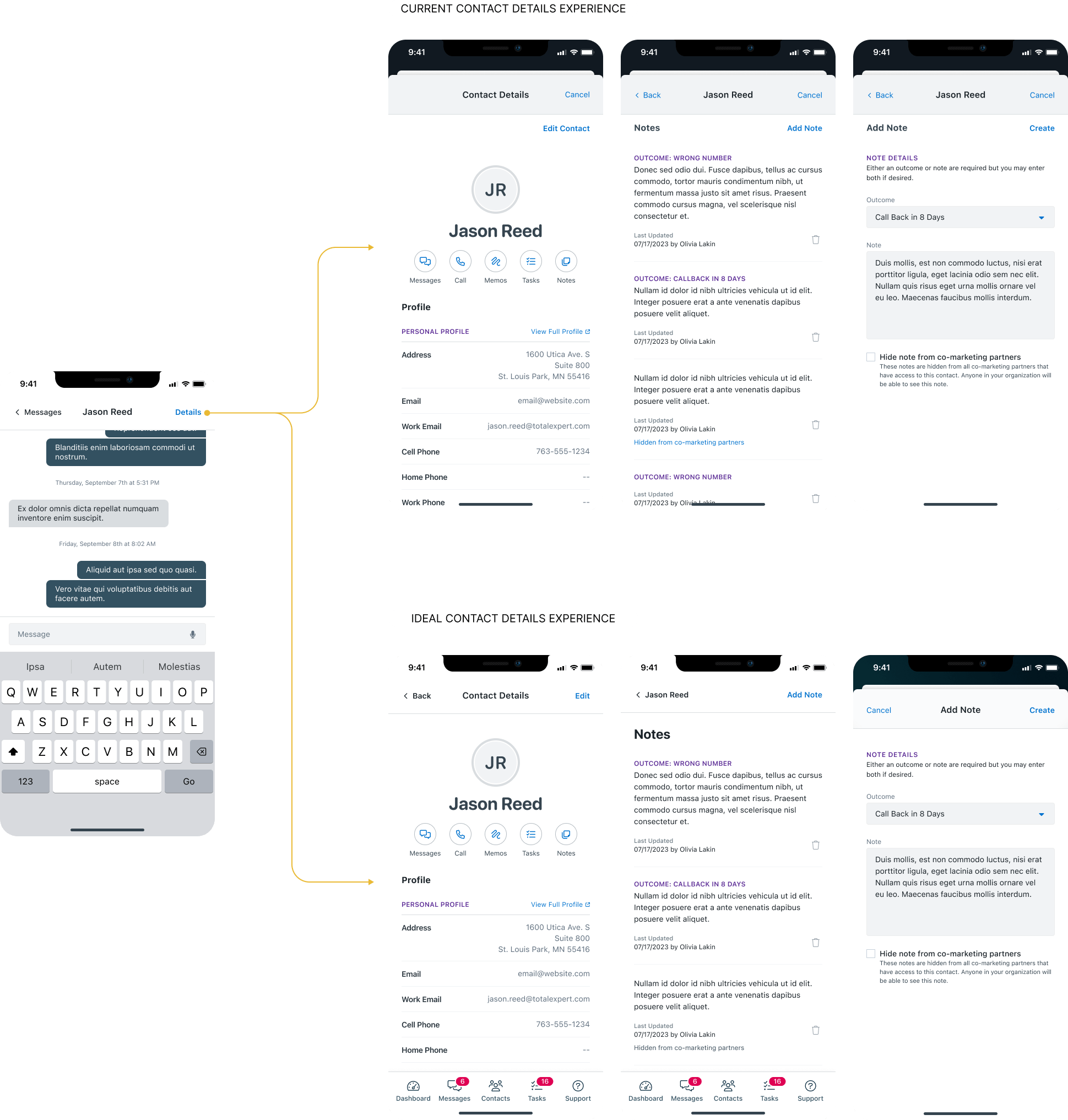
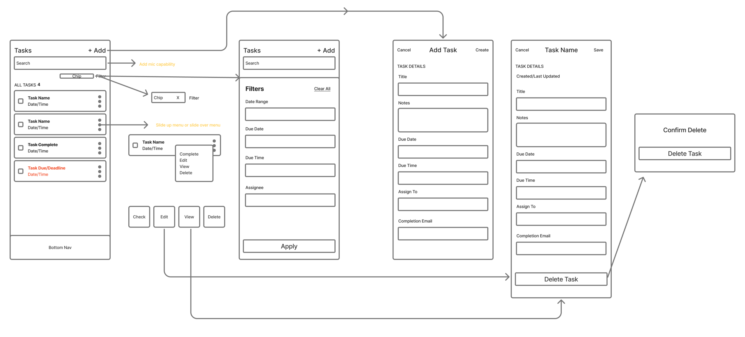
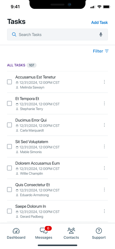
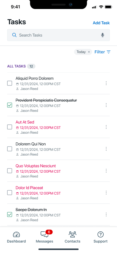
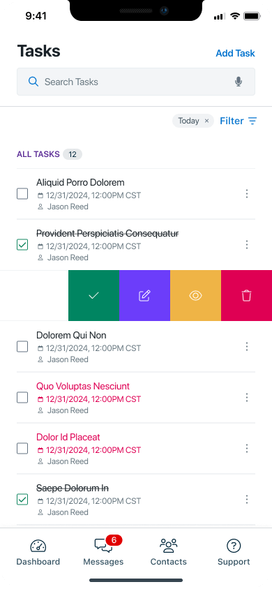
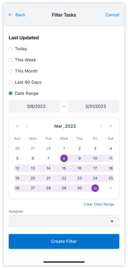
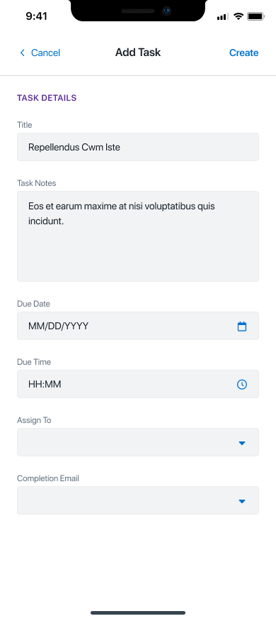
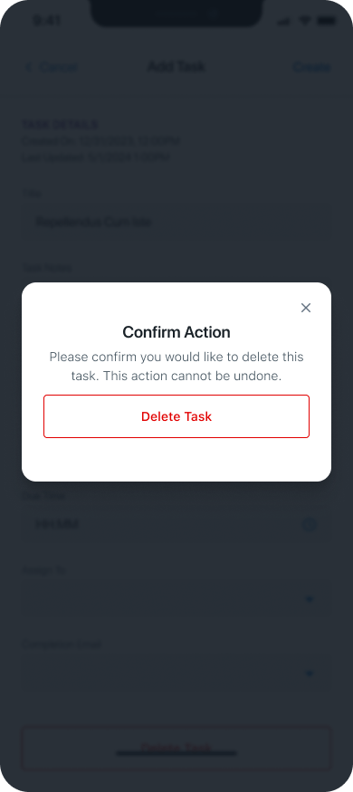
Added the ability to view, create, and edit tasks within the app.
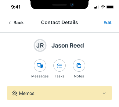
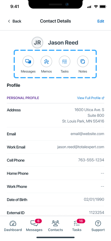
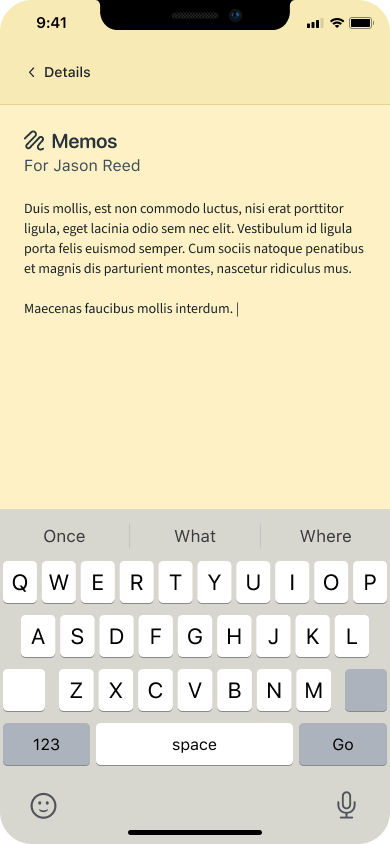
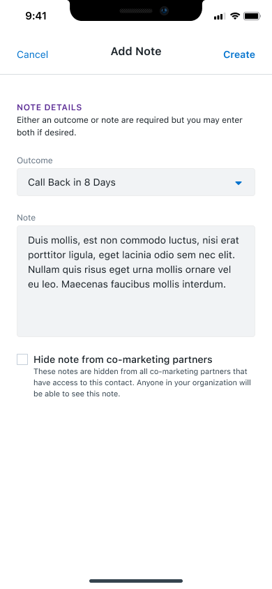
Incorporated memo creation and viewing on contact records.
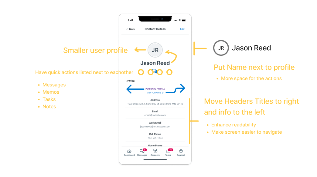
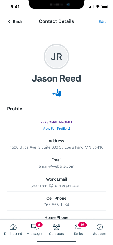
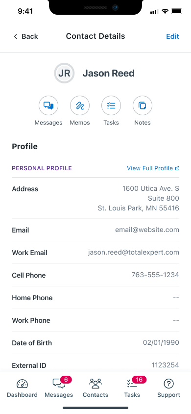
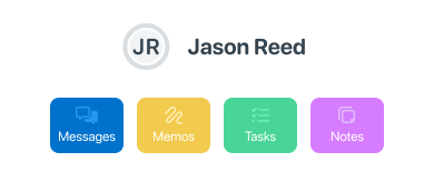
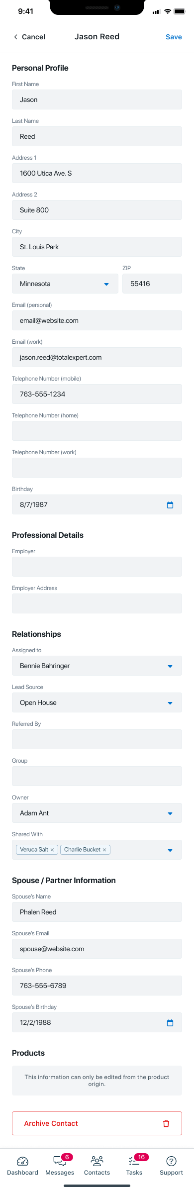
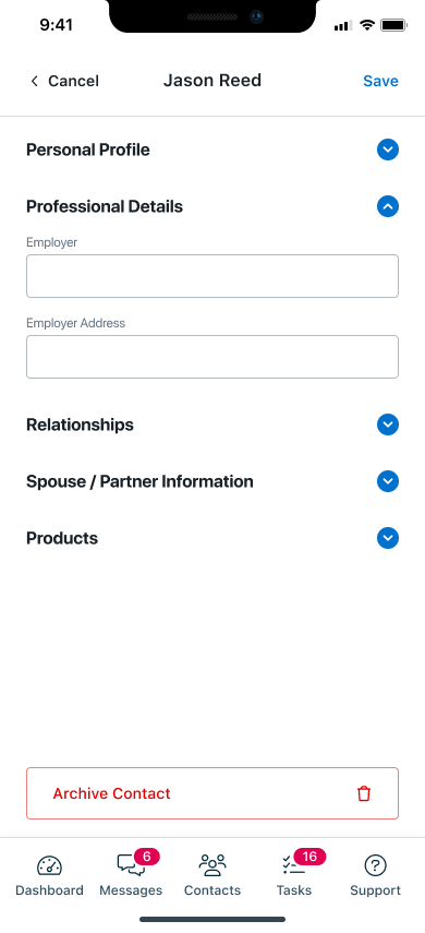
Improved the navigation for contact details.
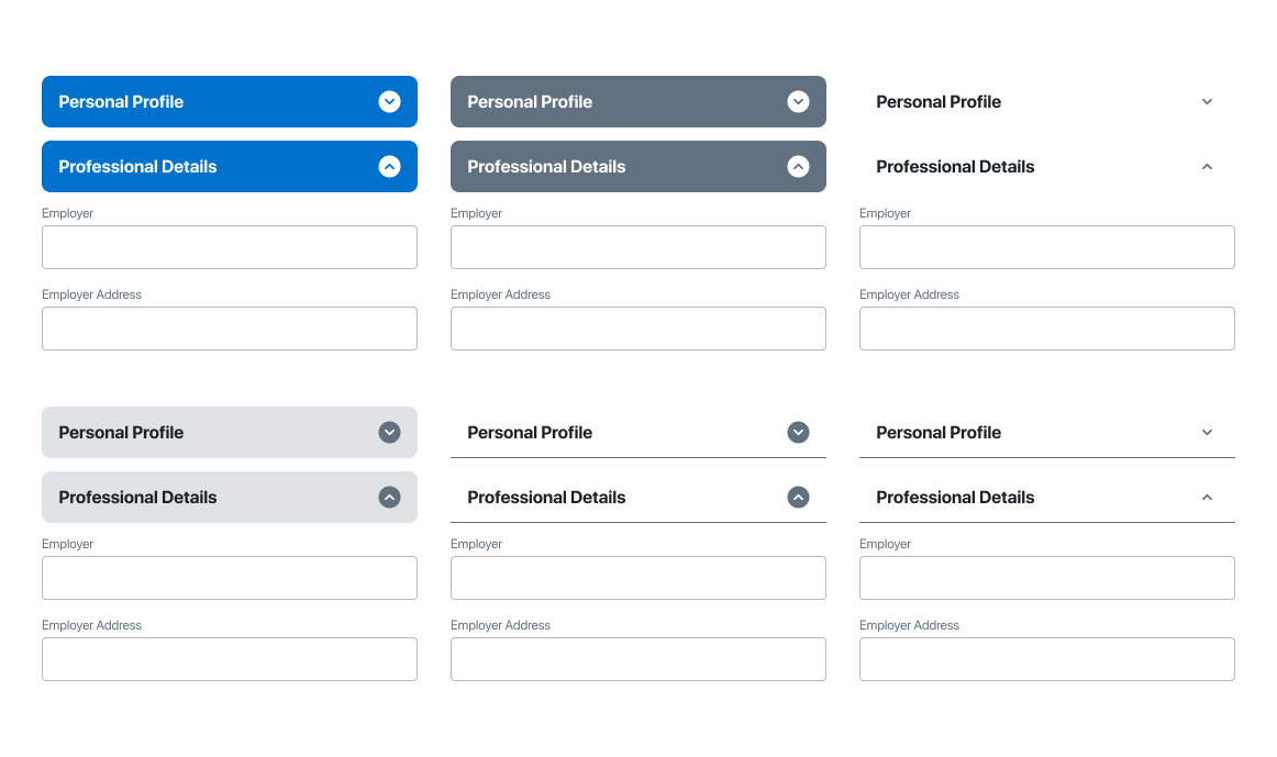
Redesigned Android screens to align with iOS, converting panel-based displays to standalone screens.
🪪
Enhanced the contact details main page to include memos, tasks, notes, and outcomes.
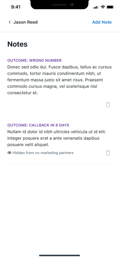
Enabled visibility of outcomes associated with leads.
To make the Total Expert mobile app both effective and user-friendly for users, I focused on incorporating these key features:
One of the most critical improvements was a complete overhaul of the user contact details screen.
I converted layered, cramped panels into dedicated screens to mirror iOS usability patterns—improving clarity, space, and accessibility without disrupting Android conventions.
TotalExpert aimed to achieve a consistent look and feel between the Android and iOS versions of the app. To support this goal, I retained certain panel elements for slide-up menus and pop-ups to minimize excessive navigation and provide a smoother user experience.
I converted layered, cramped panels into dedicated screens to mirror iOS usability patterns—improving clarity, space, and accessibility without disrupting Android conventions.
Revamped the editing workflow for contact details, making the process more intuitive and user-friendly. This included clearer field organization, collapsible sections, and a more streamlined navigation.
Previously, task creation and updates were only available on the web platform. To bring full task functionality to mobile, I introduced the ability to view and manage tasks directly within the app.
I designed a streamlined interface featuring slide-action controls, allowing users to quickly complete, edit, view, or delete functions with minimal effort. I implemented a filtering and search system to further enhance task management, enabling users to efficiently organize and locate tasks within their workflow.
Recognizing the need for better task visibility and interaction flow, I added a slide-over menu for instant task management and introduced color-coded status states to visually differentiate task progress. These enhancements made it easier for users to prioritize, manage, and complete tasks directly within the app.
I redesigned the task creation flow to be intuitive and efficient, enabling users to seamlessly add, update, or remove tasks directly within the mobile app. The new interface includes clearly defined input fields, contextual guidance, and minimal steps—allowing users to create tasks on the go without confusion.
Editing and updating tasks now feels effortless, with real-time field updates and accessible edit states. I also introduced a streamlined delete function, ensuring that removing tasks is just as straightforward, while maintaining confirmation prompts to prevent accidental loss of data.
Added functionality to view memos associated with each contact record. This included creating a visually clear and easily accessible section for memos, ensuring they could be retrieved quickly when needed.
The memos section was initially displayed on the main screen, but it occupied too much screen real estate. To optimize space and improve usability, I transitioned the memos to a dedicated screen.
Enabled users to view outcomes associated with specific leads, presenting them in a structured format for better decision-making. Visual aids like icons and color-coding were incorporated to improve recognition and usability.
I designed a streamlined interface featuring slide-action controls, allowing users to quickly complete, edit, view, or delete functions with minimal effort. I implemented a filtering and search system to further enhance task management, enabling users to efficiently organize and locate tasks within their workflow.
↓ 20–30%
reduction in navigation friction for first-time visitors
↓ 25–40%
decrease in data interpretation errors through clearer hierarchy and labeling
↑ 15–25%
improvement in time-to-insight when reviewing development data
↑ 30%
faster scanning of active projects and redevelopment metrics
↑ 20%
increase in user confidence when exploring public economic information
Importance of Consistency:
Designing screens for both Android and iOS reinforced the value of maintaining a cohesive look and feel across platforms while respecting their unique design guidelines.
Prioritizing Usability:
Balancing aesthetics with functionality highlighted the need for intuitive and accessible designs that simplify the user experience.
Streamlining Navigation:
Through features like collapsible sections and slide-action menus, you learned how to reduce unnecessary navigation steps, improving efficiency for end-users.
Adapting to Space Constraints:
Managing screen real estate effectively, such as transitioning the memos section to a dedicated screen, taught you how to optimize layouts without compromising usability.
User-Centric Design:
By exploring alternate displays and incorporating additional actions, you gained insights into creating solutions tailored to user needs while maintaining clarity.
Platform Alignment:
Adapting Android screens to mirror iOS designs required finding a balance between consistency and platform-specific user expectations.
Managing Screen Real Estate:
The challenge of overcrowded screens pushed you to make critical design decisions, like introducing collapsible sections and dedicating screens for specific features.
Minimizing User Effort:
Designing features like slide-action menus to reduce scrolling and navigation involved innovative problem-solving to maintain functionality without overwhelming users.
Feature Integration:
Adding functionalities like memos, tasks, and lead outcomes while keeping the interface clean and intuitive required careful planning and testing.
Iterative Refinements:
Overcoming initial design hurdles demanded continuous iterations and adjustments based on feedback, emphasizing the importance of flexibility and adaptability.